Specifics of UX/UI web design development
Experts, who work on creating websites, know what UX/UI web design is. However, this term is unfamiliar for customers who order it and often they don’t realize what they pay for. In this article we will discuss the specifics of UI/UX web design and whether it is worth the cost or not.
Modern design of a website based on UI/UX
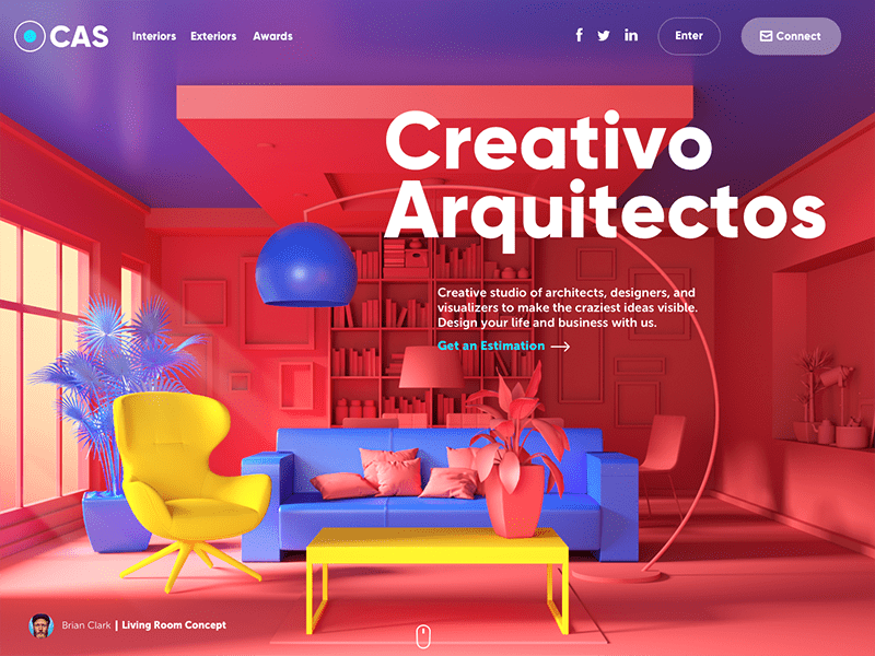
Each of us had to face resources with inconvenient interface: there were too many buttons to press in order to get to the necessary page and in the number of cases the buttons merged with the background which made it difficult to recognize them at once. Obviously, creators of such platforms didn’t involve UI/UX designers therefore losing potential customers. The main aim of a UI/UX expert is to create an interface which would be practical, comprehensible and harmonious for an ordinary user. Google can serve as an illustrative example of simple and familiar to all resource. There’s nothing unnecessary and every user knows what to do.
What do the abbreviations UI/UX mean?
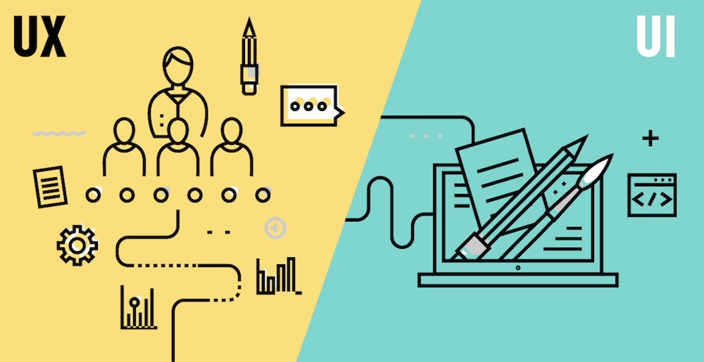
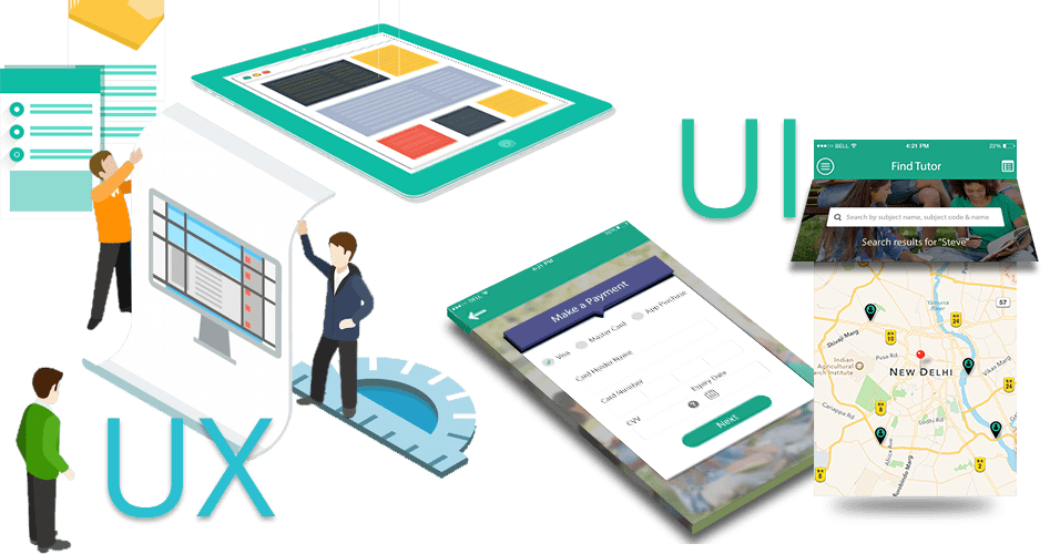
UX is decoded as “User Experience”. UI/UX design answers all the questions: how convenient and practical is the interface, is it easy to work with and is it comprehensible.
UI is decoded as “User Interface”. It implies the interface appearance and its physical characteristics.
One cannot exist without the other thus these two notions were united. That’s how UI/UX web design appeared – interface design where usage conveniences and appearance are equally important. Websites created by UI/UX experts who prettified the frame of text, images and buttons and made it convenient for different gadgets have more visitors and therefore customers.
General requirements to UI/UX web design:
- A target audience-centered orientation. Many customers are not aware of their target audience. To undertake researches in this area is considered to be expensive as for money and time. As a result – low attendance of pages which cannot be saved even with the help of advertisement because it’s impossible to get new target clients without knowing a target audience.
- To find a middle ground. It’s unnecessary to burden a resource with abundance of different kinds of functionality since it will be difficult for user to navigate. At the same time, down-to-earth simplicity, when the elements of functionality are hidden or deleted, making search on the page a puzzling quest, is not welcomed either. The interface has to be comprehensible for a customer, helping to navigate in a matter of seconds.
- Users' behavior analysis. It allows to estimate the degree of resource attendance and the attendance of its separate pages. Basing on the analysis one may edit or supplement UI/UX design. For instance, if you noticed that some functions in mobile version are used very seldom you may remove them there keeping in the desktop version.
- Testing. It’s not a service to save money on. Before starting, it’s recommended to test the functions, color harmony, usability, different elements of corporate identity, the way pages display and work on different devices. It’ll help to find and fix the issues in time.
Modern web design on concrete examples
If you open a website and it’s clear where to click to get wherever you want, it doesn’t annoy you, it means that UI/UX experts worked on it really hard.
Here’s a bright example of a website development made by our company for a cleaning company. On the main page, a customer can choose a service at once, calculate its price and get a subscription for regular cleaning. There’s no need to wander the resource pages searching for necessary information. The most important and essential info can be found at once you open the page. Convenient button location, mobile adaptation, pleasant color scheme, exhaustive service information – all these work for the company target clients and as a result – good conversion and new clients for the cleaning company https://cleanspace.com.ua
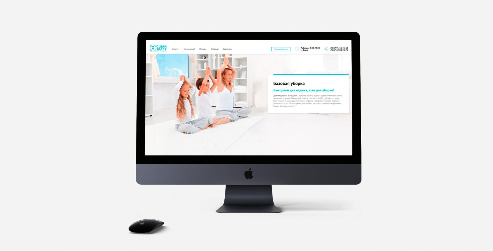 Case: website development, logo and marketing strategy for Clean Space
One more example of the website we made for a designer furniture online shop. A minimalistic interface was in the main focus here. A minimum of text, high quality pictures, ease of use. Thus, we have modern, stylish website responding the requests of target audience. The adaptive version for various devices was also developed, which is convenient for usage as well as the main page http://citek.ua
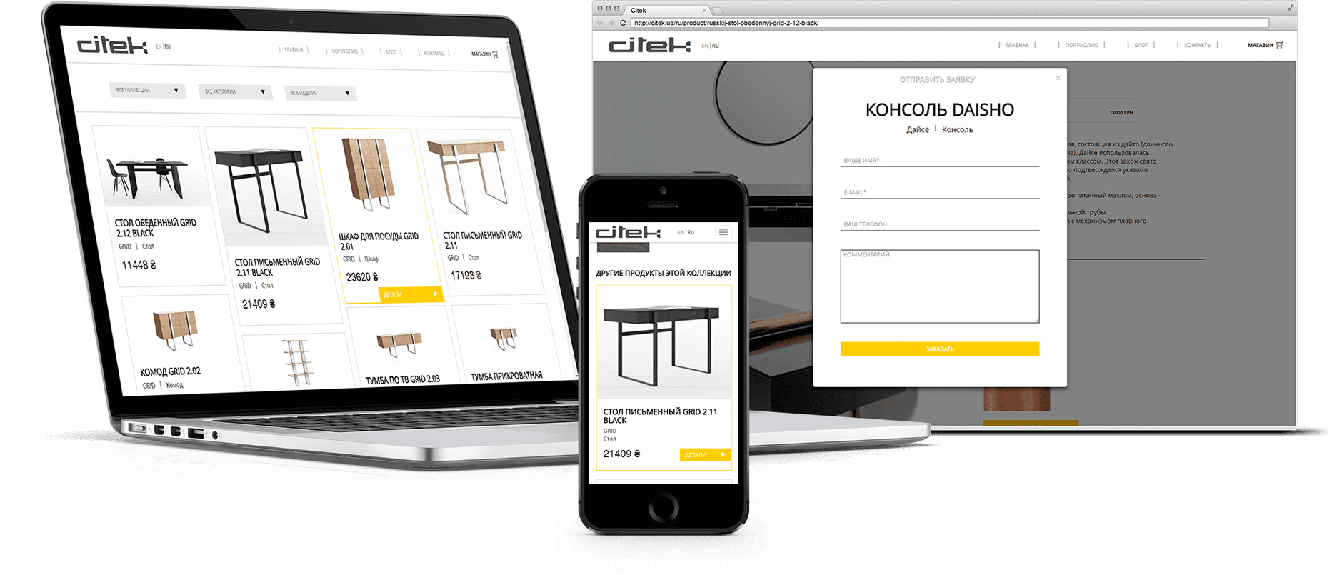
Case: website development, advertising video and photo/video shooting for Citek
Appropriate usage of UI/UX design when developing websites not only increase conversion and draw new target clients but also work for the company image on the whole, helping to form a positive digital reputation. A good digital reputation plays a good part in developing and prosperity of a brand. If you want to update your old-fashioned resource or to create a completely new website using UI/UX design, we will gladly help you with it!
Read more: The main criterion for creating selling sites

 Russian
 Ukrainian

Add a comment
Fields are required *