Case: website development, naming, branding and positioning for Zegen
Client:

-
What is done:
- Positioning
- Naming
- Website
- Branding
Project results
The developed positioning of the company in the market increased brand awareness among the target audience, allowed to form a tone of communication with potential consumers, and determined competitive channels for promoting products.
The adaptive website has increased the number of appeals and sales and has become an integrated part of the brand image.
The site was created based on the developed positioning, focusing on a new target audience. As a result: it became part of the company's image, increased the number of applications and sales.
Objective
To develop the positioning of the company, which will become the foundation for further communication of the brand in the market.
Creation of an adaptive website with an intuitive interface which visual and textual content that is closely connected with the target audience preferences.
Development of brand marketing tools: collections of naming, corporate identity for POS products.
Preliminary analysis
- architects who design rooms. Use 3D visualization to create a holistic image of the interior.

- end-user.
Company positioning
- We plunge headlong into the production of veneer furniture to understand the key engines of the company, its internal values, and philosophy. Meetings with the client, interviews with employees, fast-beating heart when looking at production processes inspired us to develop company communication in the market.
- ZEGEN is an approach to furniture creation that meets the rhythm of modern trends and values. This is the interaction of design and production, a symbiosis of ideas and the best functional solutions. A company that is guided by a desire to share the vision of the designer, his personality, and his creative style.
- When ideas take shape.
Naming
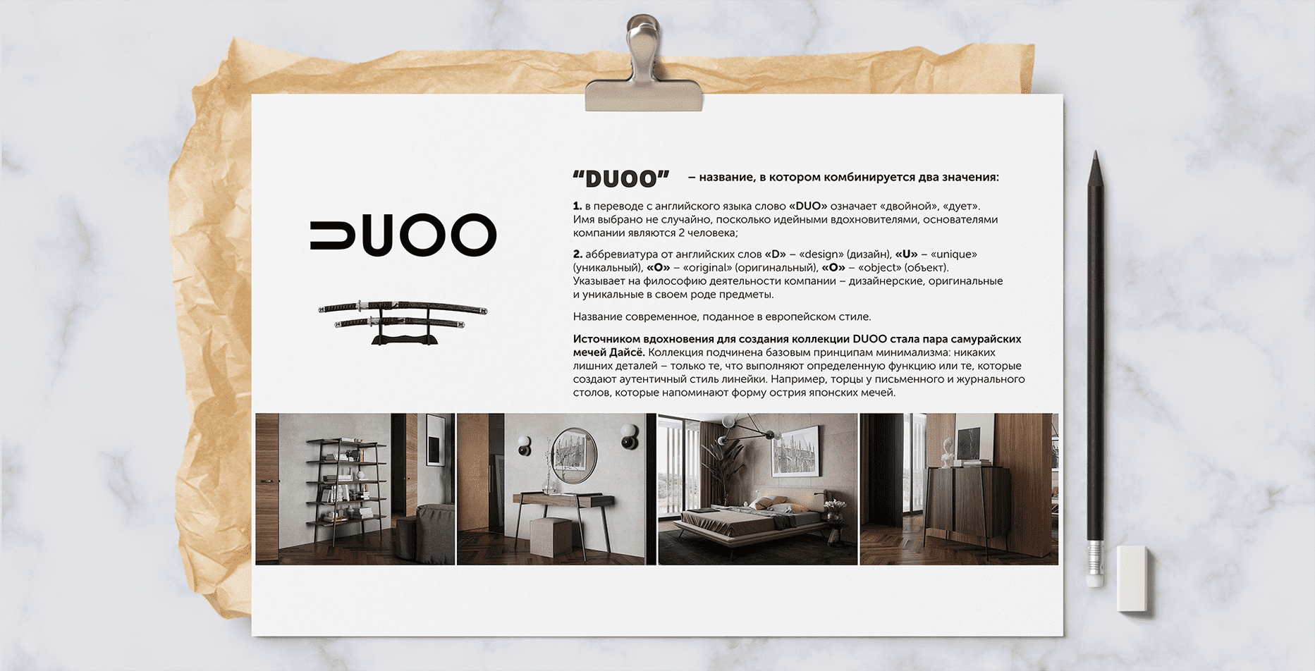
- We developed naming for a collection of furniture from Ukrainian designer Andrey Mogila. The name has a double meaning:
- - in translation from English the word “duo” - “double”, “duet”. Naming reflects the key idea of the collection: a combination of two elements in the subject: the natural beauty of veneer and the power of metal.
- - abbreviation for English words: "design", "unique" , "original" , "object". The name indicates the philosophy and direction of the company - designer, exclusive pieces of furniture.
Development of the main site of the company
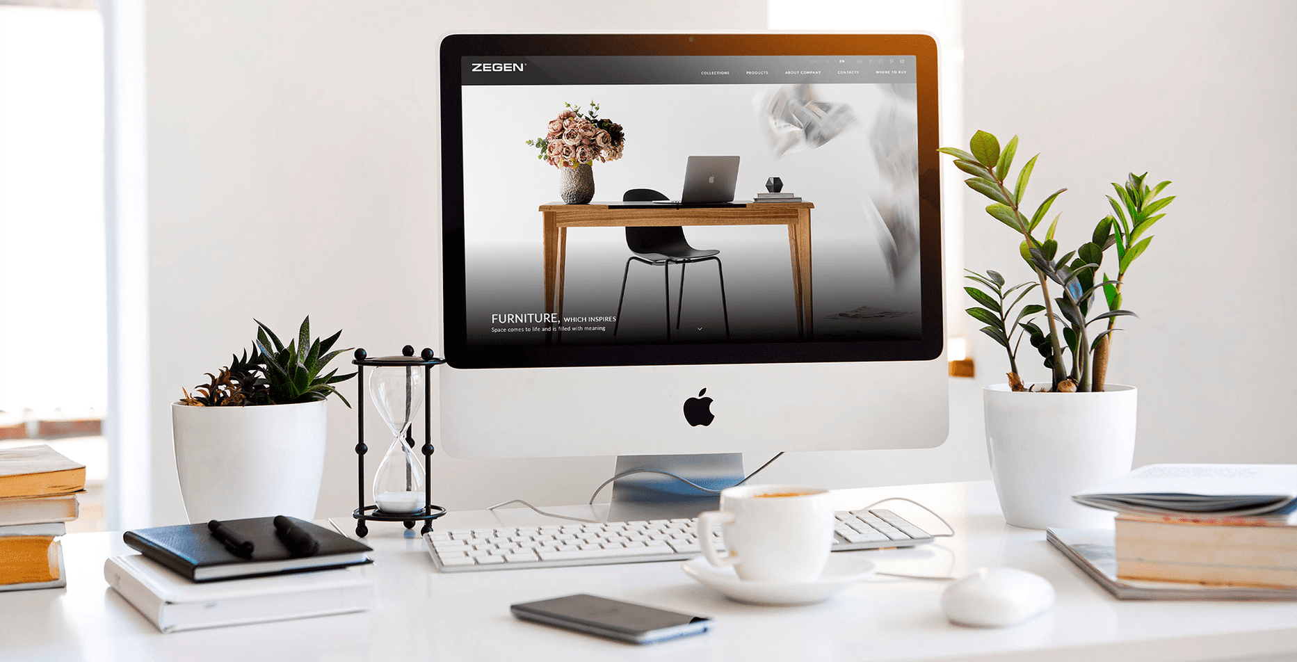
Adaptive design
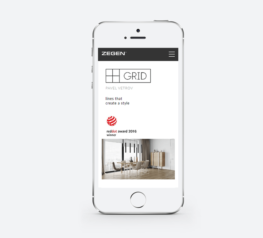
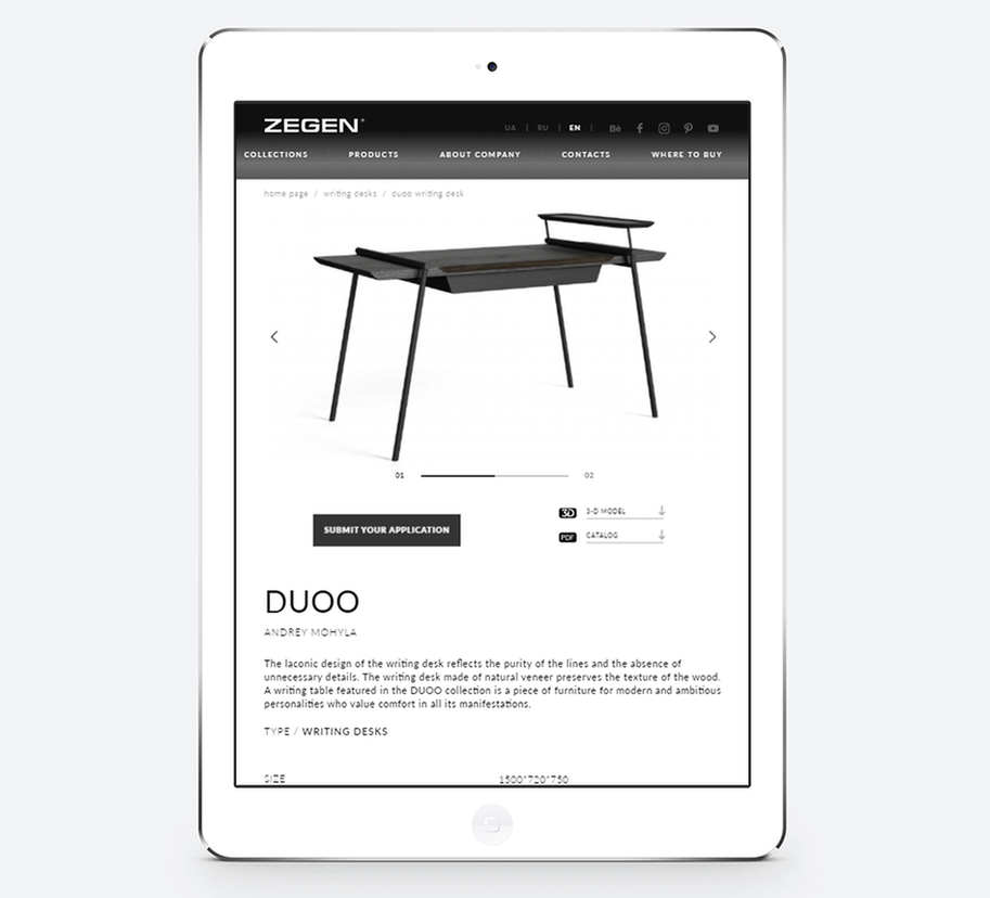
Home screen of a corporate site
- - website design presents the company's core values and is focused on the European market
- - a flexible system allows maintaining the relevancy of the content on the site
- - fast loading of a web page brings the site to the TOP position in the search results
- - convenient admin panel allows editing the site even to the unskilled user
- - page fully adapted for mobile devices
Branding
- Presentational POS-materials are created in the corporate identity style of the company, intended for the international furniture exhibition.
Reviewed
-
-
very serious work. We will also use such advanced technology. Thanks for the project.
Add a comment
Fields are required *

 Russian
 Ukrainian
