Branding for the International Liberty Institute (ILI)
Client:

-
What is done:
- Branding development
Client
The International Liberty Institute, in collaboration with the Austrian School of Economics, aims to enhance economic knowledge, financial literacy, and scientific awareness. The Institute promotes and develops the ideas of personal economic and political freedom.
Task
Conduct a brandstorming session with the Institute's team leaders to assess the organization's mission and develop a unique brand identity. Design a logo and brand guidelines with clear usage rules.
Logo Design Stage
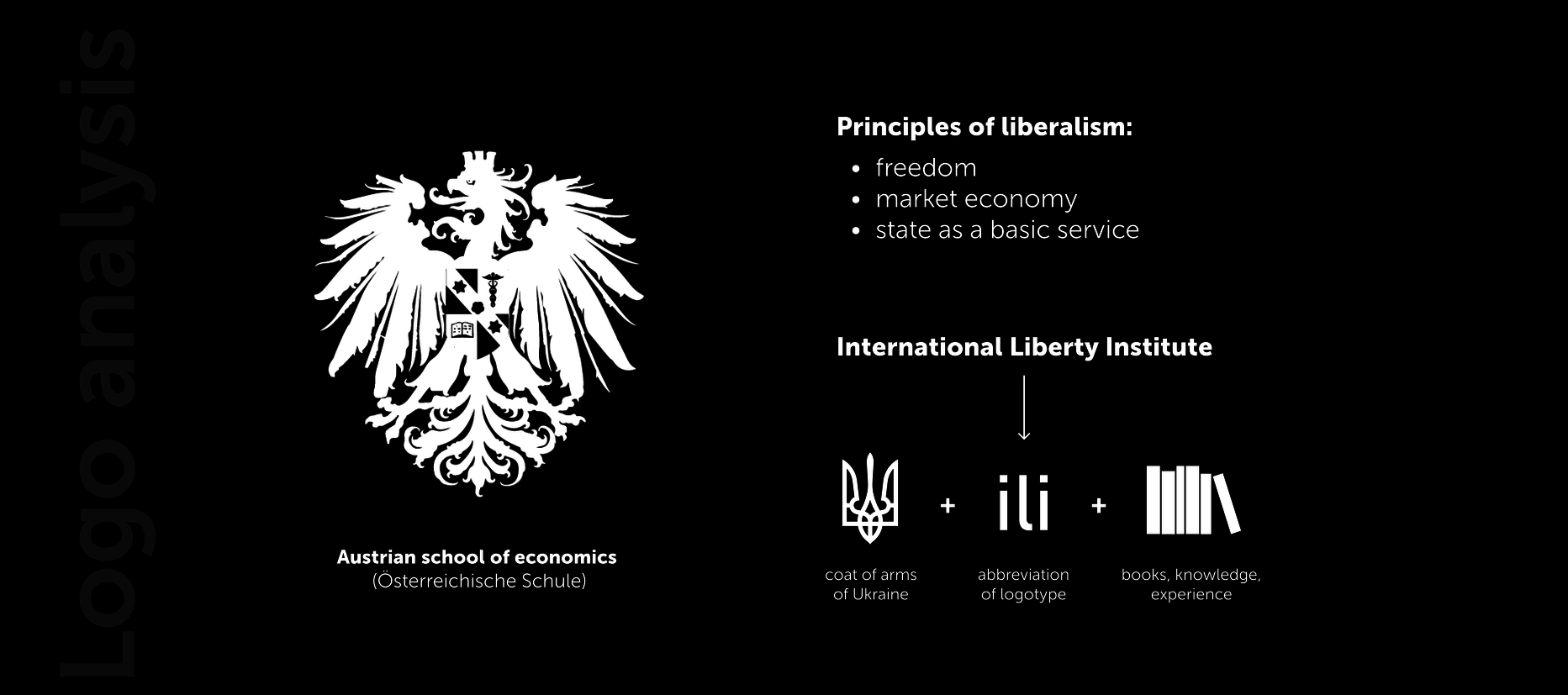
- After joint design sessions with the client, the historical context was analyzed, and several concepts for the emblem and typeface were developed.
- Since the fundamental principles of liberalism are freedom, market economy, and the state as a basic service, these elements had to be reflected in the logo.
- The idea of the mark is to combine stylized initial letters of the Institute's name, a minimalist image of books on a shelf, and a reference to the trident.
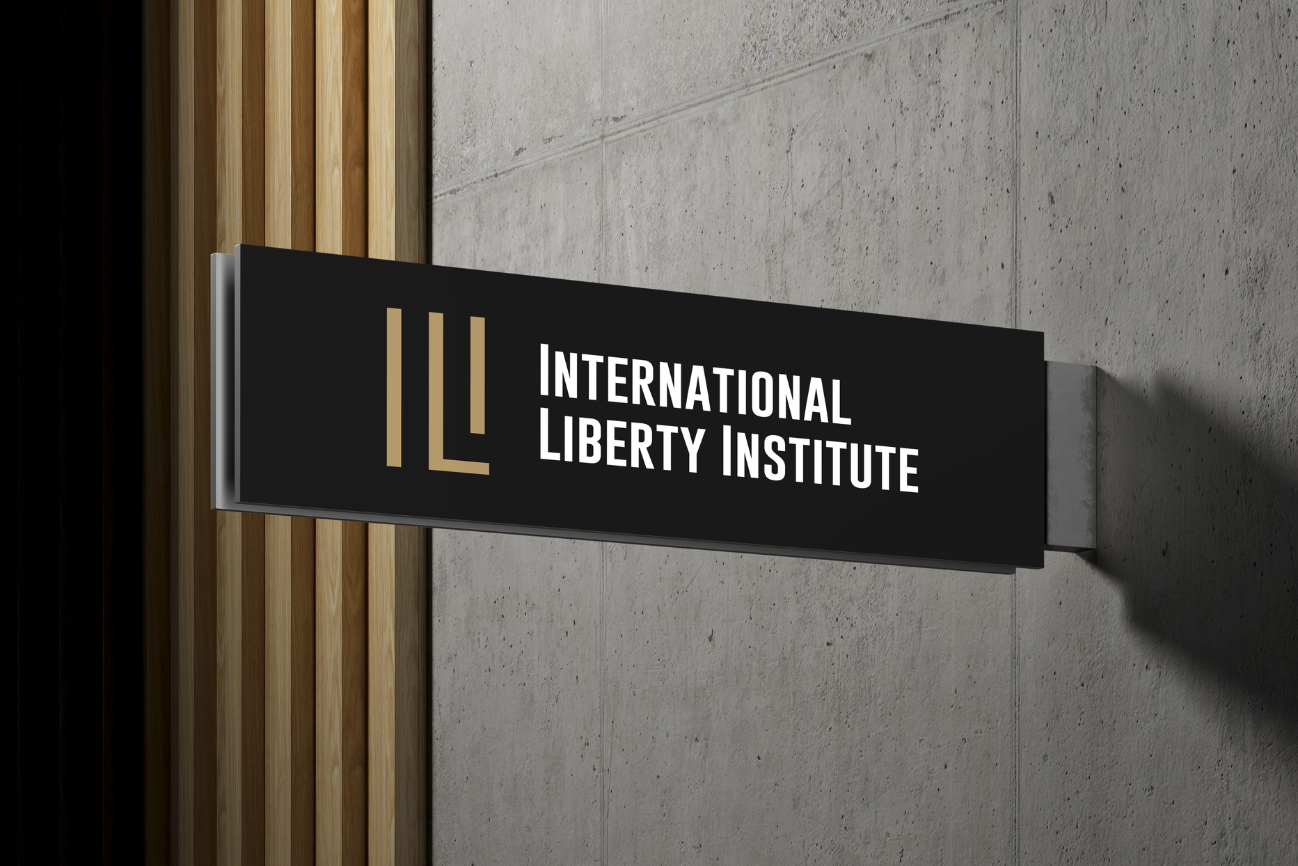
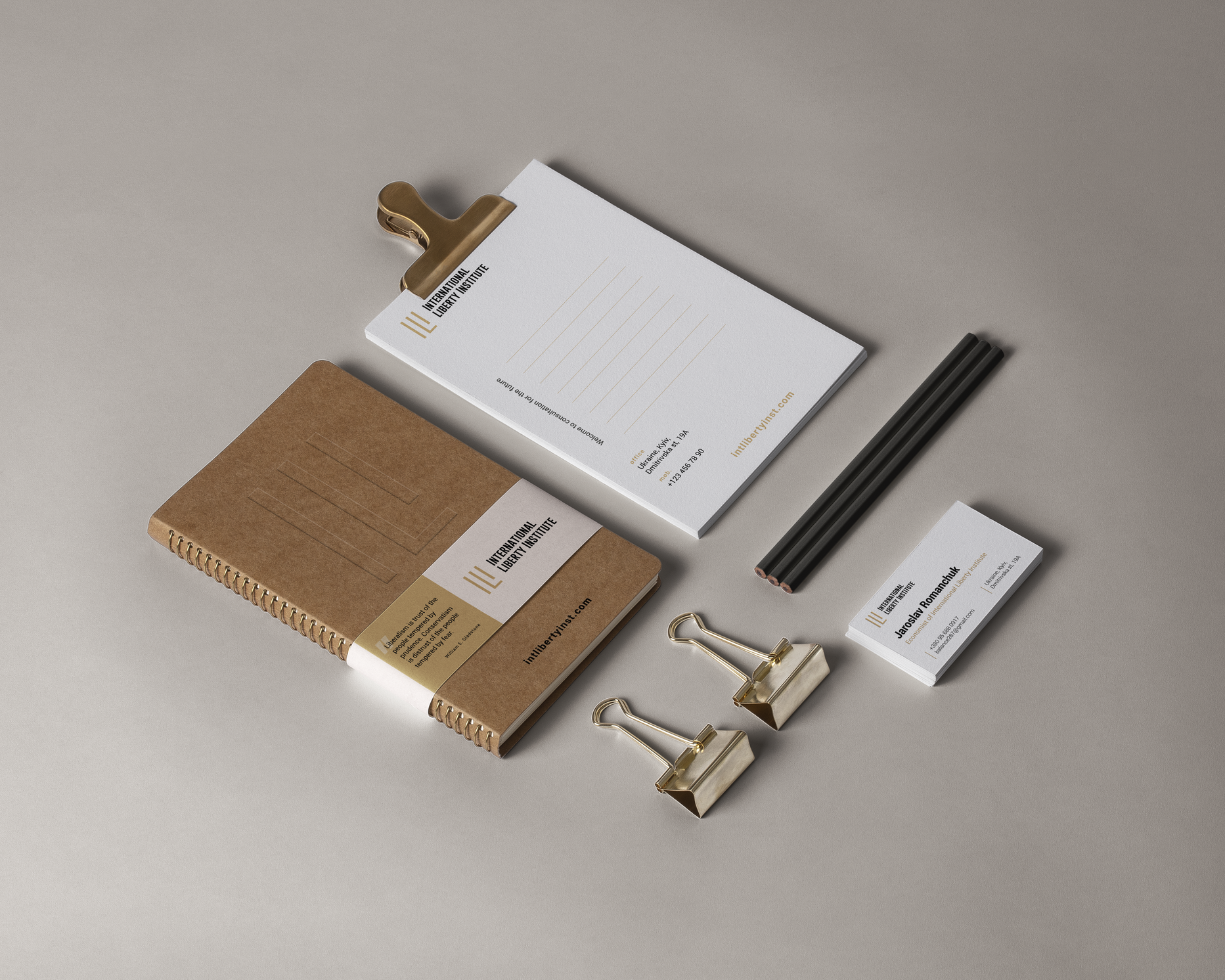
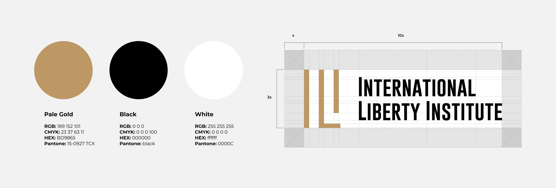
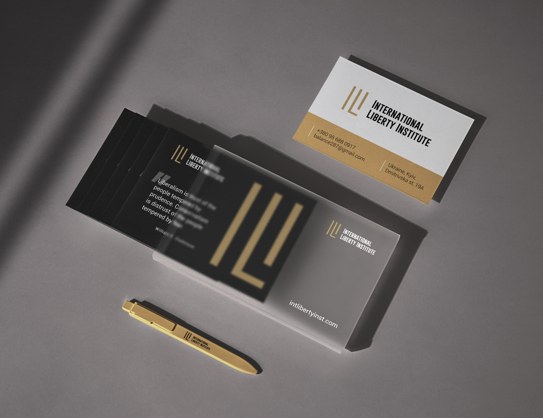
- The logo's color scheme includes a gold mark and black text. A variant with a noble purple color and text on a plaque was also developed.

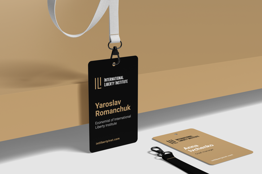

- Three primary colors and a custom font were defined, emphasizing the significance of intellect and the organization's inner strength.

Result
The resulting logo looks minimalist, conceptual, and restrained.
A closed voting method was used to select the final version, as several concepts were presented to the client. It would be interesting to discuss the experience of working in a team when the decision about the brand's visual image is made collectively.

 Russian
 Ukrainian




Add a comment
Fields are required *