Logo and website design for Canadian marketing company BR Solutions
Client:

-
What is done:
- Logo design
- Landing page
Client
"Brooke Robinson Solutions" is a Canadian company that provides marketing services and development of advertising strategies for brand promotion. The agency offers clients a thorough market study, analysis of the target audience and definition of communication channels in accordance with the characteristics of potential consumers and business needs.
Task
Develop a personal logo for the company's founder, Brooke Robinson, as well as an updated logo for the marketing agency, which will convey the brand's values and identity, with the ability to stand out in the market among competitors. It was also necessary to create a company website for effective brand positioning.
Logo design
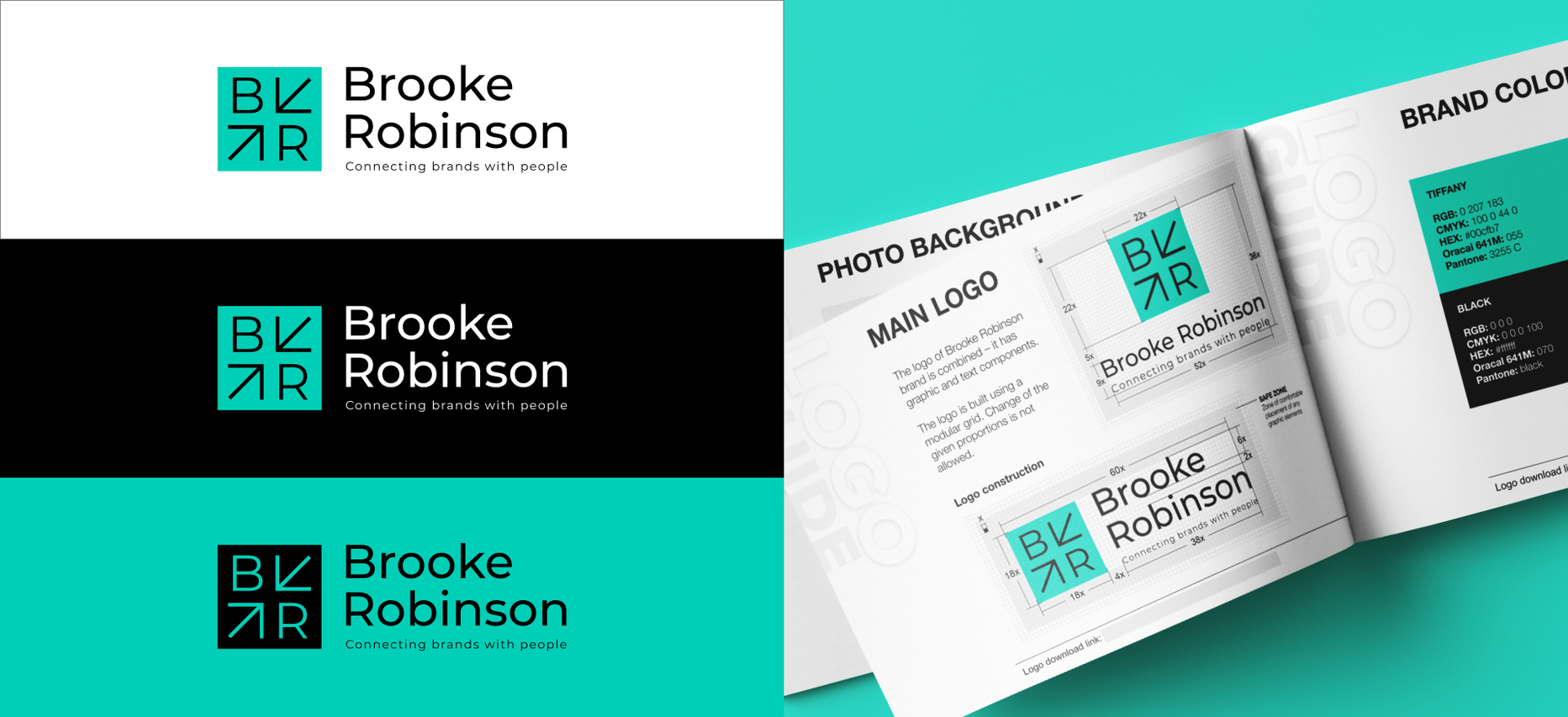
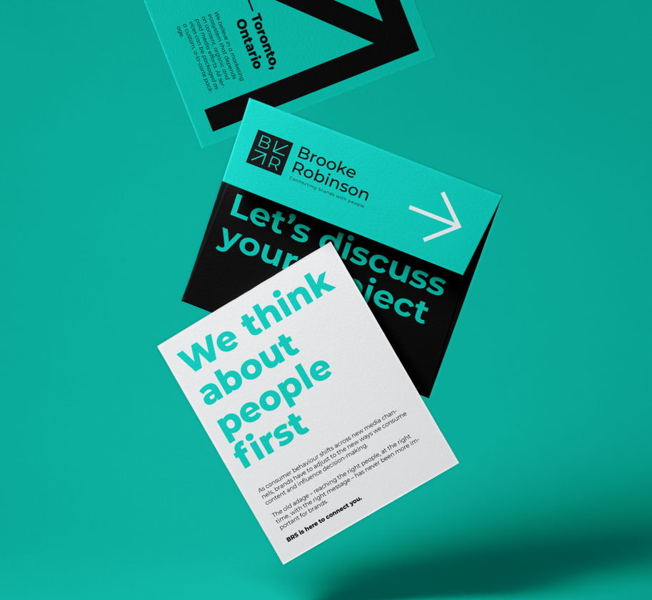
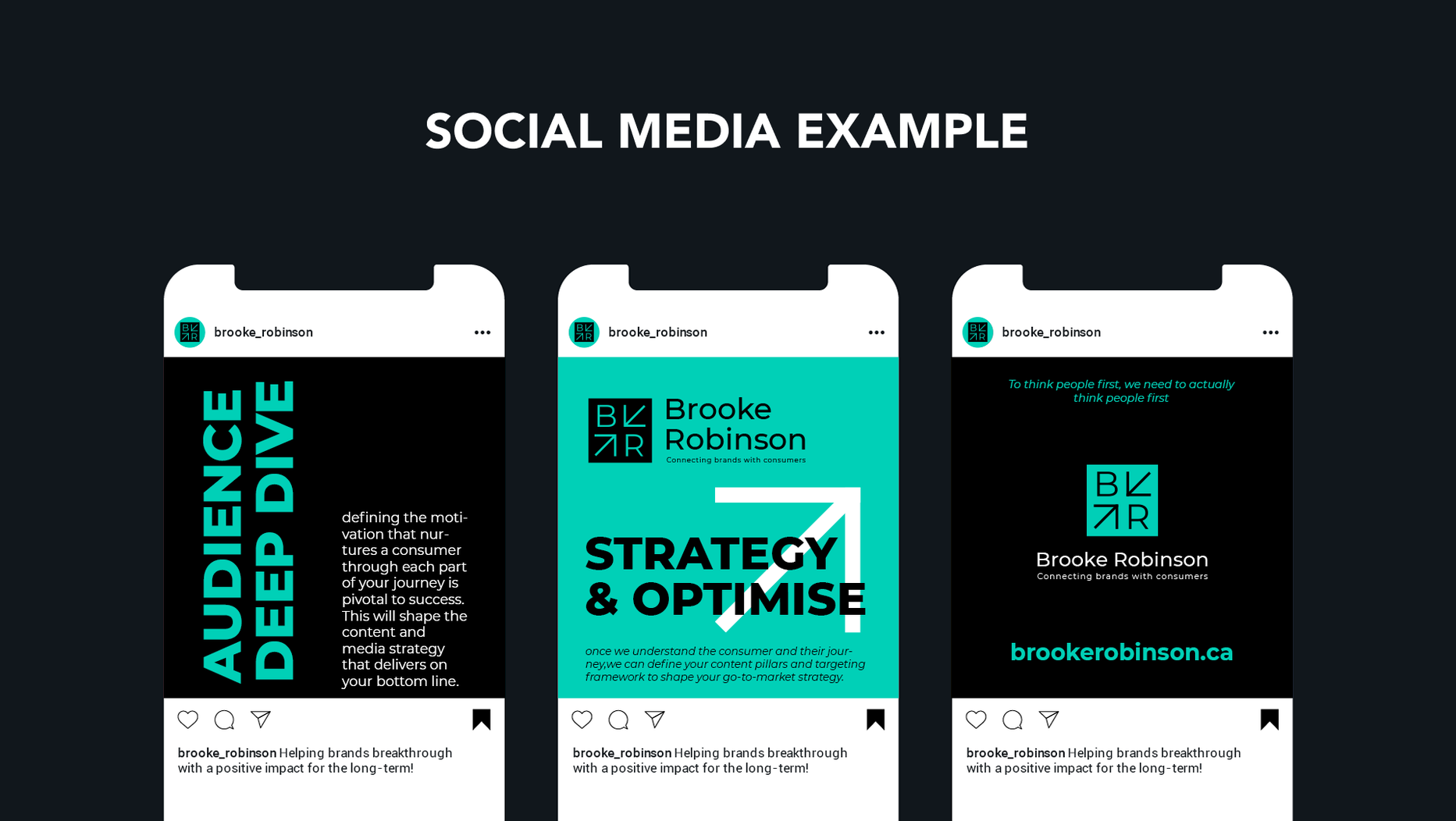
- We proposed three corporate style concepts and immediately agreed with the client on one of the options, namely the concept of "bright minimalism". The logo sign consists of two arrows and a pair of letters (B and R) in a square area, which create a harmonious composition. The logo symbolizes the support of brands and movement in the right direction - the success of business activities.
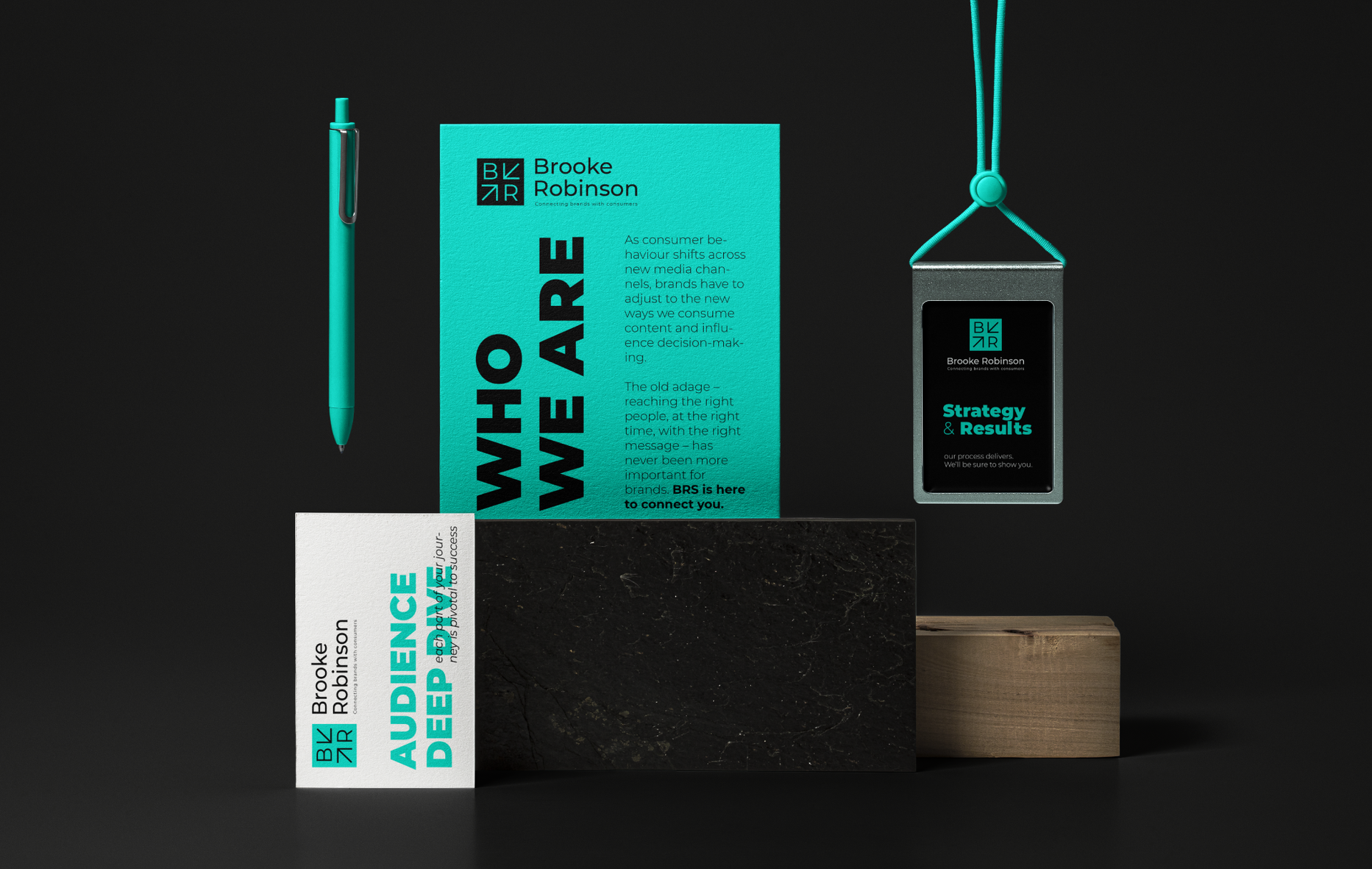
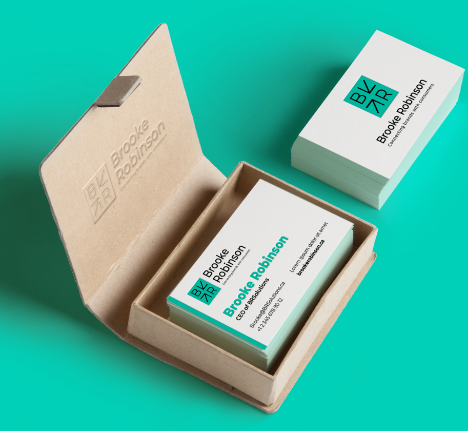
- The main colors of the logo are black and the color "Tiffany", which illustrate elegance and luxury. Laconic forms create the image of a large, serious company that is successfully operating on the market. The logo is memorable, has an authentic and stylish look.
Creating a landing page
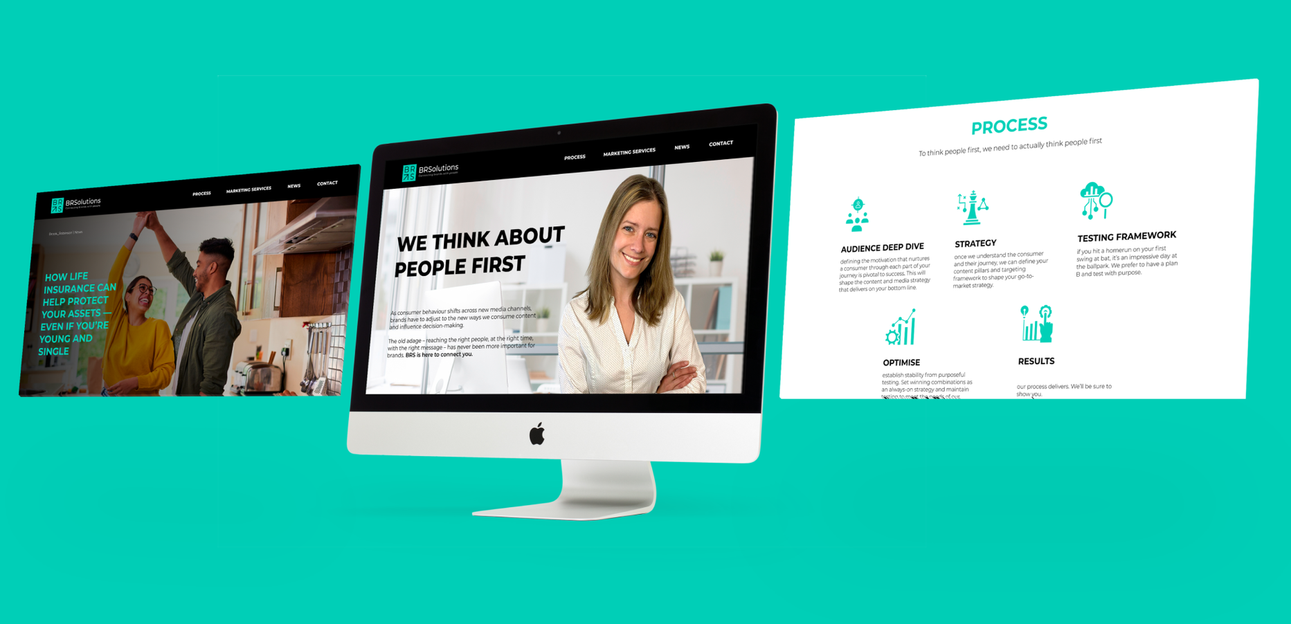
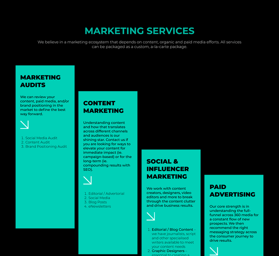
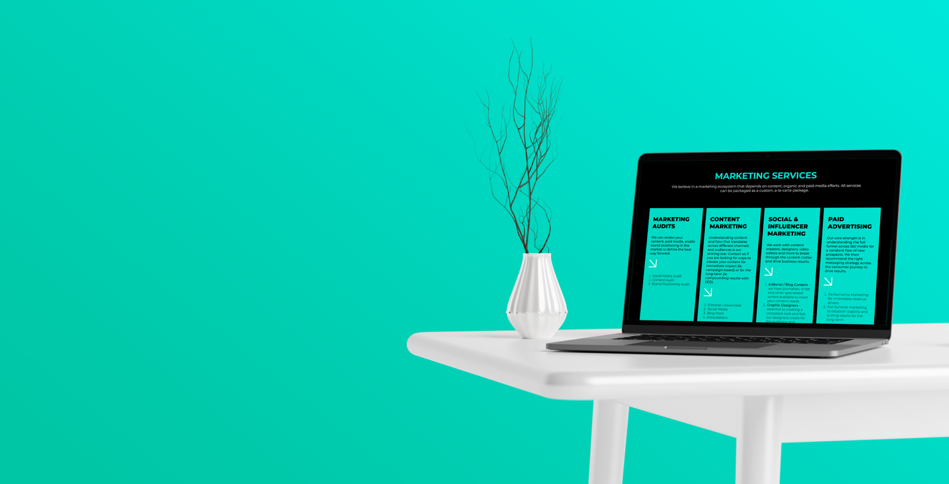
- The first stage of work on the landing was the development of a prototype. We have created several sections where the consumer can familiarize himself with the company's activities and services, useful blog articles and contacts.
- At the second stage, we developed a unique site design using a newly created color palette (white, black and Tiffany color). We also took into account the possibility of further promotion of the landing page and the convenience of its use from a smartphone. Landing "BR Solutions" reproduces the main values of the company and creates a positive marketing agency, increasing the competitiveness of the company.
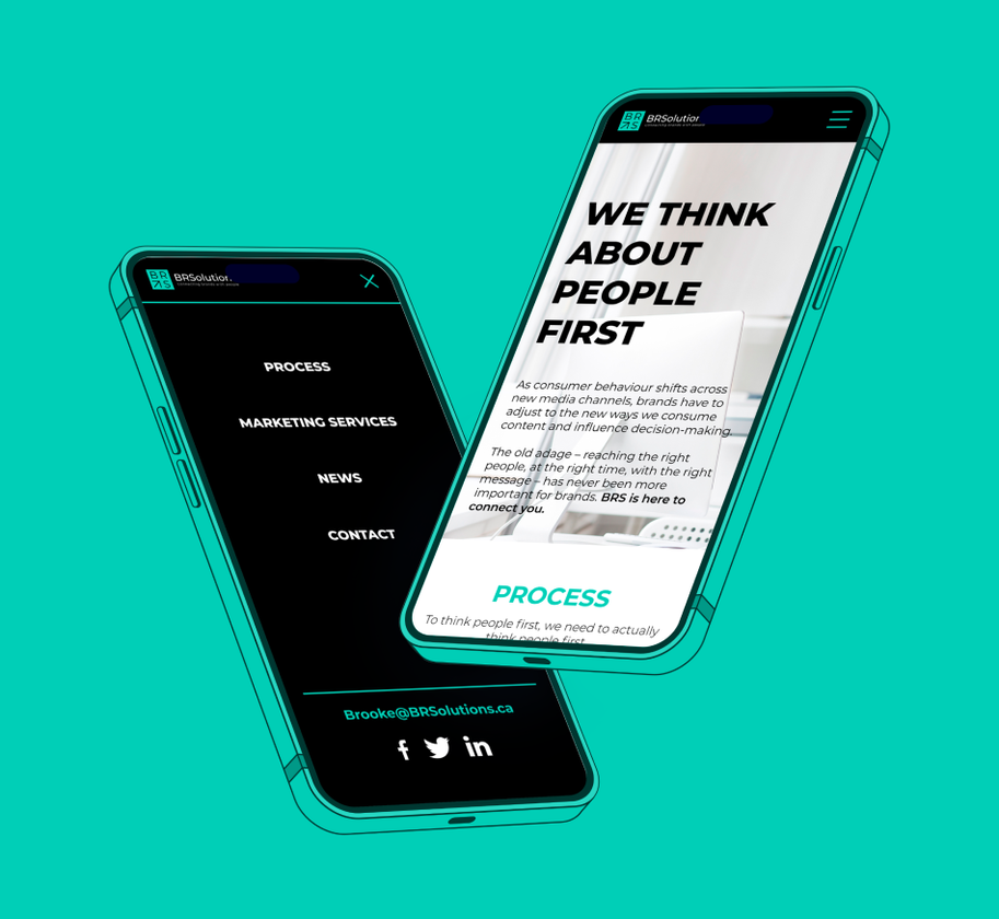
We have developed a logo that reflects values and conveys the main message of the company - to help businesses grow and progress. The elegant logo of the company "BR Solutions" is written in the style of minimalism.
The company's landing page was created based on the integrated approach of the Rubarb team. The beginnings of the development of a smart UX and stylish UI; The page is more adaptive, making sure that the site is interested in any kind of attachment for effective interaction with the audience.

 Russian
 Ukrainian
Add a comment
Fields are required *