Case: development of brand positioning, naming, logo and product packaging.
Client:

-
What is done:
- Development of brand positioning
- Naming
- Logo
- Product packaging
Task
Assistance in launching a new product - development of a logo, naming, brand positioning and product packaging.
The client needed to establish itself in the European and world markets as a manufacturer of luxury professional cosmetics for beauty shops, and establish itself as a manufacturer of cosmetics of high-quality raw materials with maximum use of natural ingredients and increase sales.
Initial analysis
Lamalior Company - a manufacturer of professional cosmetics for face and body care, has launched a new line of cosmetics for the European market.
Target audience
B2B for the European Union countries.
Brand positioning development.
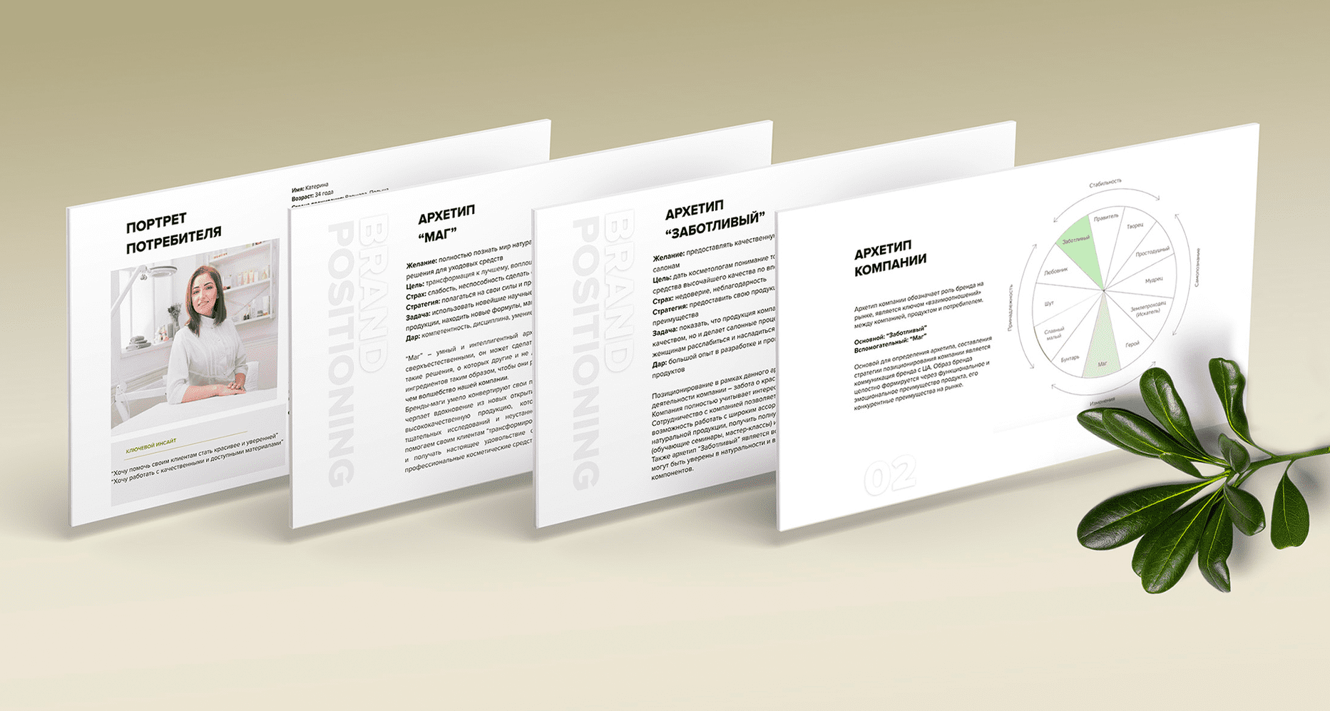
- The company has applied for the development of brand positioning for the European market.
- Our task was to show that the company's products not only differ in excellent quality, but also make beauty shop procedures very pleasant, helps women to relax and enjoy caring for their skin.
- Positioning expresses the basic motivation of the company - caring for the beauty of women and the convenience of cosmetologists. The company fully considers the interests of its customers, their desires and goals. Beauticians can be sure of the putity and high quality of products and its components.
Naming
- After writing positioning, we started the stage of developing naming. Based on the interests of Central Asia, we have developed several unique names for the brand.
- BREALE- from the English - be real. Meaning - BREALE makeup products help you discover the real, beautiful and unique. The name is modified in such a way as to be read softly and easily remembered.
- BESOLA - From Spanish beso - a kiss. The name is associated with something pleasant and soft, like a kiss. BESOLA prepares your skin for the hottest kisses. The name is easy to read, pleasant to pronounce.
- Outstanding and easy presentation distinguish the company in the market, create vibrant associations that meet the lifestyle, tone of communication of the target audience and brand.
Logo development
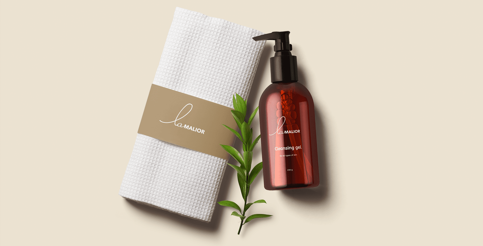

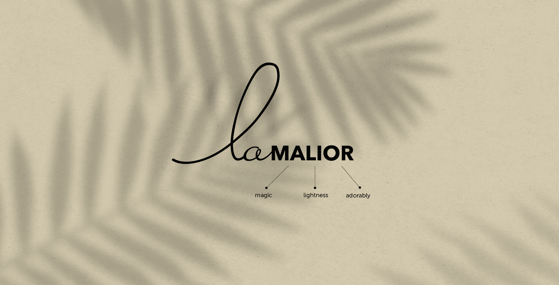
- The brand logo is font. The smooth line of the logo at the associative level declares femininity, and a strict font indicates the quality and safety of products.
- We developed a light and unobtrusive design, which, in conjunction with the tone of communication between the brand and the target audience, allowed us to interest the final consumer.
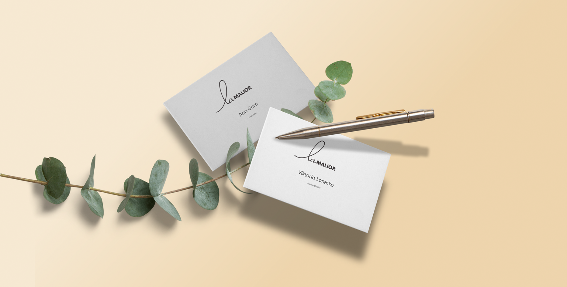
- Also we have provided a guide to using the logo along woth it, which presents options for use depending on the case and context.
Product packaging
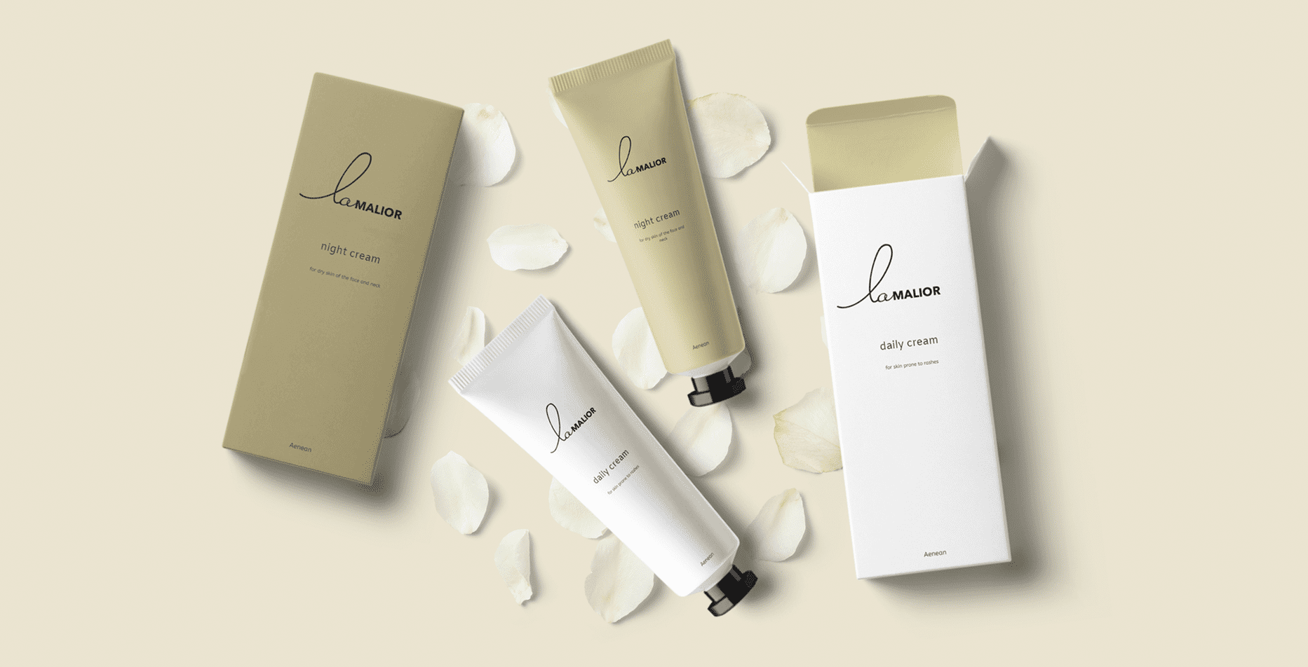
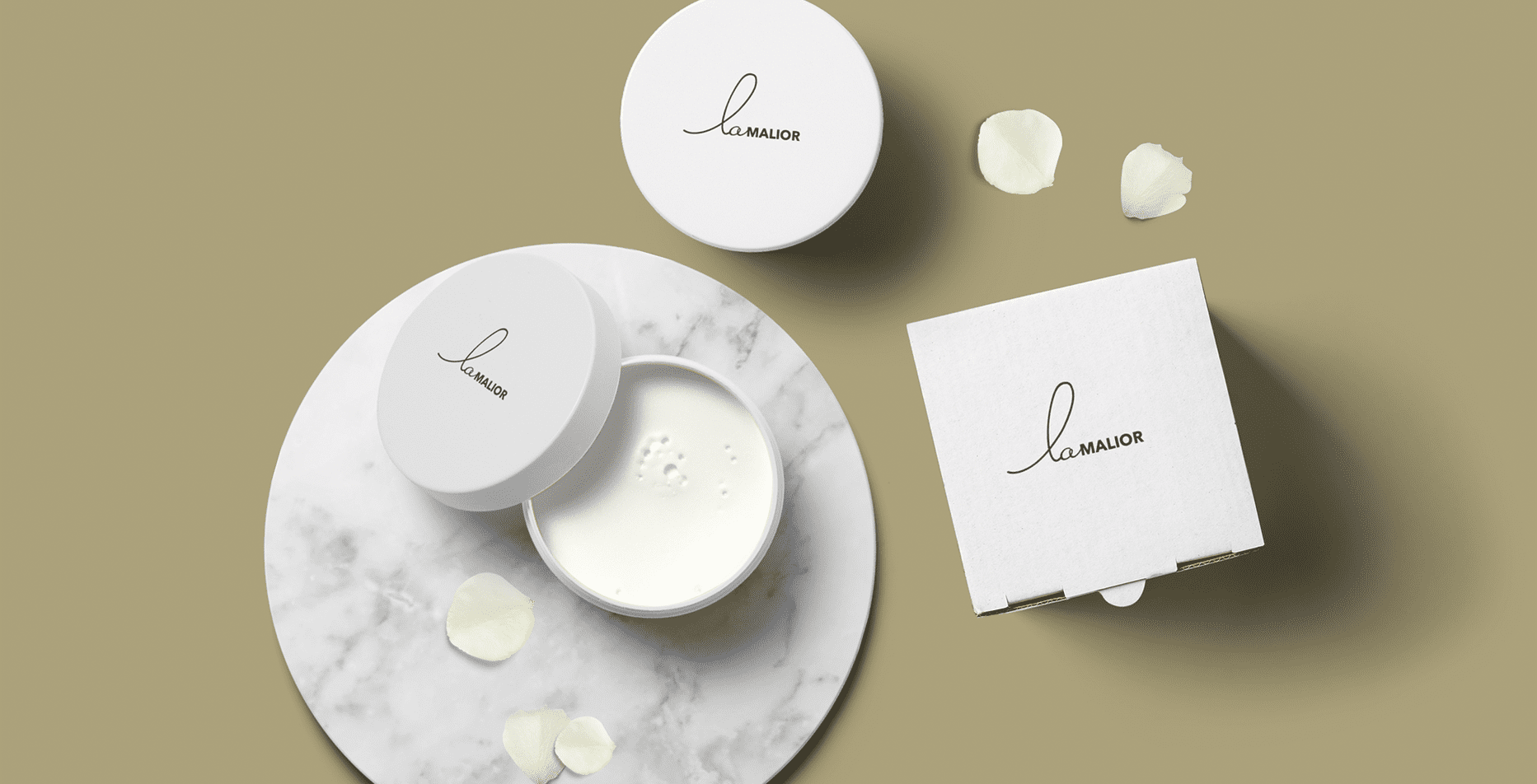
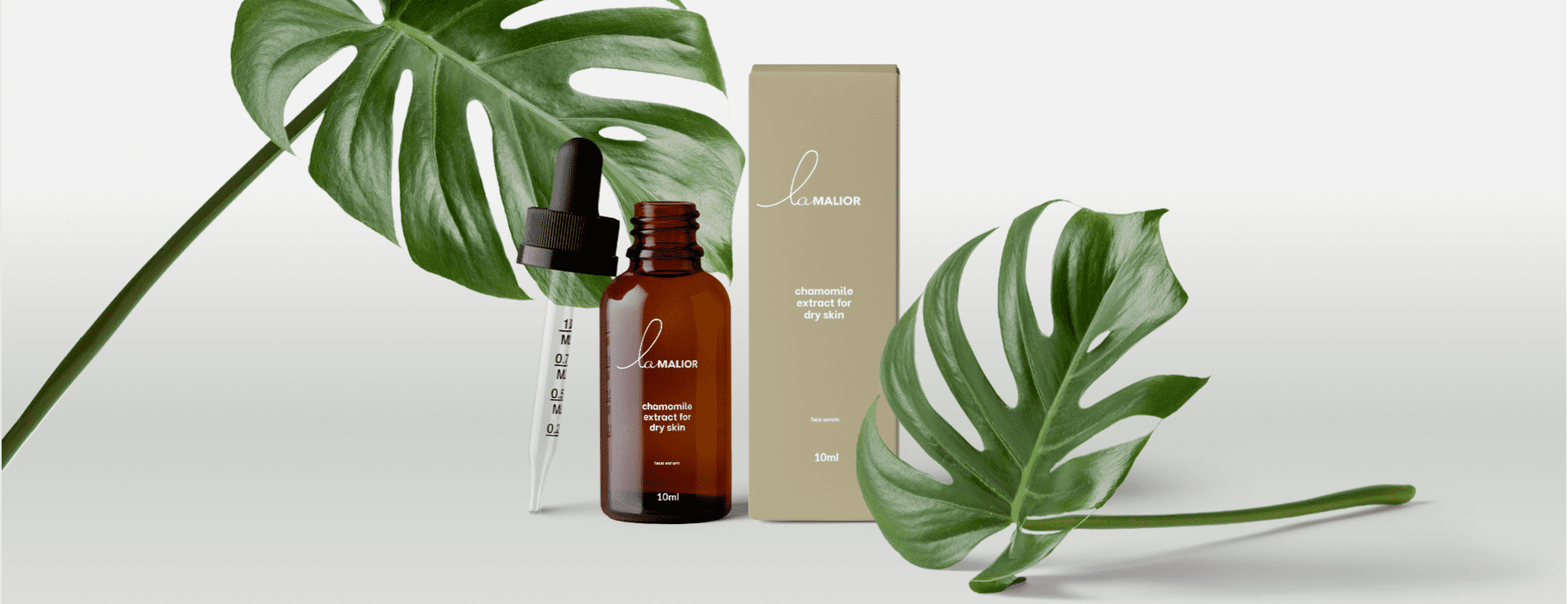
- We developed packaging for new products, which has a common concept for the line, and at the same time emphasized the individuality of each unit of products.
- Pastel colors were used to maximize the naturalness of the product and the safety of its use.

Project outcomes
An integrated approach allowed to create the correct brand positioning in the market and tools for interaction with Central Asia. Based on the analysis of the brand’s target audience, research on the competitive environment, determination of brand archetypes, a competent brand positioning has been developed with emphasis on the rational and emotional motives of Central Asia. Brand identification guide is also provided.
Interesting naming distinguishes the company from competitors, passes the necessary messages and causes the right associations.
The developed logo emphasizes the brand concept, focuses on product quality and customer care.
Beautiful and high-quality packaging of products competently presents the company, attracts the attention of the target audience, gains its trust, causes tender associations with nature, purity and safety

 Russian
 Ukrainian


Add a comment
Fields are required *