Case: corporate identity development, logo rebranding, website for So Beauty
Client:
-
What is done:
- Development of corporate identity
- Logo rebranding
- Website
OBJECTIVE
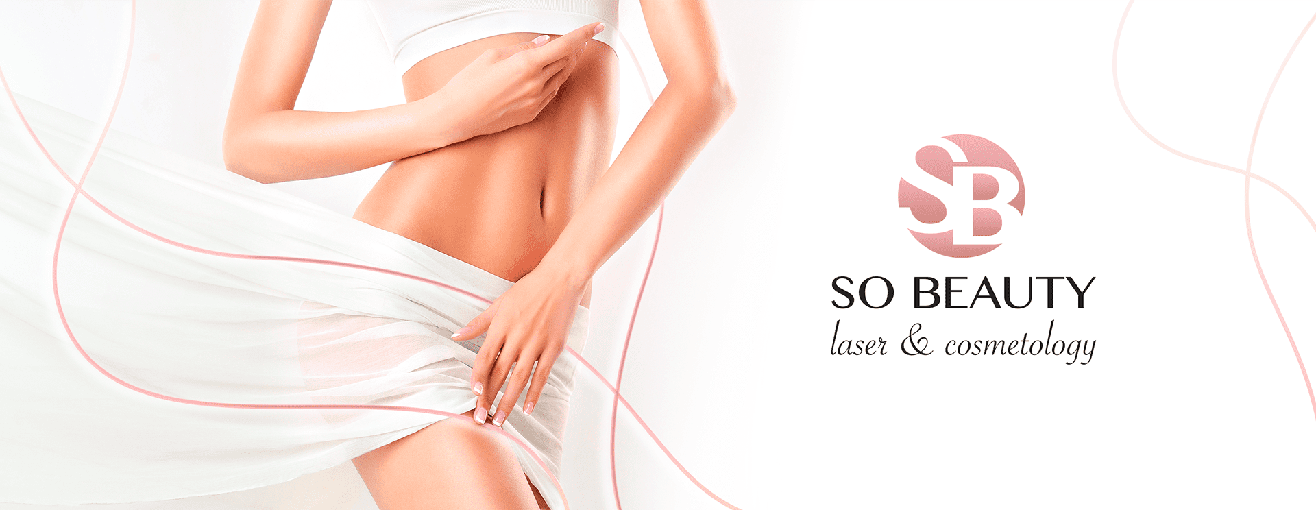
To develop clear for the target audience corporate identity.
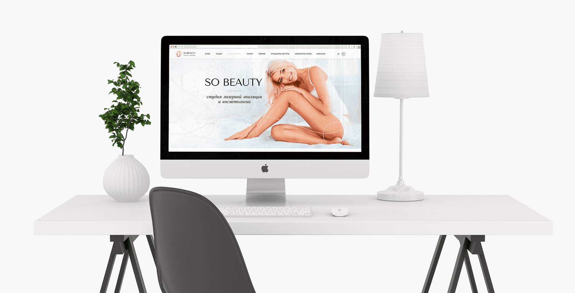
To create a youthful, concise, and user-friendly website design. To boost customer appeals through the site.
PRELIMINARY ANALYSIS
Our customer is engaged in laser hair removal and cosmetology.
After examining the product, competitors, and the needs of the target audience, we concluded that the success of the company will depend on branding that will correctly represent the company in the services market.
TARGET AUDIENCE
20-34 years old women
Logo rebranding
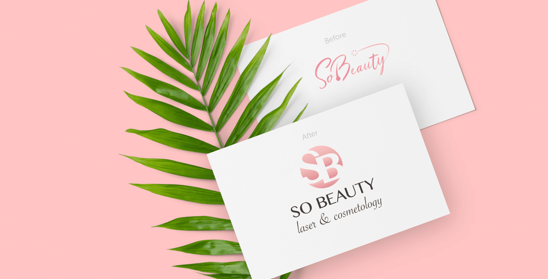
- The brand logo is combined. It contains a graphical and textual component.
- The color scheme and logo design associatively declare femininity, indicates the quality and safety of procedures.
- Simple and unobtrusive design, in conjunction with the tone, attracts attention and is easily perceived by the target audience.
- The logo is accompanied by a guide for the use, which presents options for its appliance depending on situations and context.
Corporate identity development
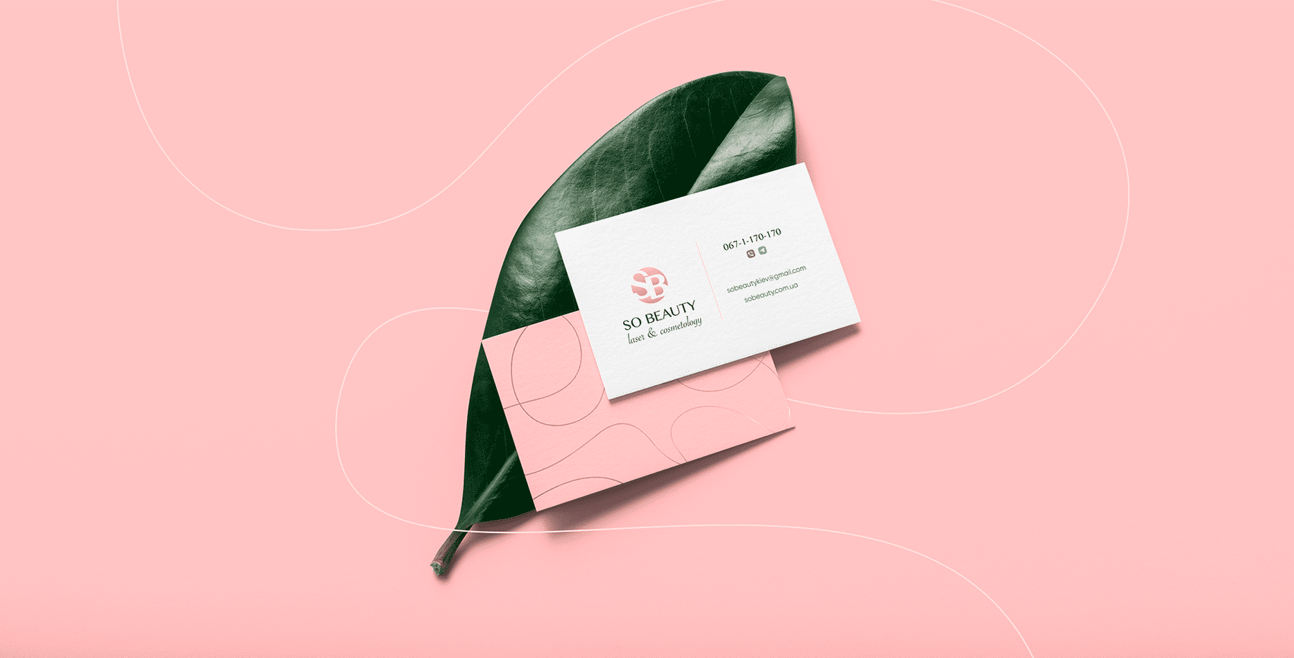
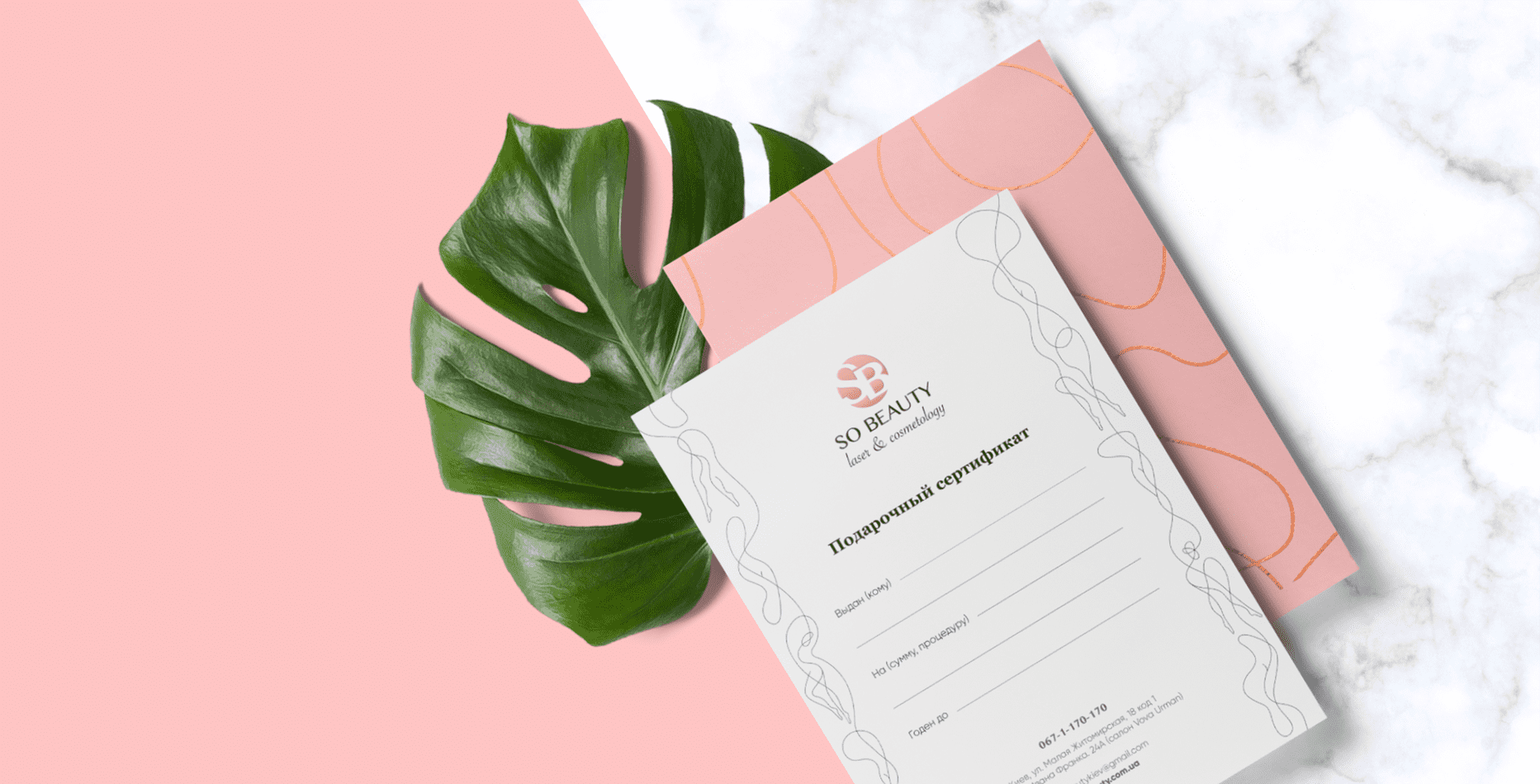
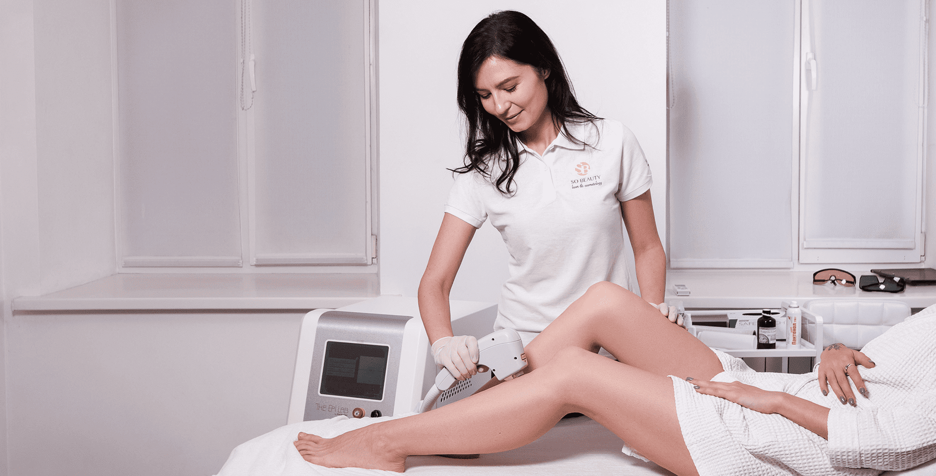
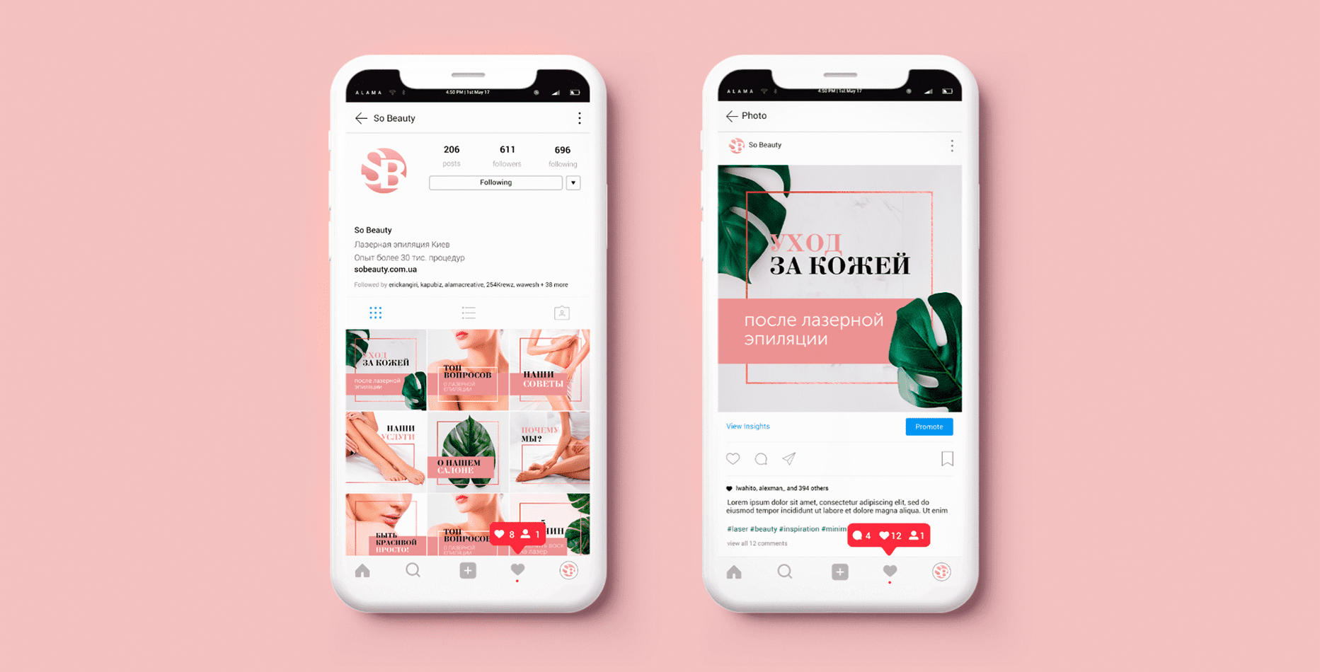
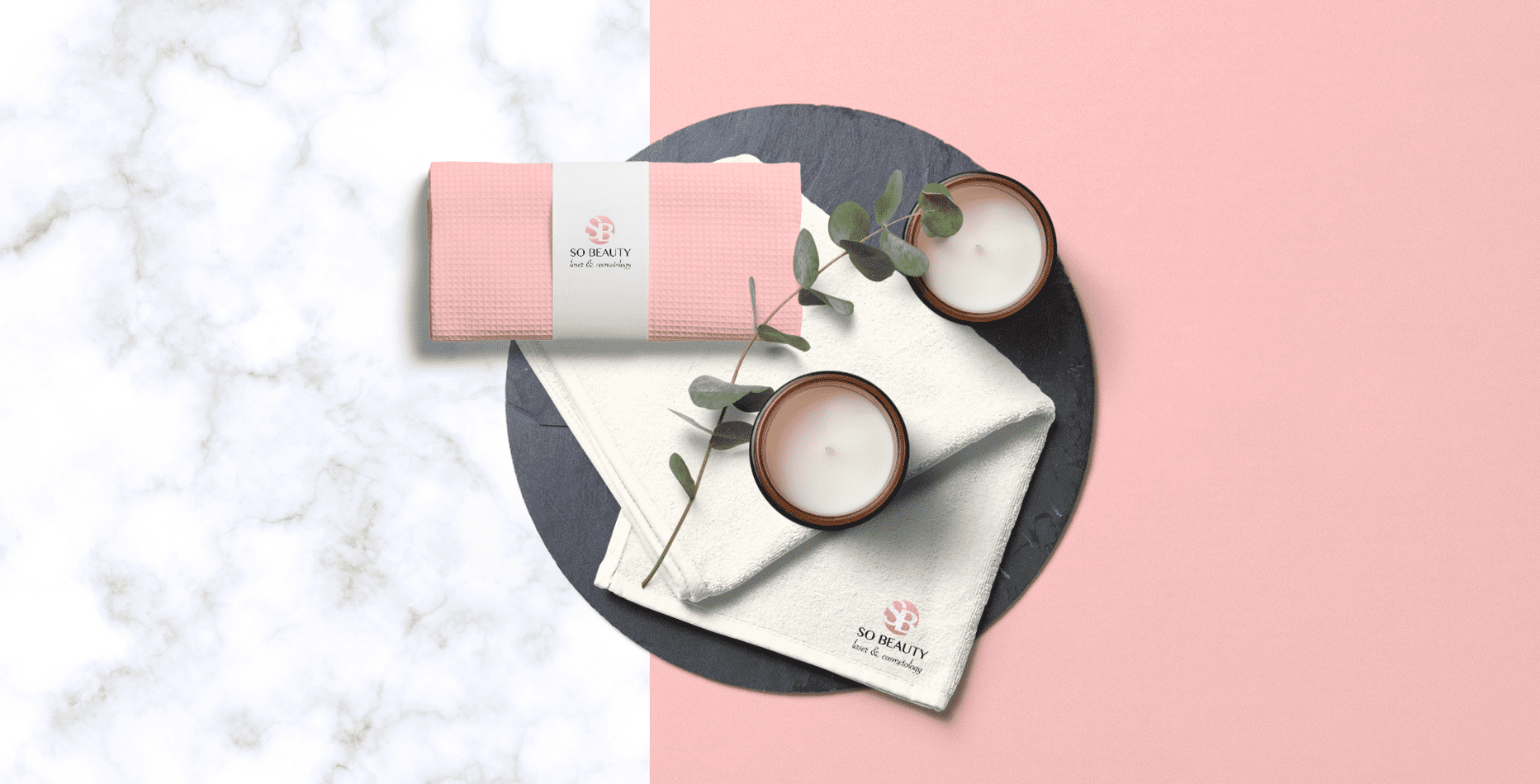
- For the full-fledged promotion of the company, we have developed a corporate style that is aimed at its target audience. Branded elements made in delicate pastel colors using graphics draw attention and inspire the trust of potential customers.
- Positioning expresses the basic motivation of the studio — caring for the beauty of women, the convenience and safety of procedures.
- It was important for us to show that the studio not only uses exclusively high-quality and modern equipment but also makes salon procedures very pleasant, helps women relax and enjoy caring for their skin.
Website development

PROJECT RESULTS
We managed to cope with the task:
The developed logo helps to distinguish the company from competitors, displays its activities, focuses on the quality of procedures and caring of clients.
Proper positioning made it possible to create a friendly and youthful image of the studio.
The site has become part of the brand image and performs its function. The client has increased the number of applications through the site.

 Russian
 Ukrainian
Add a comment
Fields are required *