Case: logo creation, booklet, positioning and rebranding for the company Bioresources
Client:
-
What is done:
- Positioning
- Logo
- Rebranding
- Brochure

TASK
The company "Bio Resources" is a constantly growing and developing company that has already earned prestige in the market and therefore needed rebranding. It was necessary to develop a logotype, a brandbook and some promotional materials.
INITIAL ANALYSIS
After analyzing the company and its activities, the first thing we had to do was to work out its positioning in the market in order to move in the right direction in the process of logo development and rebranding.
TARGET AUDIENCE
B2B, cheese, meat and dairy, confectionery manufacturers
Company positioning
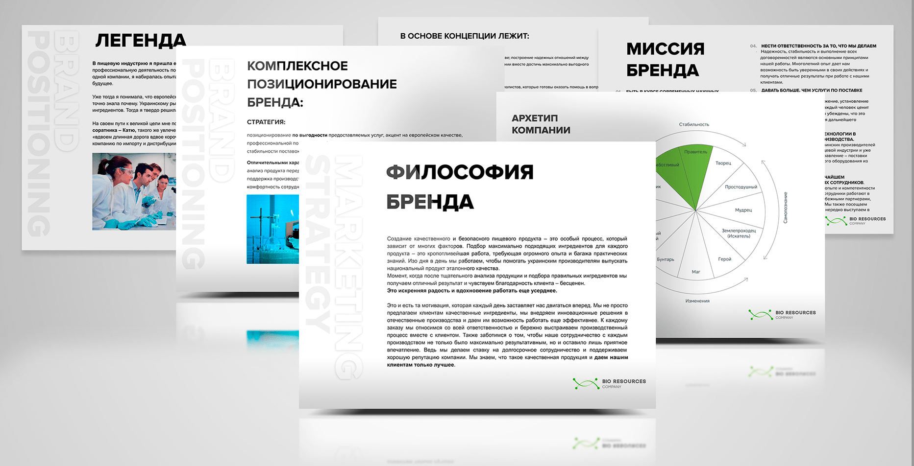
- Positioning the company "Bio Resources" was developed in the following areas:
- - archetype of the brand
- - portrait of the target audience
- - legend of the brand
- - comprehensive brand positioning
- - mission and brand philosophy
- - effective promotion channels
Logo development
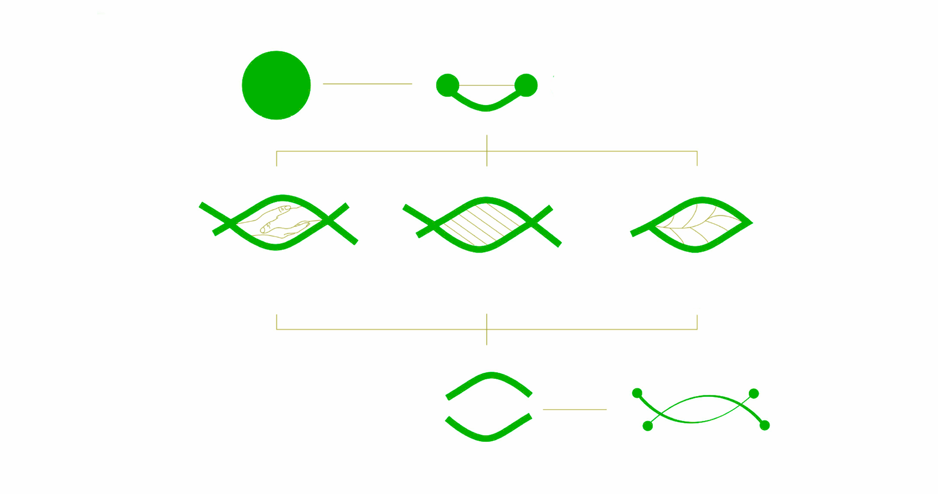
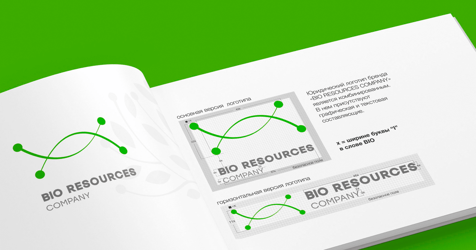

- 3 different concepts of the logotype were suggested. The chosen concepts were presented in several variations. The main color is green, as associated with nature, tranquility and reliability.
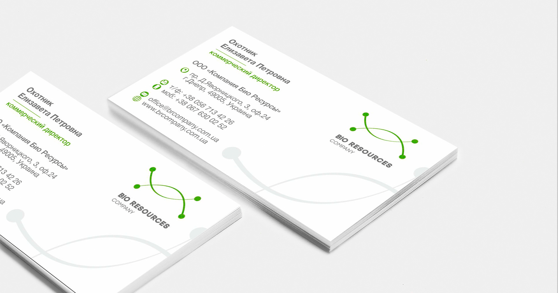
- Selected logo conveys a lot of meanings:
- - circles symbolize the molecules and their compounds
- - soft curved lines symbolize growth and nature
- - the logo itself reminds the structure of DNA and a green leaf at the same time
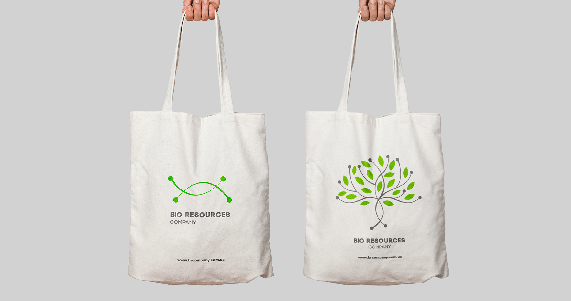
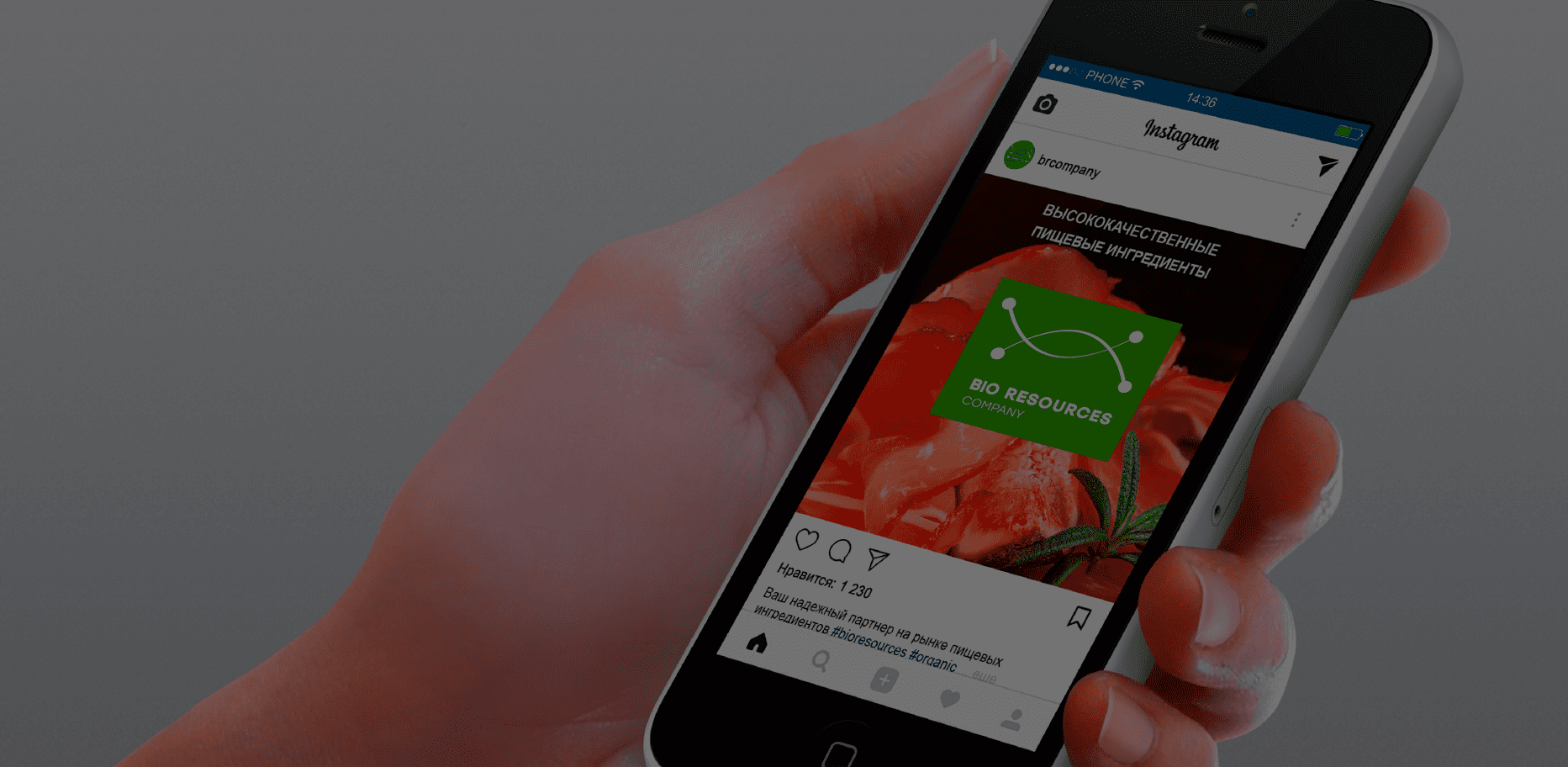
- Also we presented the options for using the logo on the website, in social networks, on souvenirs and printed materials.
Rebranding
- We developed a manual on visual identification of the brand.
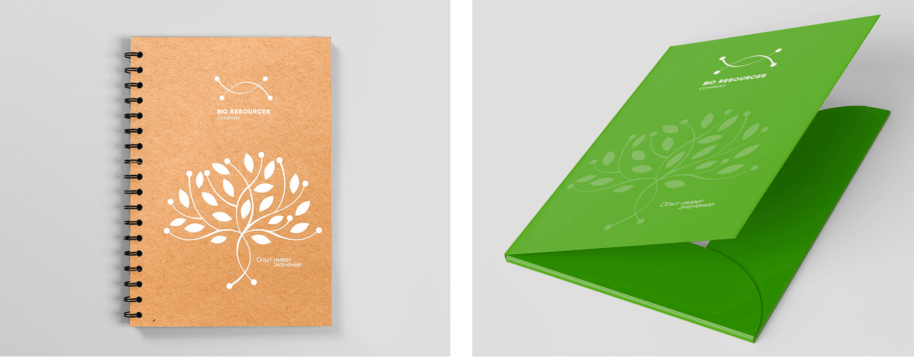
- The Main part of the brand book includes the logo in the horizontal and vertical versions, recommended and prohibited use, corporate colors and fonts, corporate graphics.
- The Printing Products section presents style guides for business cards, letterheads, folders, notepads, note papers etc.
- The Souvenirs section provides recommendations for the manufacture of pens, pencils, company labels, paper and plastic bags, eco bags, cups.
Creating an advertising brochure
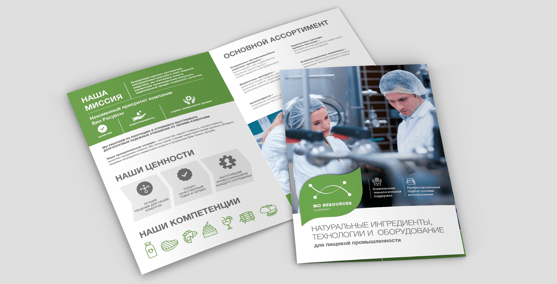
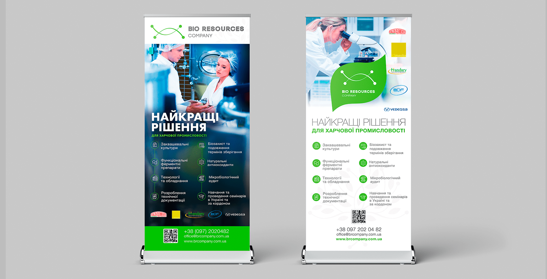
- Brochure is a short presentation of the company and its services.
- In a concise form we presented the main work directions of the company, a brief description of the company itself, its mission, philosophy and aspirations. We highlighted the quality of products, high level of service and the benefits of cooperation with a team of professionals in the field of food ingredients.
PROJECT OUTCOMES
Логотип, разработанный для компании "Биоресурсы", отображает ее деятельность и вызывает у аудитории правильные ассоциации с природой и надежностью.
Детально проработанное позиционирование и пособие по визуальной идентификации бренда дали возможность создать правильный образ компании – натуральной, надежной и современной.
Красивая и качественная рекламная продукция с грамотной презентацией компании привлекает внимание целевой аудитории и завоевывает ее доверие.

 Russian
 Ukrainian
Add a comment
Fields are required *