Rebranding of the agricultural company “Agrokhim-Partner”: communication strategy, logo, pattern, corporate style, and website
Client:

-
What is done:
- communication strategy
- logo
- pattern
- corporate style
- website
Client
"Agrokhim-Partner" is a company that has been working in the Ukrainian agricultural market for more than 12 years.
The brand provides farmers with professional support in implementing technological solutions that reduce the negative impact on the environment and increase the productivity of farms.
"Agrochem-Partner" helps Ukrainian agribusinesses develop their enterprises and obtain maximum results.
Task
The main goal is to increase recognition and strengthen the reputation of the brand with 12 years of experience in the Ukrainian market. It was pivotal to preserve and reproduce the company's traditional values as well as apply modern marketing tools for effective communication with the audience.
To fulfill the task, it was necessary to conduct the target audience analysis, research the modern agricultural market, and develop a new brand positioning with a communication strategy. When the Rubarb team had worked through this part, we realized that the company's corporate identity didn't correspond to the new positioning and needed rebranding. For rebranding, it was necessary to update the logo, develop the corporate style, and a new website for the company "Agrokhim-Partner".
Strategic Session
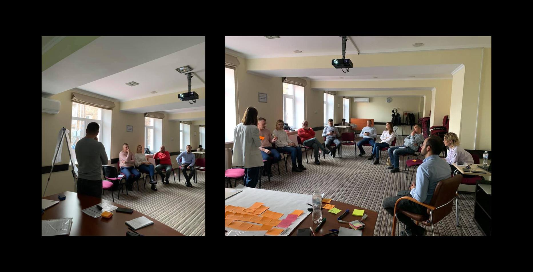
- The company had a powerful goal - to create a brand communicating with farmers; a community that will cultivate the necessary values and have a common vision of the Ukrainian farmersʼ future. "Our goal is to unite people who understand the importance of creating a strategy in agribusiness, not just tactics", - "Agrokhim-Partner" company's headship.
- To implement this purpose, we held a two-day strategic session with our client. In order to form the right values for the future brand community, it was necessary to start from the inside: to understand the company's philosophy and to receive open feedback from the entire team of “Agrokhim-Partner”.
- Over the course of two days, together with the "Agrokhim-Partner" team, we developed the brand's new values and mission, as well as worked out the positioning. The main idea of the strategy is to promote real human values. We had to create not only a community for farmers but also for their families - as this will be an even greater impetus for the development of Ukrainian agribusiness.
Positioning and communication strategy
- The main goals: conduct a market analysis and outline the consumer's portrait; define the archetype of the brand; develop an updated positioning; formulate the company's philosophy and tone of voice; choose communication channels.
- The company combines all the strongest characteristics of the "Caregiver", "Magician", "Hero", “Creator”, and "Explorer" archetypes.
- All these features are embedded in the internal work of the "Agrokhim-Partner" team and are manifested in their attitude towards customers receiving professional support 24/7.
- The Rubarb team has also developed 4 creative communication ideas. Together with the client, we decided to implement all the concepts one by one.
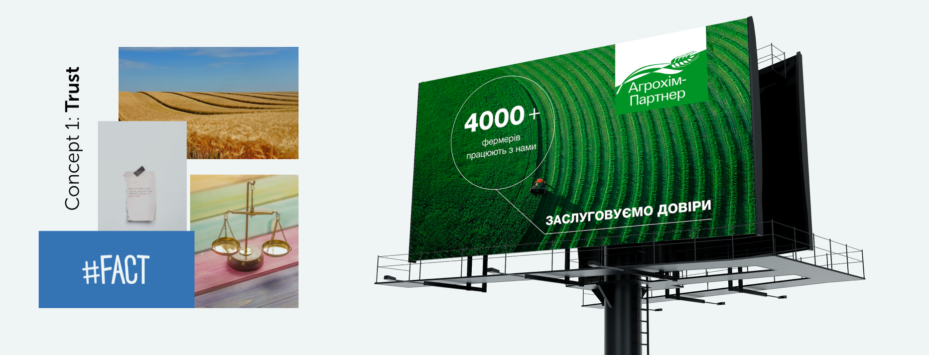
Concept 1: Trust
- As long as the brand's target audience is quite conservative, understanding their pains and behavior, we decided to show why it's worth trusting the “Agrokhim-Partner" company through the visualization of real facts in numbers.
Concept 2: “Win-win”
- We put the farmer first and demonstrate the brand as a reliable partner for effective cooperation.

Concept 3: Wealth
- Any business is about making money, and farming is no exception. In this concept, we convey to the client that cooperation with “Agrokhim-Partner" is always about the result.

Concept 4: Partnership
- The meaning of this concept lies in the fact that this brand is a lifeline helping in difficult moments and suggesting how to improve the farmer's business and make it successful.

Logo
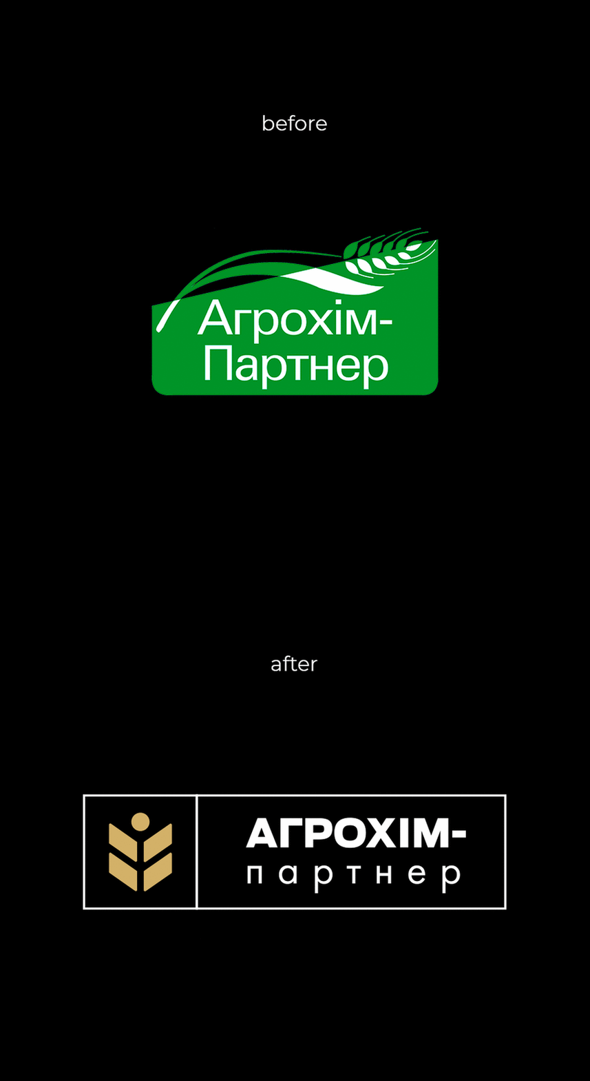
- Creating new positioning, we came to the conclusion that “Agrokhim-Partner" needs rebranding, and the start-point was updating the logo.
- Since the company has a rather traditional positioning and values, we had to demonstrate all this in the new logotype. The main idea of the sign is the ear of wheat as a direct association with the agricultural sector.
- However, during the work, our team rethought this symbol and made it in a style of minimalism: the image of the wheat ear is still identified with the agrosphere but has a modern look. As a result, we have modernized the traditions, and the new logo fully corresponds to the new brand positioning on the market.
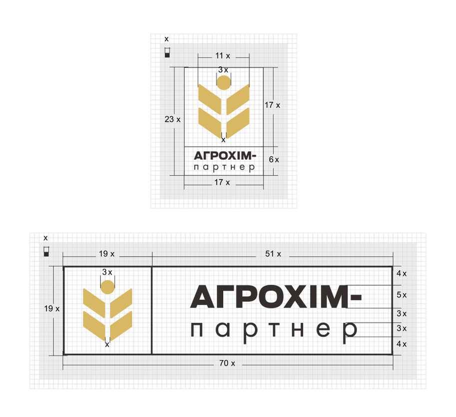
- The corporate colors are black, white, and “rich gold”, where the golden shade symbolizes the high yield and profits of the company's customers, and the black and white colors favorably emphasize it.
Pattern and corporate style
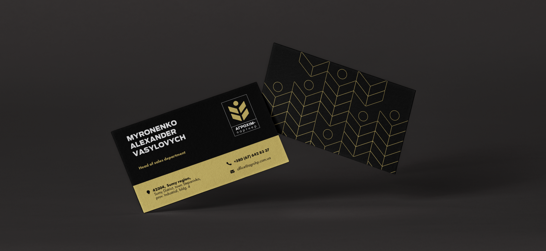
- The next rebranding stage is the identity and pattern development. The pattern is based on the image of a wheat ear used in the logo.
- Idea: Visualize the images related to crops and fields. Bright spaces between the blocks add rhythm to the composition.
- The feature of the pattern consists of two variants of its use: basic (with filling) and linear. In addition, it can be used with a variety of backgrounds and colors, which allows the client to expand the design possibilities for creating a corporate style.
- After that, we developed an identity and selected company colors and symbols that most accurately reflect the brand image.

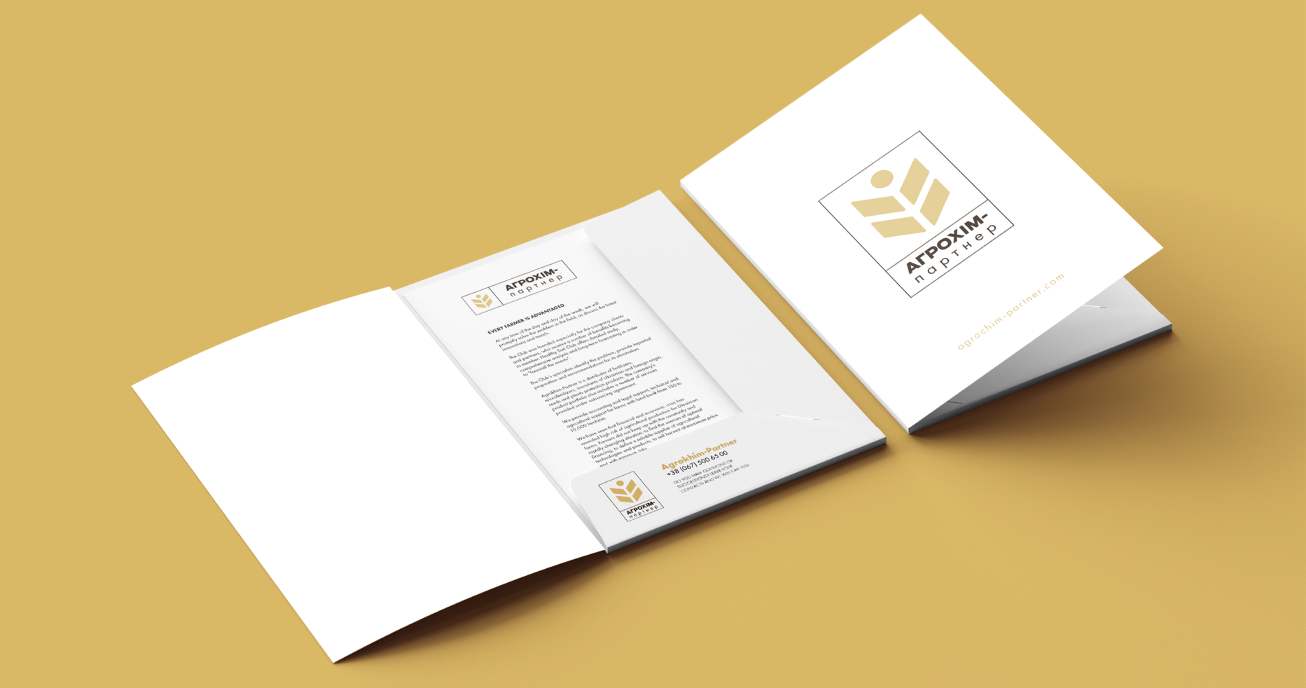
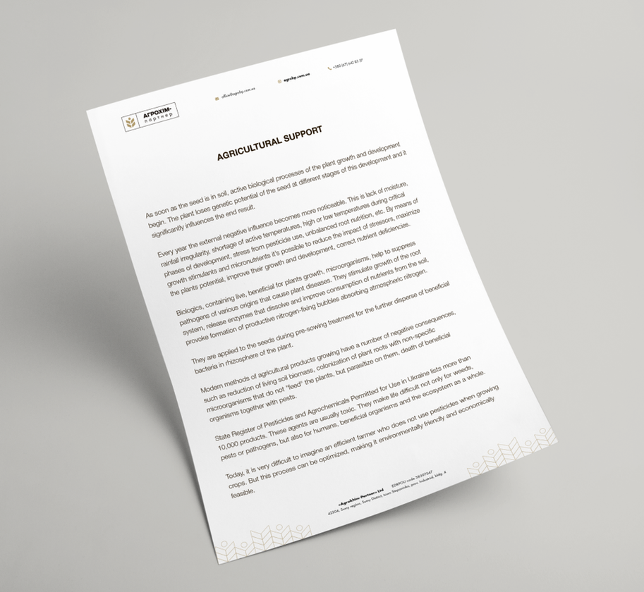


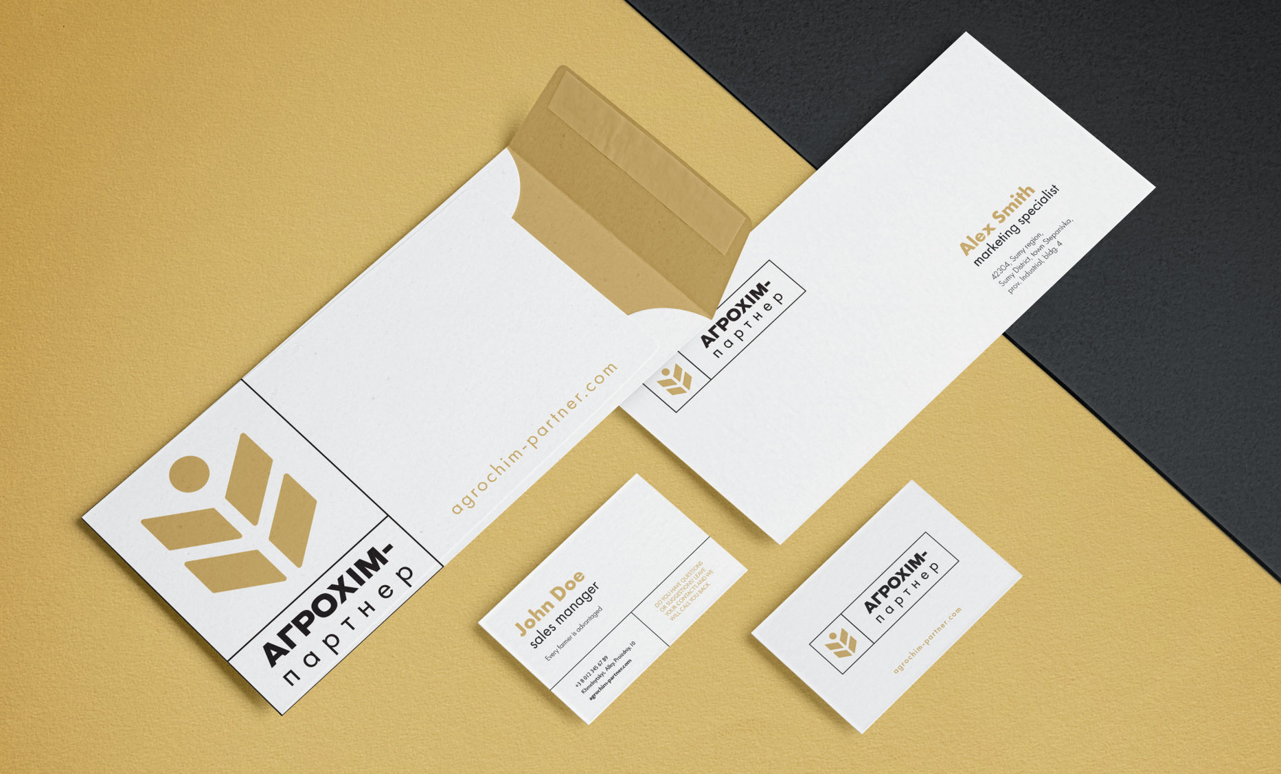
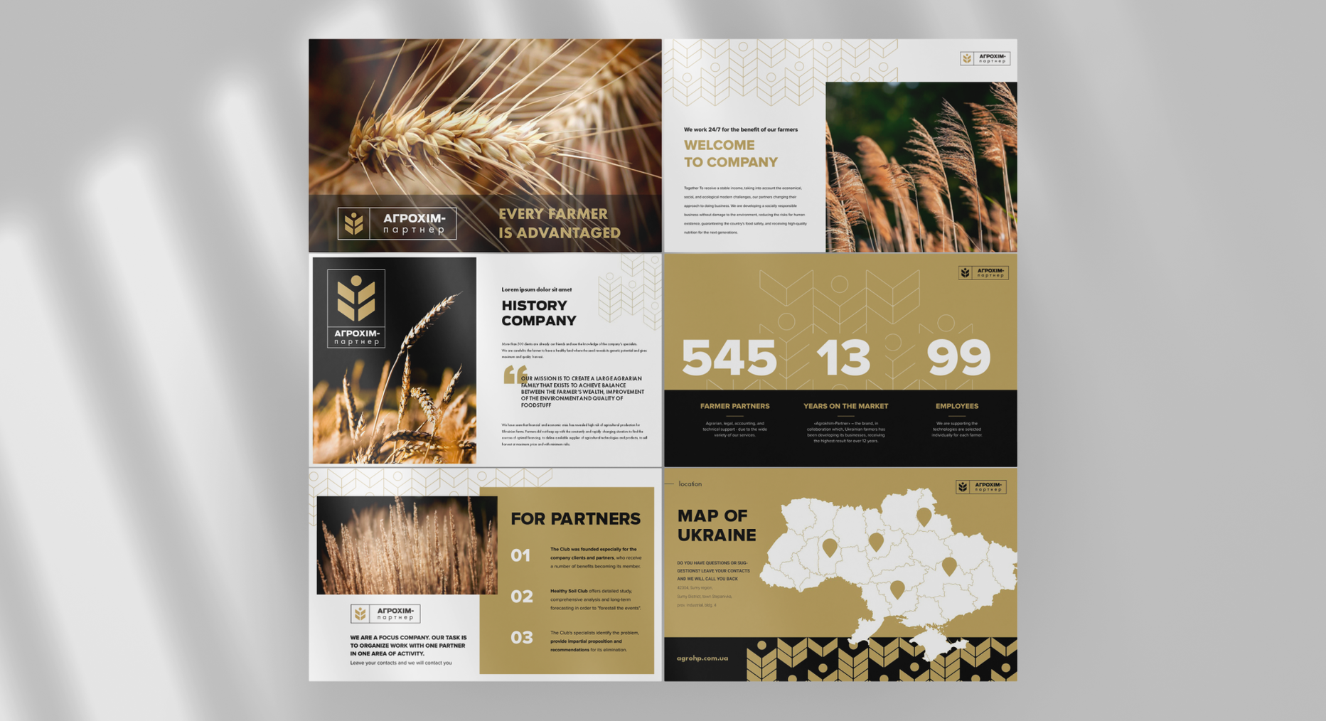
Presentation matherials for sales

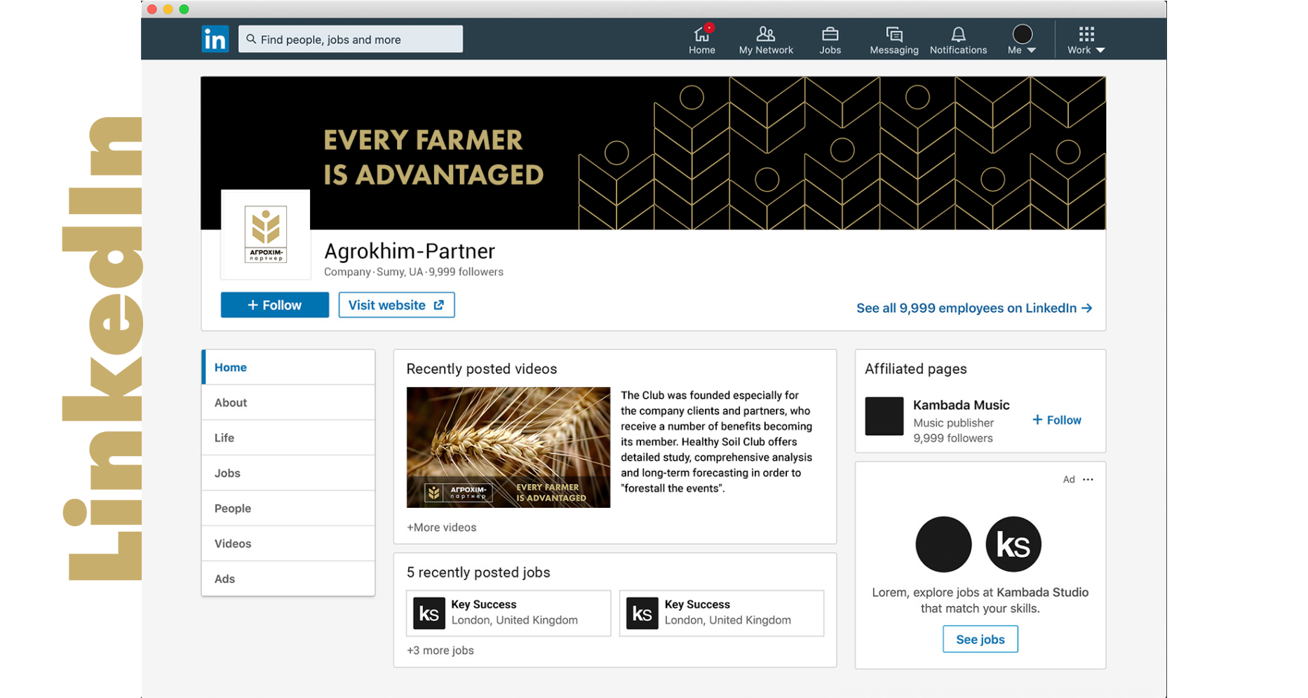
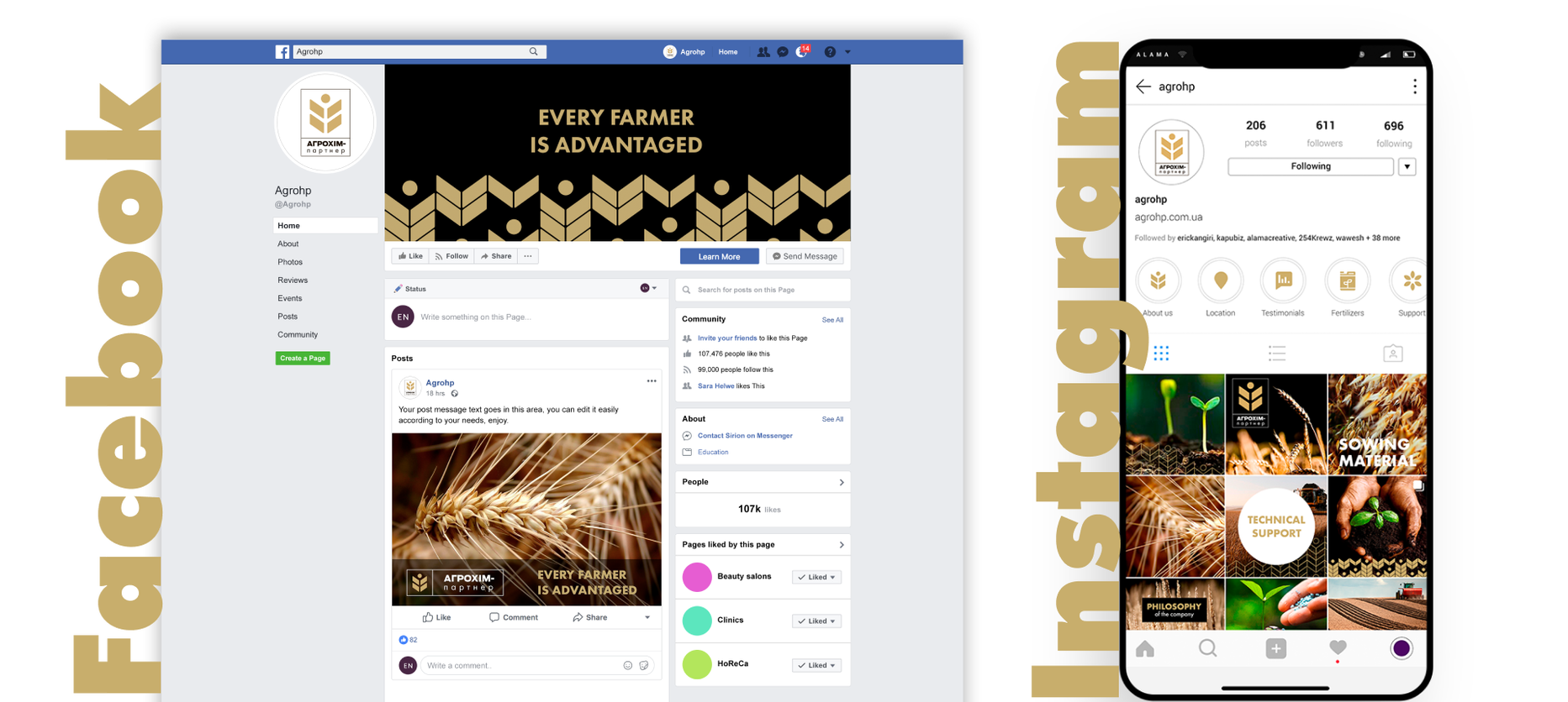
Social media cover development
Corporate website development
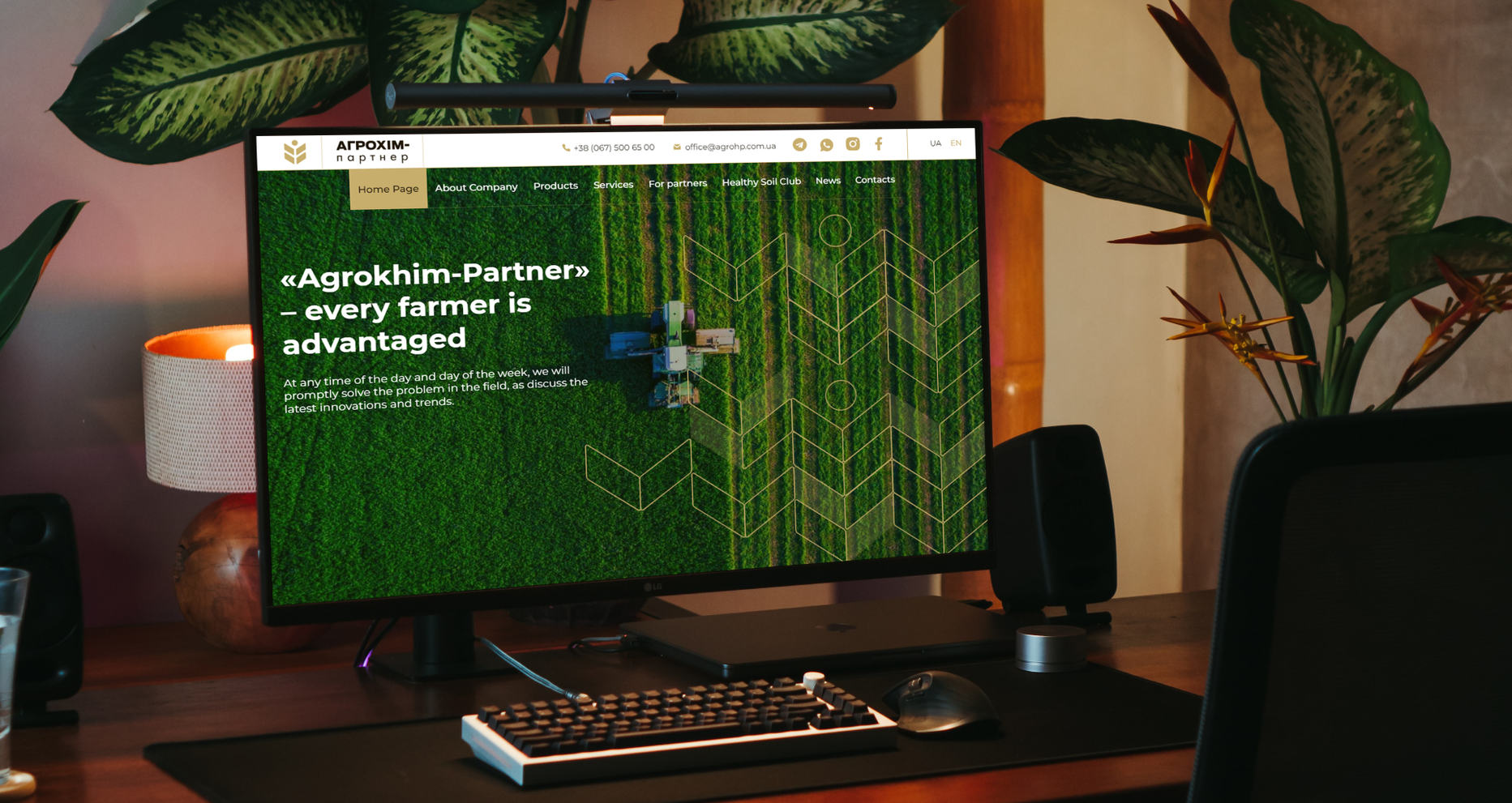
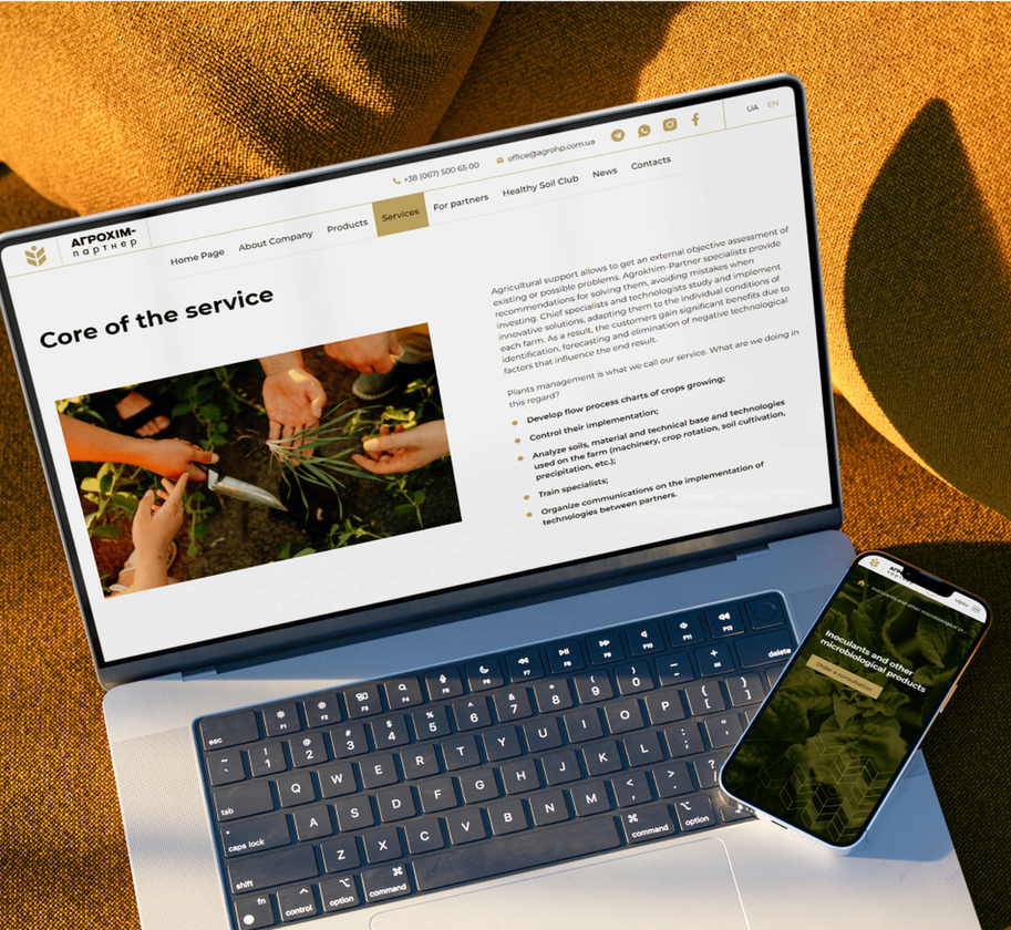
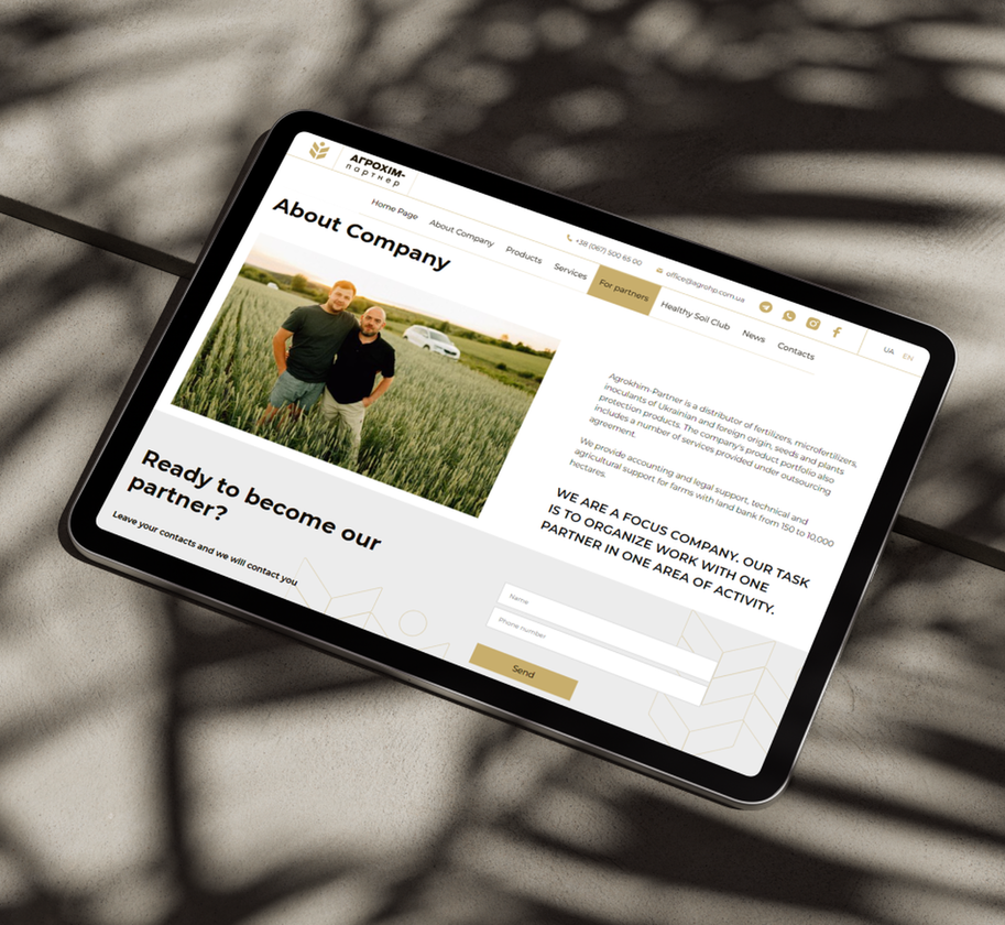
- One more rebranding milestone is the creation of a new brand website. It was pivotal to convey the main message of the company - a caring approach to working with customers as well as to reveal the brand value - its desire to develop the Ukrainian socially responsible agricultural market, without harming the environment.
- We worked out the structure of the site in detail, so that it was intuitive and easy to use, created a modern and minimalist design that stands out from among agribusiness competitors and completely reproduces the philosophy of the brand. Our team also created a mood board and selected references for live shooting, to make all website content uniform conveying the main values of the “Agrokhim-Partner" company - sincerity and openness.
Case in life
- Here's the review: You can see the results of our cooperation with "Agrokhim-Partner" on the company's new website and on the brand's social media.

Project Results
We have created the image of a brand that is a leading player in the agricultural sector, is distinguished by its positioning in the market, and is recognized by its corporate style. Thanks to Rubarb's comprehensive market analysis, "Agrokhim-Partner" uses the right communication channels with their audience.
Despite the fact that part of this project fell at the beginning of the war in Ukraine, we could successfully complete all the work. Today, the brand successfully operates in the Ukrainian agricultural market, introducing effective solutions for the farmer's enterprises.

 Russian
 Ukrainian

Add a comment
Fields are required *