Marketing research, branding & website development for transfer company Arkway
Client:

-
What is done:
- Naming
- Logo
- Site
Client
Arkway is a Czech company providing transportation and transfer services within the Czech Republic and the EU.
Task
Main objectives: to analyze the market and determine the target audience; define brand archetype; develop complex positioning; formulate the legend and philosophy of the company; choose communication channels
Solution
First of all, marketing specialists did a SWOT analysis and researched competitors. The Rubarb team analyzed the user experience and segmented the transfer and transportation market. As a result, we got a clear portrait of the potential consumer of the company, taking into account geographic and demographic indicators.
Naming
- The name of the company is what creates the image of the brand. Naming should carry the right message to the consumer, evoke associations. The main task was to create a brand name that would create the right associations for the client, namely: it is easy to remember, sounds good, speaks of belonging to the company's field of activity, does not have negative connotations, stands out in the market, is short and legally clear.
- We offered 7 unique brand name options, taking into account all modern naming standards. When creating a name, we used a variety of approaches: the use of abbreviations, alliteration and rhyming techniques, combinations of words of various origins, and also created a neologism. For further use and scaling of the brand, we have selected most of the names in English (and one in Czech), as the ambitious company Arkway plans to expand in the future.
- Insight: modern naming trends - simplicity and conciseness. That is why leading companies choose names consisting of one or two words.
- As a result, the client chose the name "Arkway", a neologism consisting of the words "ark" - the ark as a mythical image of the car, and "way" - the way. “Arkway” is exactly what is easy to remember and corresponds to the main concept of the brand.
Logo
- A logo is a visual representation of brand positioning, which contains the meanings, values and features of the company in order to evoke the right associations in the client and build a holistic brand image. The logo is a key element in branding as it allows customers to recognize the company and differentiate it from competitors.
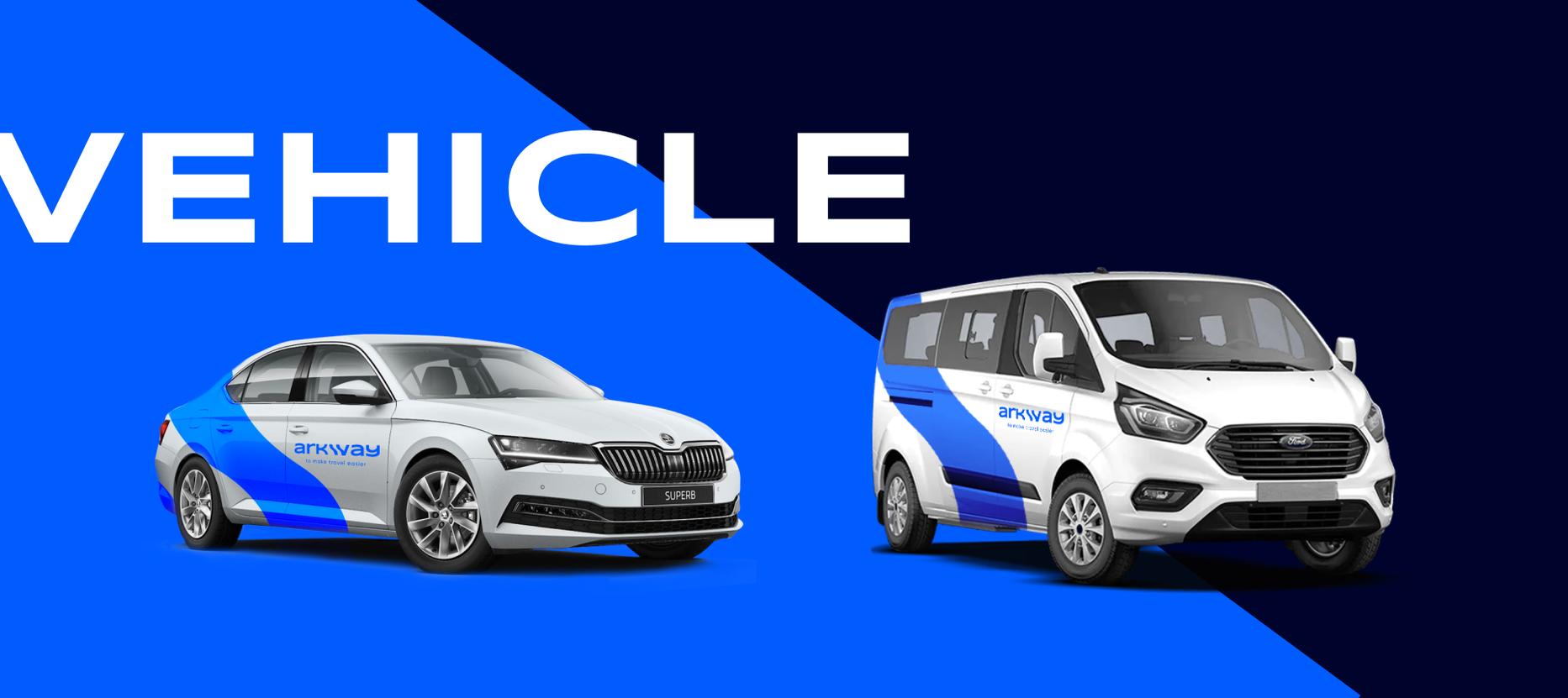
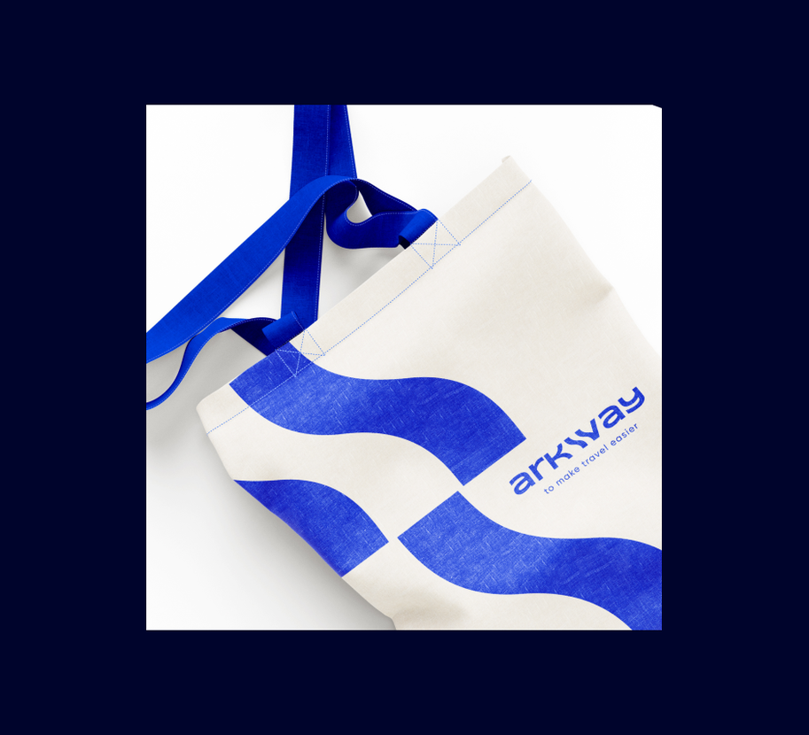
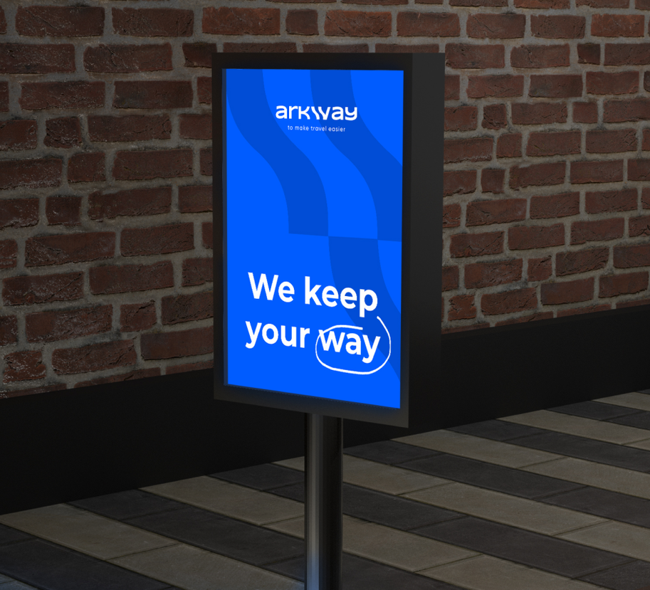
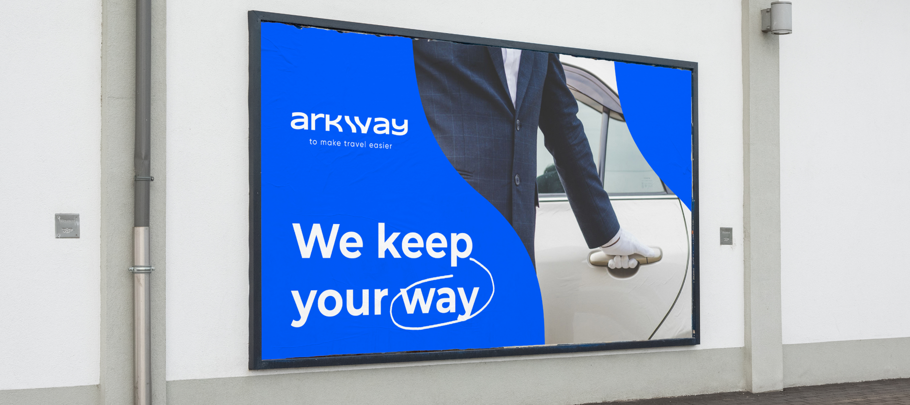
- The main goal is to create a transfer company logo that will convey the brand identity: reliability, safety, comfort and carelessness. The logo should also contain elements that reflect the character of the brand, such as colors, shapes, fonts, or other design details.
- Insight: a combination of deep meanings, modernity and style - this is how the logo for the Arkway brand can be characterized. Thanks to many years of experience and skill of our team, we have developed a visualization of the brand name, where the letter W is drawn in the form of wavy lines, symbolizing the road as an uninterrupted journey of the consumer during travel. The main corporate color is bright blue, which evokes a feeling of peace and security.
- The second text part of the logo is the slogan “to make travel easier”. It is these words that mark the main mission of the Arkway company - to simplify the travel process for customers. The slogan also reflects one of the brand's key values, namely carefree travel: when the transfer arrives on time, the consumer enjoys the trip, is confident in the safety and reliability of his carrier.
Landing Page
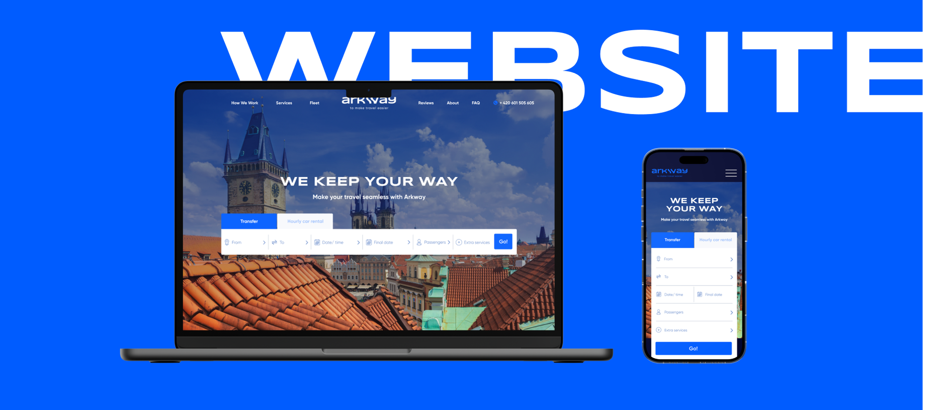
- It was important to develop a conversion page through which it would be convenient to book a transfer in a few clicks. It was also necessary to describe the company's approach to work and disclose the list of additional services provided by the company.
- We developed a clear UX design and copywriting, and created a unique design that is different from competitors in the market and fully continues the integrity of the brand. The developers of the Rubarb team have created an individual ARI for a convenient transfer order.
- Insight: When creating the site, we took into account important issues: the purpose of creating the site, the possibility of further promotion, the convenience of using the page from the phone and the region where users live.
- We have also developed a convenient and simple order form, which includes all the required fields for the convenience of customers (start and destination points of the trip, dates, number of passengers, choice of car, additional services).
Project results
We have created a brand image that competes with the mastodons in the transfer market in the Czech Republic, with a strong and stable positioning, modern design and meeting the needs of today's audience. The term for the implementation of one project (positioning/naming/logo/landing page) is 45 working days.

 Russian
 Ukrainian
Add a comment
Fields are required *