Russian
 Ukrainian
Design of the logo: external simplicity with internal meaning
The emergence of the first logo in the world happened because of a dog that listens to the gramophone! The story happened more than 100 years ago! The dog named Nipper listened to the voice on the phonograph of his late owner. The new owner of the dog depicted it in his picture and sold it to the English company “Gramophone”. They sold plates for a gramophone. That is why the creator of the picture was offered to replace the phonograph with a gramophone. In 1900, the logo became a registered trademark of “Victor and HMV records”. During its existence, the logo practically has not changed, and today its estimated cost is almost 80 million dollars!
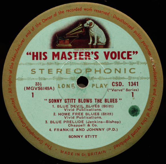
This story is a good example of how successful logo design helped not only in the promotion of the company's goods but also due to its popularity and recognition, in more than 100 years it costs more than the company itself.
Logo design: Trends 2022
Every New Year brings changes in the world of graphic design. Development approaches, trends and preferences are changing. But one thing remains the same: regardless of trends, the most important thing is an individual approach to each brand.
This year, when developing logos, bets are made on:
- Coloured gradients;
- Geometric shapes;
- Metal Logo;
- Visual minimalism;
- Bright colours.
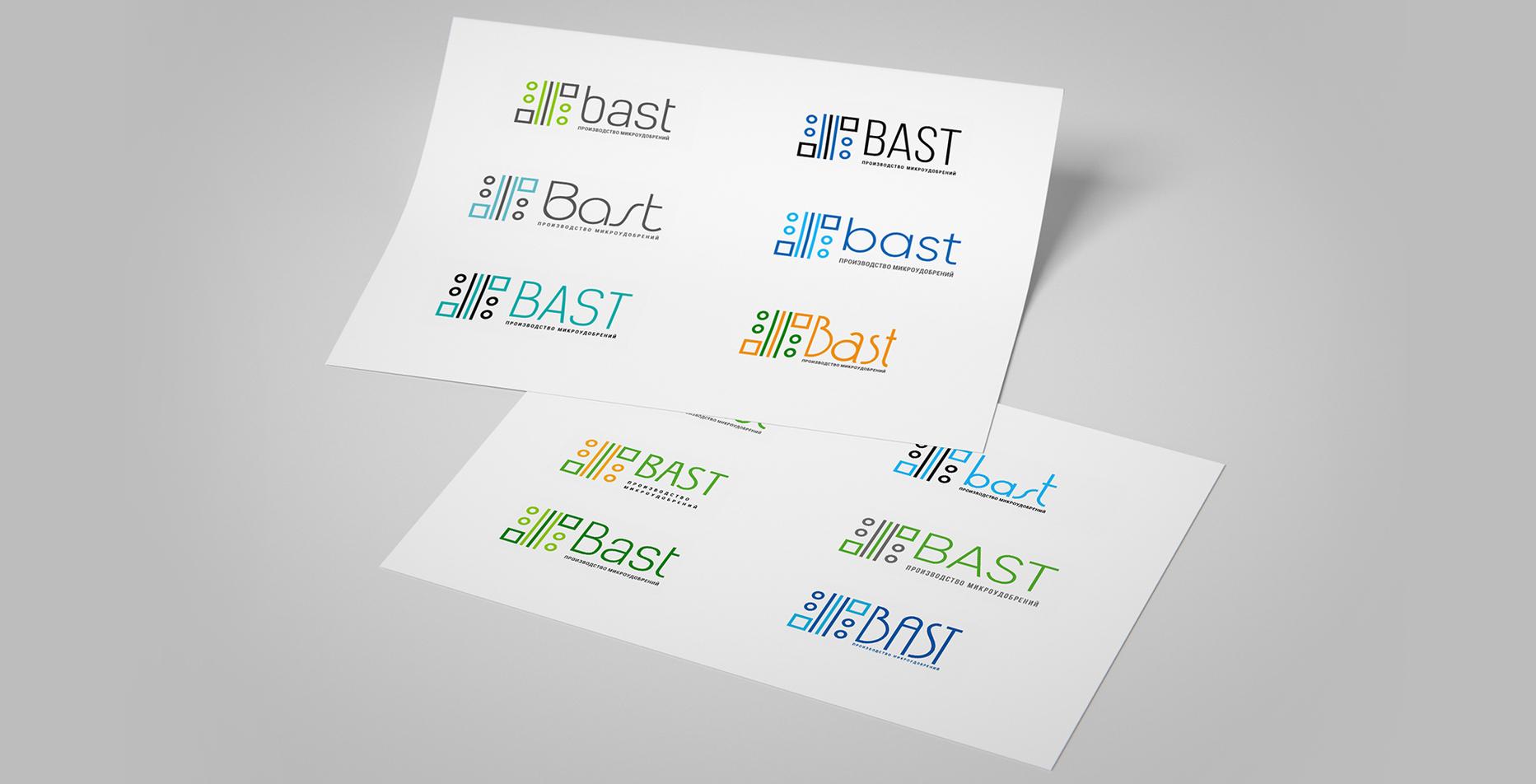
Our designers take a holistic look at logo design. While creating the logo our designers take into account our clients' wishes, the analysis of the company's work, its target audience, study the competitors’ works and the actual trends in logo creation. For example, rebranding of the logo for the company "BASt", which produces fertilizers, we made 3 years ago, but anyway logo has not lost its relevance. All thanks to geometrical elements, which our designers successfully embodied in the emblem of the company! Each element has its meaning: circle – is a drop of water, lines – farm fields, squares – cans, in which the fertilizers are packaged https://rubarbs.com/bast#branding
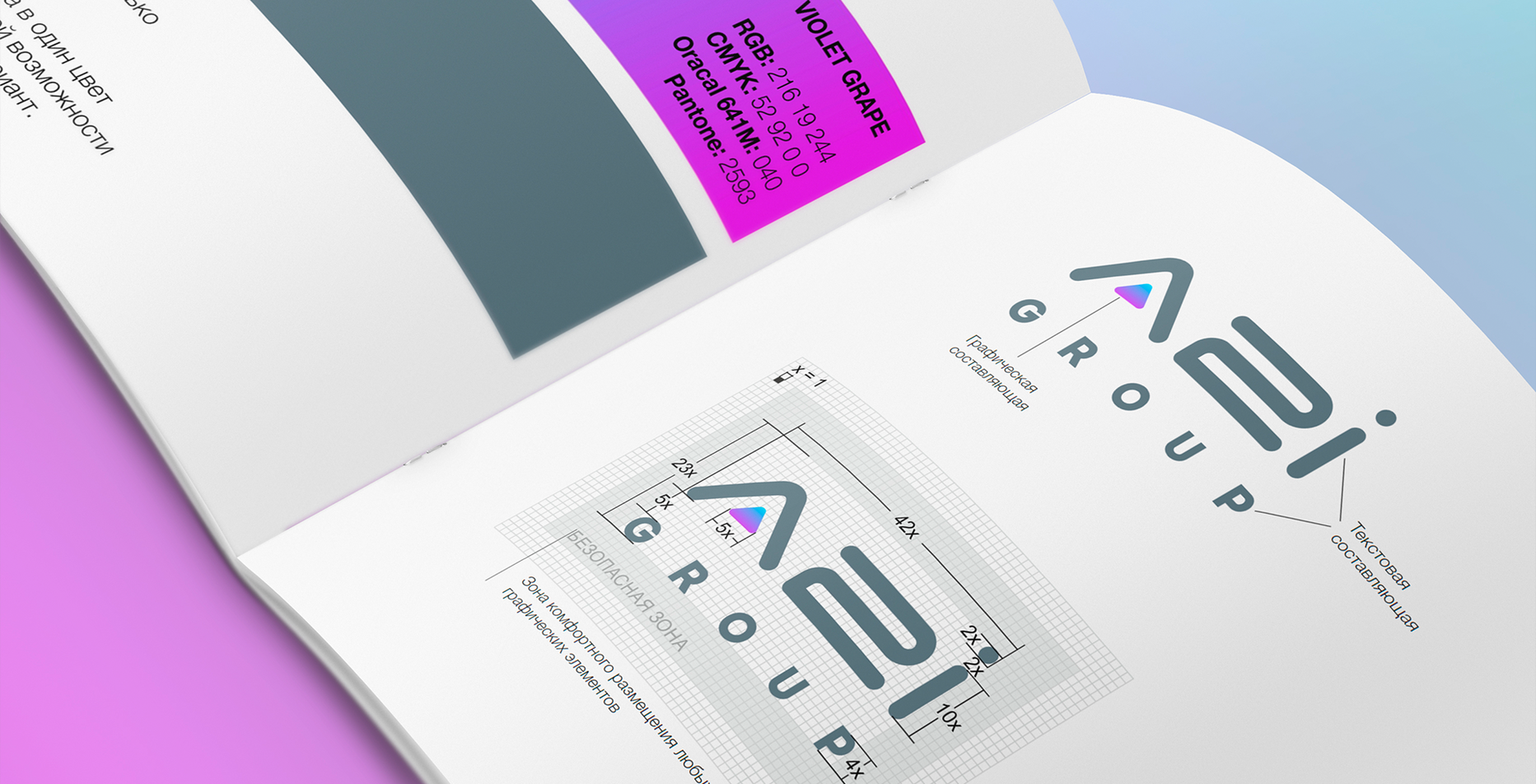
Another bright example of the logo for the company "A2I", which finds solutions for business with help of artificial intelligence. We had a difficult task - to show the product to the target audience as simply as possible. As a result, the logo appeared visually simple but deep in content https://rubarbs.com/ua/a2i-group#branding
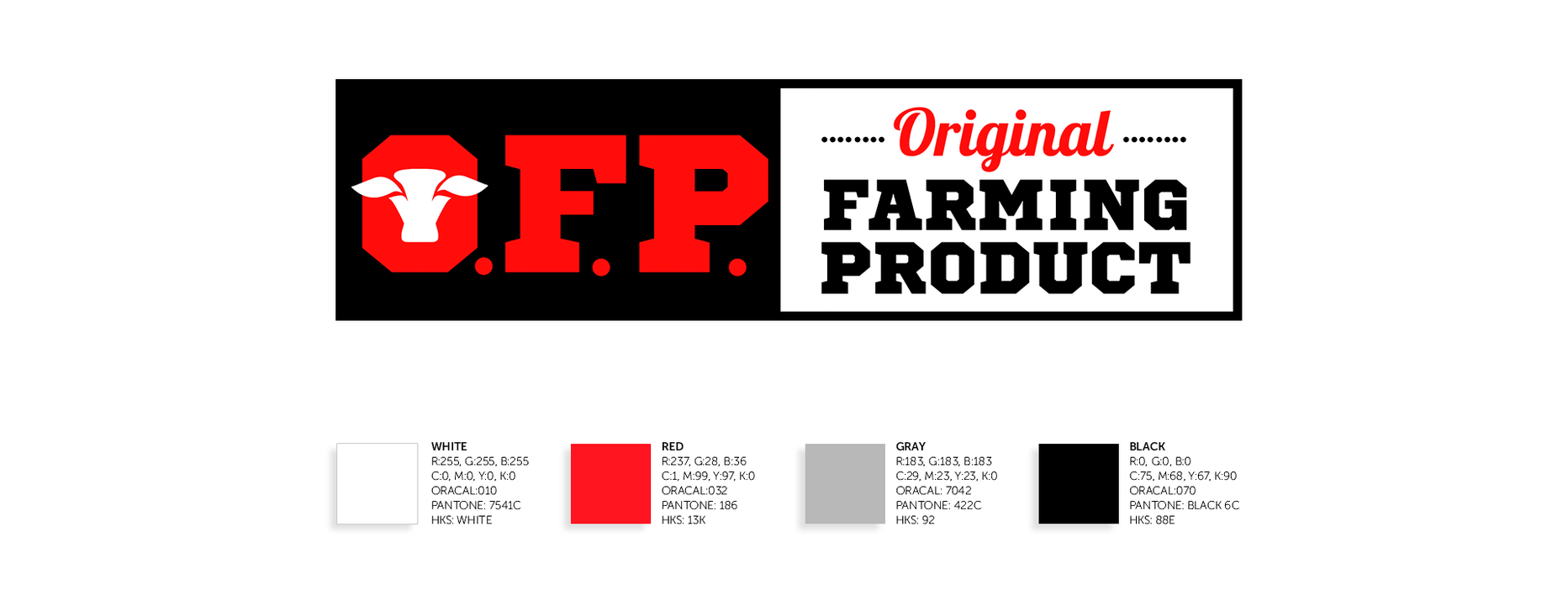
The third example we would like to draw your attention to is the creation of a logo for the company "OFP" - the manufacturer of marbled beef. The peculiarity was that the brand only entered the market, and therefore it had not had its loyal target audience yet. The logo ought to attract attention and be сatchy. For this purpose, we used bright colours and images that are understandable for our clients. Pay attention to fonts! What associations do you have? Probably, many of you remembered the Wild West paintings, the epoch of cowboys! It was not accidentally – but for better reflection of the company https://rubarbs.com/ofp#branding
How is the logo design created?
Usually, logo creation is one of the parts of corporate style development. We can also update the existing emblem of the company. At first glance, the development of the logo is simple, but there are a series of works, which our team is carrying out. Without them, it is possible to make a logo, but it will not give the expected effect.
The preparatory process includes three necessary items:
1. Product study;
2. Analysis of competitors;
3. Identification of the needs of the target audience.
Designers of RUBARB prepare several variants of emblem, from which the customer chooses the most suitable for his company. For example, the logo for "OFP" was immediately successful and was approved at the first presentation.
As a rule, we add to the logo a guide on its use, which helps polygraphs and designers accurately reflect it on any media.
The best ideas for the RUBARB logos
There are no criteria that define a good logo. The emblem of your company should be visually simple but show the company's activity, its orientation. The logo itself – means nothing. It works in a complex with other techniques, for example, with well-developed marketing and advertising companies, which help both to be distinguished from competitors, and to be memorable for clients.
Look at the famous brand logos Nike, Coca-Cola, McDonald's, MasterCard. They are very simple, but each of them has its message. The RUBARB team is ready to develop a logo for your business that is as accessible and understandable as possible, reflects the companies' function and will be easily recognizable by your clients. We know how to make a qualitative logo with the right content!