Basic criteria of making selling websites
It is difficult to imagine a company which wouldn’t have a website. Websites are made with the aim of increasing brand awareness, maintaining image, corporate culture, direct and indirect sales which, as a result, help to expand the customer base essentially. Such websites are called selling, though frankly speaking, there’s no websites which cannot be called selling. In fact, there are websites which sell badly and there are websites which sell well. In this article we will discuss the main components used when making selling websites.

Types of websites
According to what will be sold (one particular product/service or it’ll be wide variety of products/services) the resource type is chosen:
- Multi-page website
- Single-page (landing page) website
Multi-page websites are often used by companies which make and sell their products by themselves. Such resources help to introduce a brand, tell about the company, its production and show all the selection of products to the great extent. Website pages of “Ukraine” printing house may serve as a visual example of it. The website, updated by our team, helped to improve the image of the company and attracted new clients.
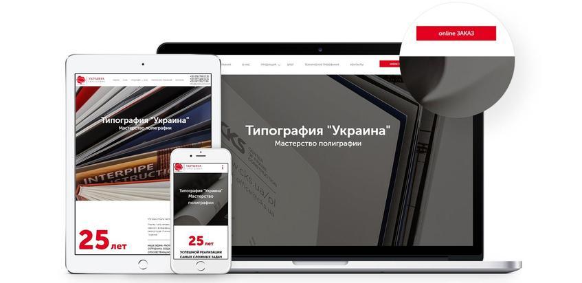
Single-page website is mostly made for a particular product, selling of which may be limited in time. Websites made for selling holiday products, for instance, artificial Christmas trees for New Year parties, may serve as a prime example.
The great example is a landing page which we made for profitable purchases community LET’S SHOP.
3 marketing kits in selling website development
Selling website is a complex of elements which motivate a customer to make a buy. Complementing one another harmonically, they unobtrusively tempt a potential customer and convince s/he that their choice is right.
Modern Web Design
Researches show that exactly a website design influences the customers’ choice to leave after the first few seconds. The concept “web development” includes not only harmonic color scheme and image availability but also:
- Responsive web design for different gadgets, which helps to attract more customers.
- Convenient navigation. The simpler – the better for customers, therefore making a buy is more likely.
- Loading speed. Slowly loading page annoys and a customer, losing patience, goes to a rival. Optimal speed of website loading is 2 seconds.
- Availability of qualitative and unique images and videos which help to make a decision in your brand’s favour.
- Common style and color scheme on all pages. It makes a brand recognizable, therefore points it out among rivals.
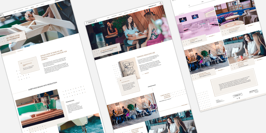
Fabrikant company may serve as an example of making a selling website. One of our main aims was to create a resource which would have comprehensible and familiar to the target audience visual context.
Competent text
Not all of the companies pay proper attention to the text content of websites. In spite of the popular opinion that nobody reads the texts, our experience shows that people actually do! Texts are especially important for new customers and partners who want to get comprehensive information about a company. If there’s no such information, a visitor may leave without becoming your client. That’s why faceless and empty texts should be left for rivals. Your website is better to be filled with informative, true content which will favorably present you to the customers.
Read more: Trends web development 2019
One of the distinctive features of selling texts is CTA (call to action). However, you shouldn’t abuse them on every page. There’re a lot of other variants of pushing a customer for buying, for example:
- Discounts offering and sales.
- Additional products or services guarantees.
- Ability of quick sending of a chosen product.
- Setting different bonuses.
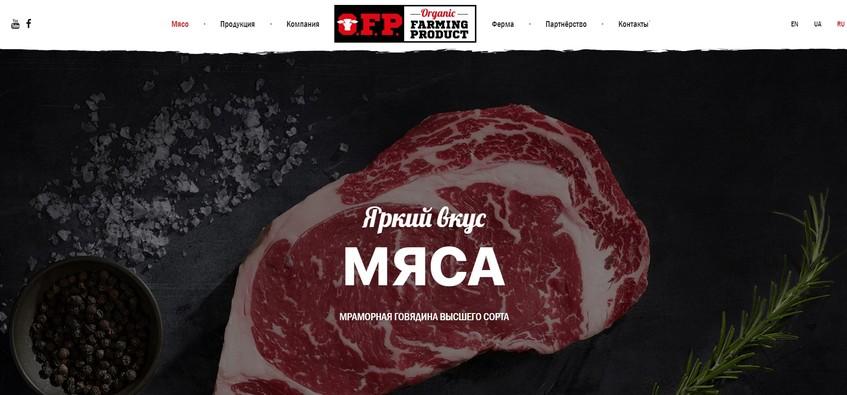
Such example of informative selling texts is ORGANIC FARMING PRODUСT company landing page. Texts there inform not only about the products but also about process of making it therefore inspiring confidence from potential customers and partners and motivating them to collaborate.
Magic Buttons
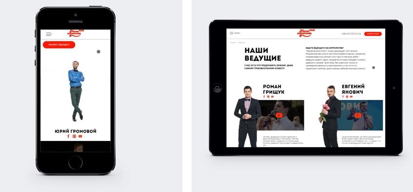
Page layout of a selling website won’t be complete without CTA buttons like «buy it now», «make an order», «get discount». It is important to bear in mind that such buttons have to accomplish a selling text, be legible and marked out with contrast colors, no matter if it’s a product description or switching from the main page to buying. The main mistake of most developers is that they underestimate the buttons design. As a result, buttons stay unnoticed.
Check out the design and layout of buttons on our client’s website Mamahohotala-event and compare it with your resource. Also pay attention to the texts which interest and motivate to make a choice.
The Main Resume
To summarize the above, we’d note that web development of a selling website is an interrelated complex of operations which are to work together in order to attract with bright qualitative images, satisfy with all the necessary information, gain the confidence and motivate to actions. Absence of one of these elements will lead to decreasing of a selling function. According to experience nobody wants it to happen.
To make a website which sells really well is not an easy task although it’s possible. Our examples are the confirmation of it. We will gladly make a wonderful selling website for your company too!

 Russian
 Ukrainian


Add a comment
Fields are required *