Project for the soul: Rubarb developed a corporate identity for the Tennis Federation of Ukraine
Rubarb – specializes in working with production enterprises. But once a year, our team, except for specialized projects, chooses one for the soul.
"Suddenly we feel the urge to abandon the standard projects and to dream up in other spheres, to be inspired by the new history, to try something close to the heart. This year we have decided to use our knowledge and creativity in the sports theme. Could there be a better way to show designer creativity, as in the historically beautiful, aesthetic sport — tennis? Together with the president of the UTF, we decided to do something unusual. The team of Rubarb Digital was on the court and even tried to play. There we got even more inspiration from the history of Ukrainian tennis. It made it clear that the idea is as relevant as possible and needs to be realized. It was important for us that in the new 2022, the Tennis Federation of Ukraine has already been updated.” — The head of the agency Rodion Goncharov.
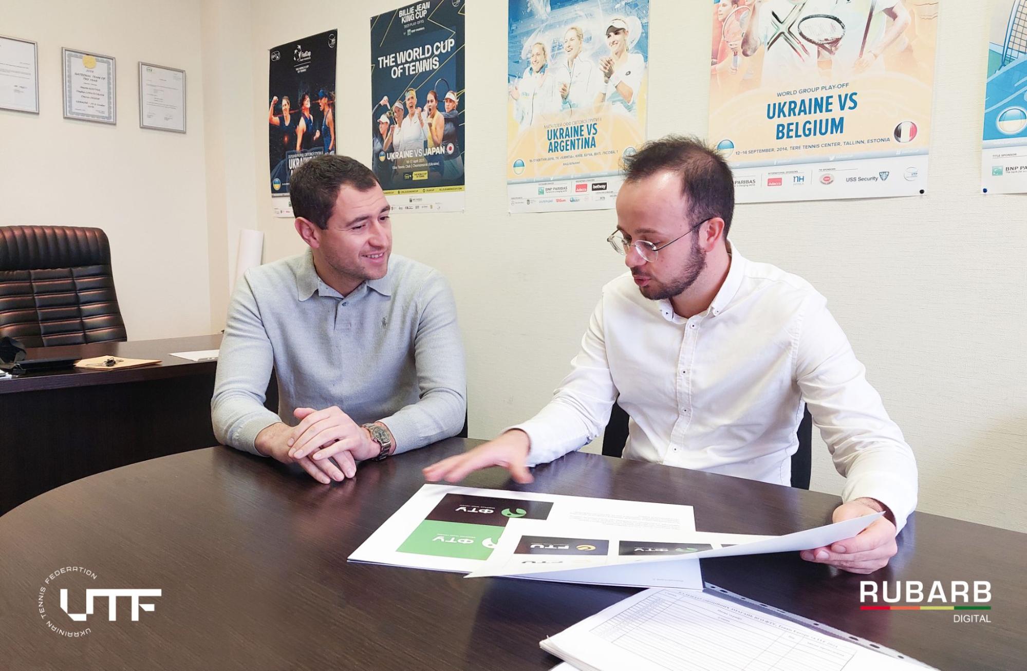
For the UTF, wе have developed a corporate style, which has made the organization more modern, attractive, recognizable at the international level.
The new logo decided to work with an association of the traditional, bright yellow ball, which has a positive psychological influence and attracts attention.
—“Rubarb team has developed several variants of the English logo, as sportsmen play not only in Ukraine but also abroad. Together with the team of the UTF, we have chosen the creative option with historically yellow. A yellow rectangle with "UTF” text is associated with the tennis court and its lines. Yellow colour and the inscription — direct association with a tennis ball. As a result, we have developed a whole brand book, which includes: logo, pattern, company colours, fonts and identity elements” — reported the designer of agency Rubarb Anastasia Shumeiko.
Logo and pattern are used in polygraphy (business cards, certificates), souvenir production (T-shirts, caps, water bottles, bags, flags), in social networks, on the site — anywhere you can show the brand, increasing its recognition.
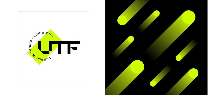
That is our small contribution to the popularization of Ukrainian sport. The goal of rebranding is not just to make the UTF recognizable, modern and original, but also to present it at the international level. The participants of the Federation often take part in international tournaments that is why there was a necessity to give new life to the brand. That was done with the help of creative font and English-language caption, which will be understood not only by Ukrainians. The modern logo has acquired a meaningful sense and more aesthetic appearance. Aesthetics and tennis are inseparable.
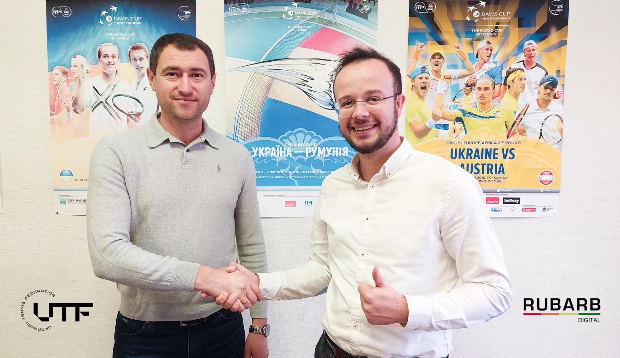
— “UTF is grateful for RUBARB's excellent work and can recommend these specialists because their views on design are up-to-date and interesting.” — we are pleased to hear the words of gratitude from our partners.
In turn, we express our gratitude to the representatives of the UTF, especially Vice-President Eugene Zukin, for his trust. We sincerely believe that rebranding will promote tennis and attract young people who become new champions for Ukraine.

 Russian
 Ukrainian




Add a comment
Fields are required *