Case: development of a logo, corporate identity, video and website for GuavaPay
Client:

-
What is done:
- Logo
- Form style
- Video
- Website
Task
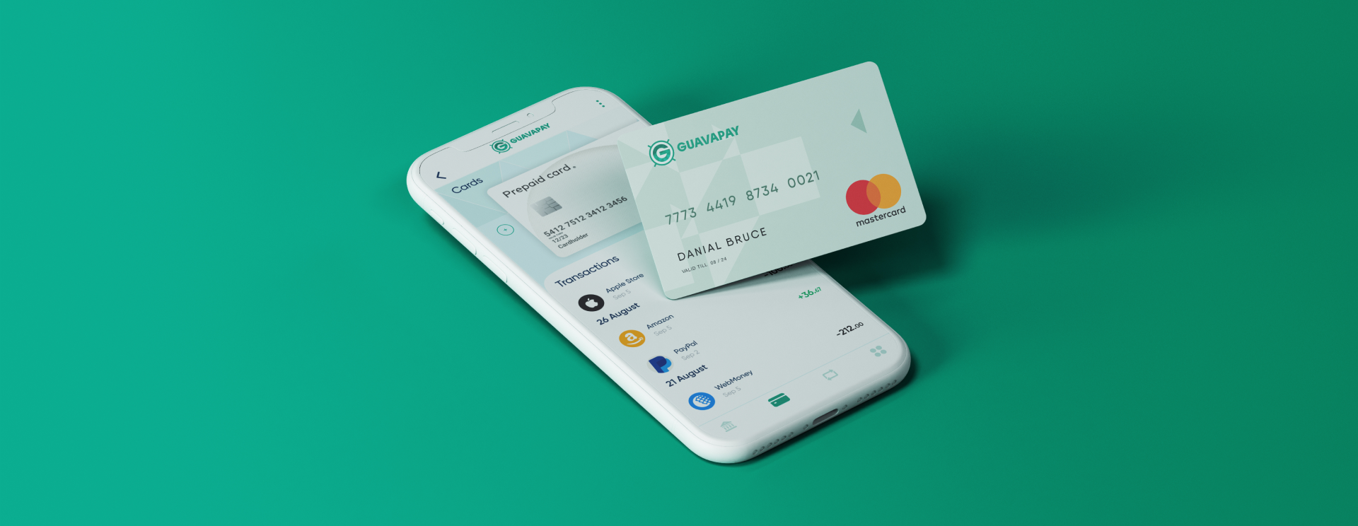
We needed to create a strong and memorable logo. To develop a corporate identity that is understandable to the target audience. To make a site as simple as possible in structure and comfortable to use, as well as a video that will be visually clear to tell about the company and the services provided.
PRELIMINARY ANALYSIS
Guavapay Limited is a processing company offering a wide range of services for individuals and legal entities in issuing, maintaining and acquiring cards
THE TARGET AUDIENCE
Individuals and legal entities in Europe
Logo development
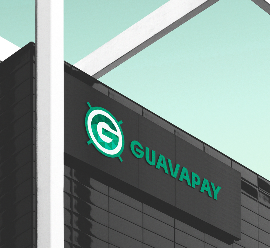
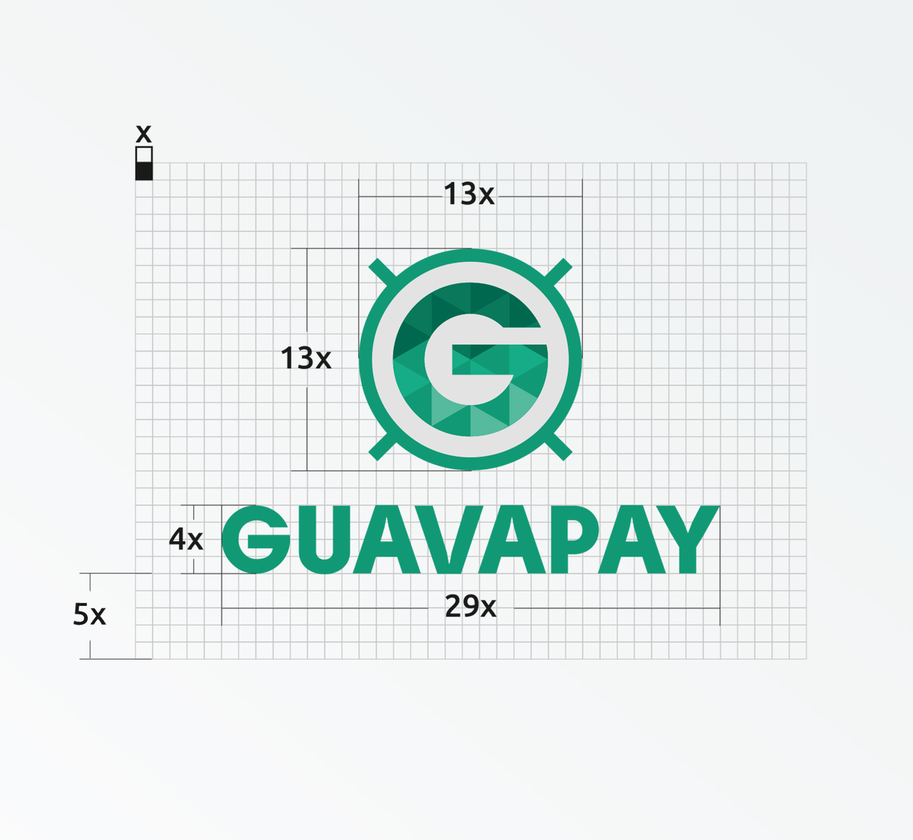
- We have developed a serious and technological logo, which, in conjunction with the tone of brand communication and target audience, allowed us to interest the end consumer.
- The brand logo is combined. It contains graphic and text components. The emerald color is associated with well-being, stability and consistency.
- The logo is accompanied by a brief guide to the use of the logo, which presents options for its use depending on situations and context.
Development of corporate identity elements
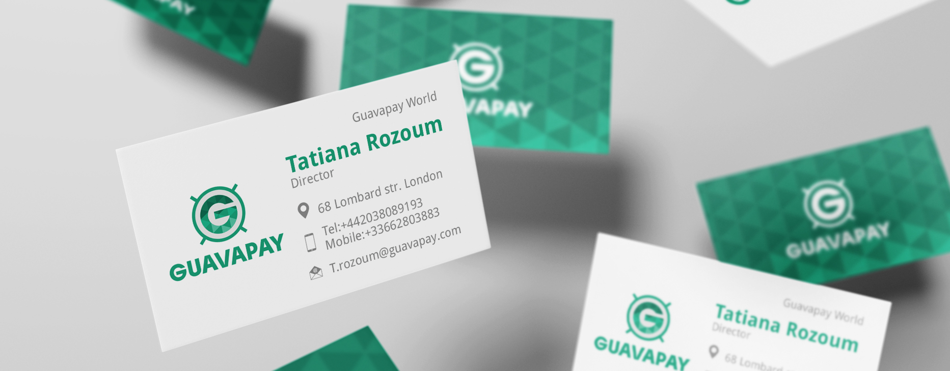
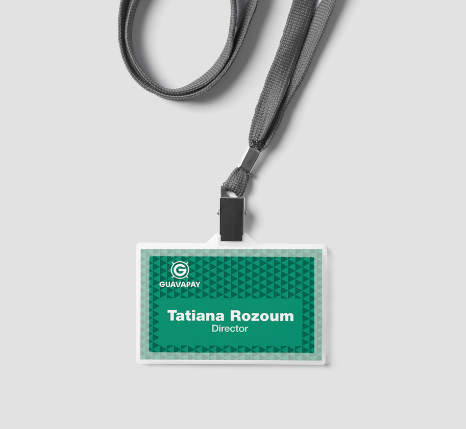
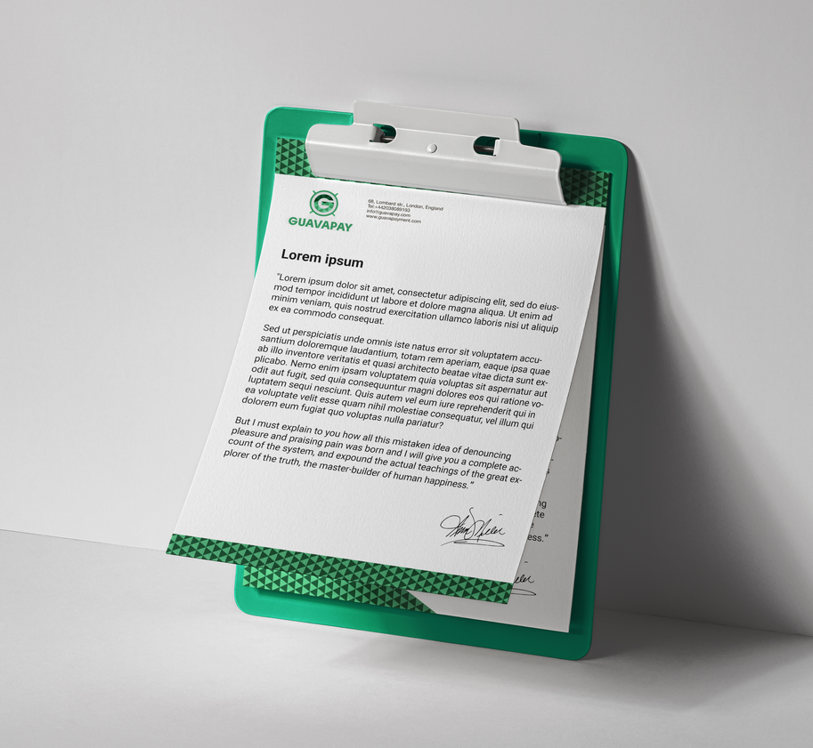
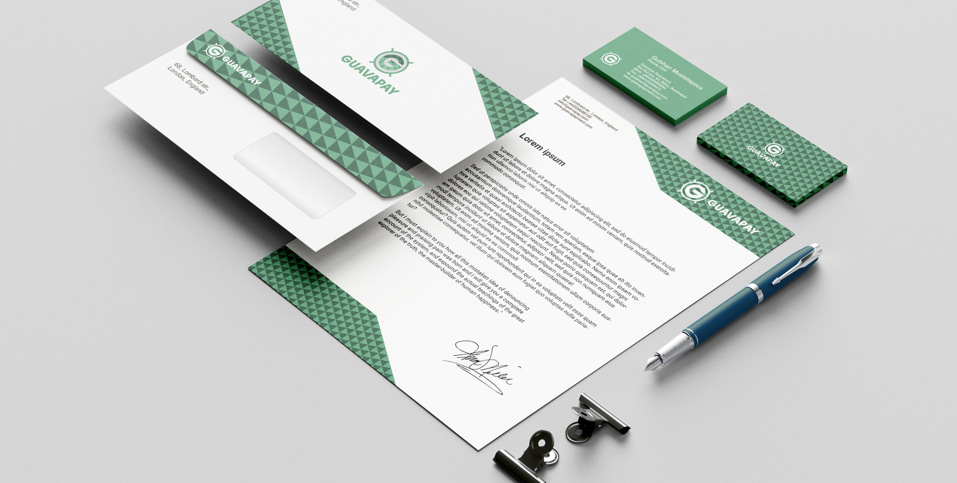
- For the full promotion of the company, a corporate style was developed. Taking the approved concept as a basis, we have created a harmonious set of elements that will work to improve the brand's image.
- Corporate elements are made in a strict business style distinguish the company from competitors and attract the attention of potential customers.
Video development
- The main task of the video is to tell about the company and the services it provides in an accessible and understandable way. The video will be broadcast on the website, YouTube and other various platforms.
- The video details the benefits of cooperation with the company and the services provided. Unobtrusive graphics complement the picture by conveying meanings, making it easier and more understandable for the target audience.
Site development
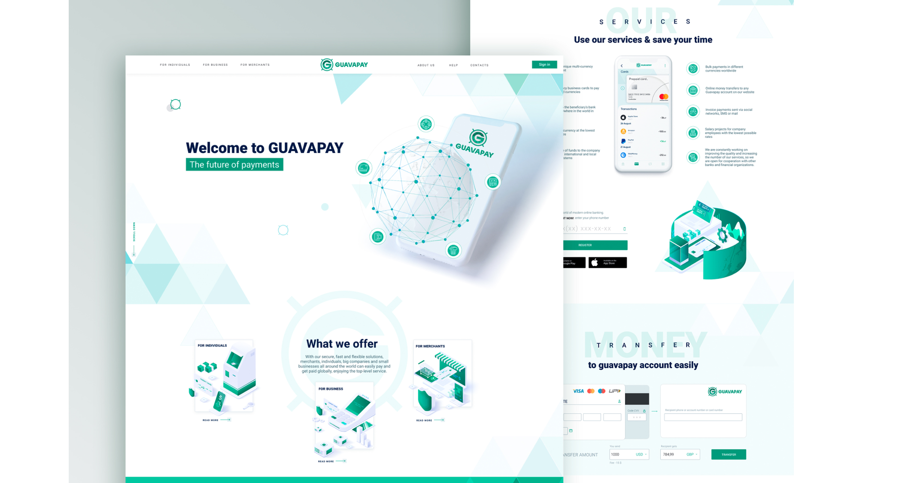
- The key point in creating the site was to develop a simple, understandable and easy-to-use site.
- We managed to make a high-quality product - a modern website with convenient functionality, which also emphasizes the expertise and competence of the brand. The use of video adds maximum information and visibility.
Adaptive design
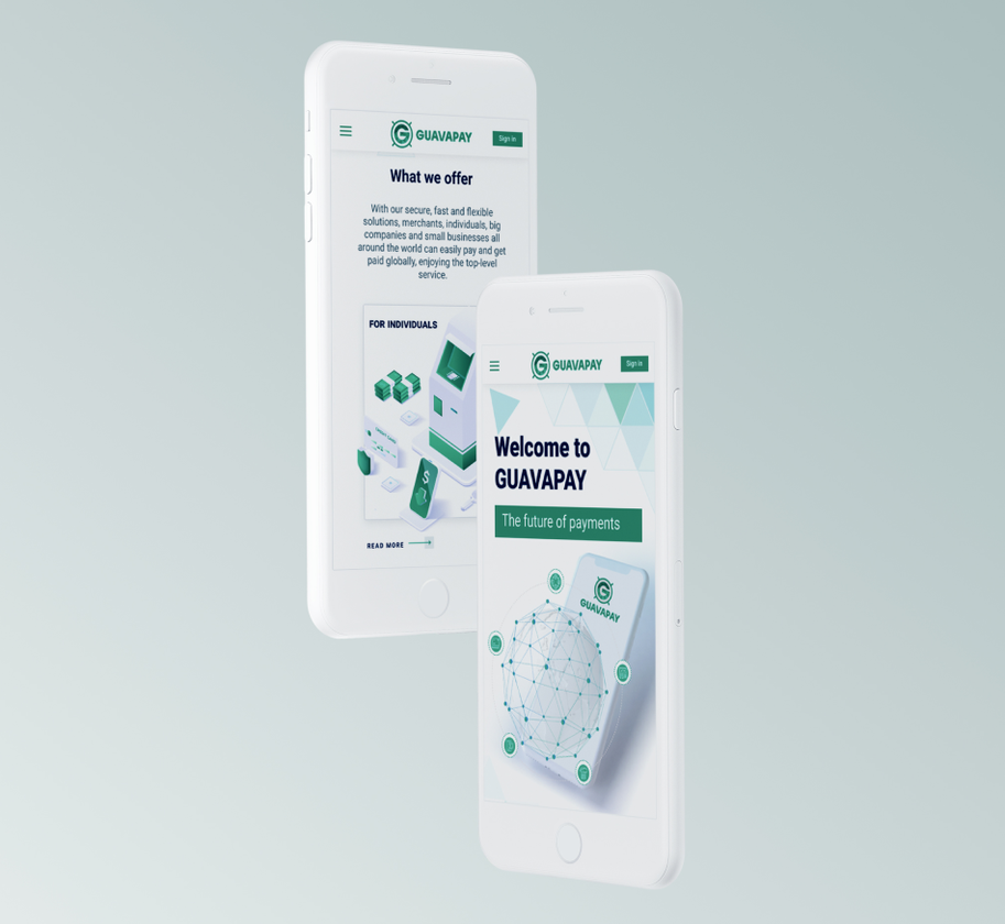
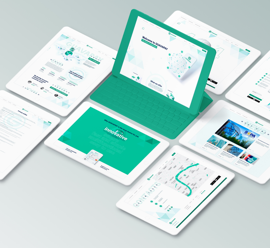
- Responsive web design ensures that the site displays correctly on various types of devices connected to the Internet, and dynamically adjusts to the specified browser window sizes.
PROJECT RESULTS
We managed to cope with the task:
We have developed a stylish and memorable logo that distinguishes the company from competitors.
The corporate identity has become a part of the brand image and performs its function, attracting attention, competently presenting the company.
The video made it easy to present the company on the market and is effectively used on the website and various platforms.
The site is already successfully working attracting new customers. The menu is logically built, nice to look at and comfortable to use.
The active start of work with new tools allowed the client to gain a foothold in the market of services offered and gain the trust of the target audience.

 Russian
 Ukrainian

Add a comment
Fields are required *