Website development and UX/UI design for MyMoneyMove
Client:

-
What is done:
- Website
- Personal site account
Client
Guavapay Limited specializes in international accounts and instant cash payments. This is not our first collaboration. The customer is starting a new area of customer service called MyMoneyMove, more focused on the B2C segment. The service helps to make money transfers in any currency to different parts of the world with a minimum commission.
Task
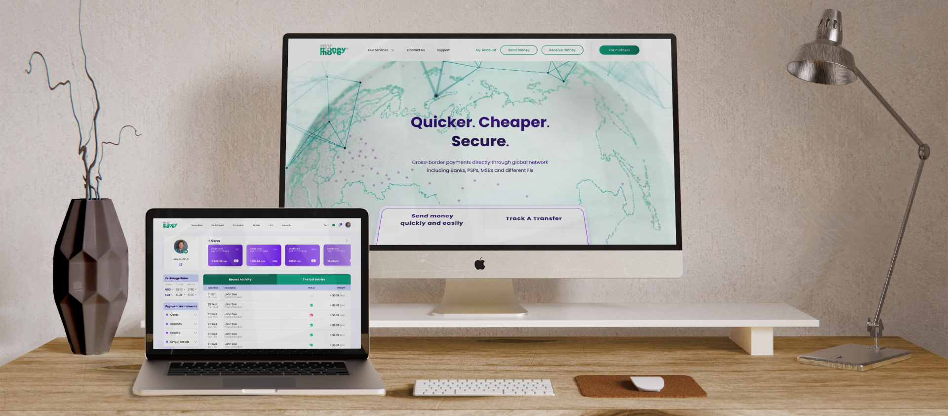
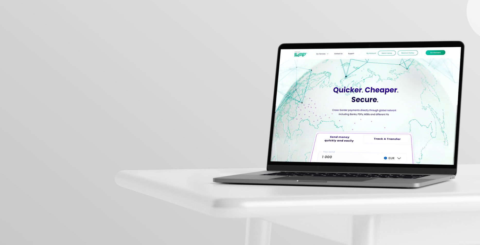
Developing a site for the presentation of services, competitive advantages and specifics of MyMoneyMove.
UX / UI design for personal site account.
Site development
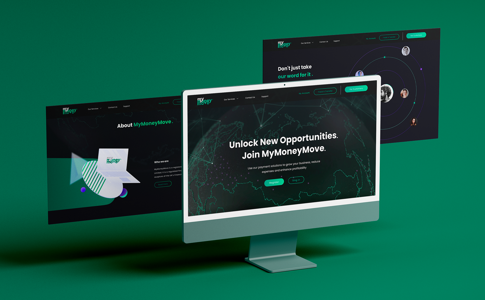
- The main mission of the site is to provide information support and sales of the company's services so that the target audience has quick access to information and can order the service online. To do this, we analyzed the market and competitors, identified the pain of the company's customers.
- The design was implemented in two colors: pure light — for customers and brutal dark — for partners.
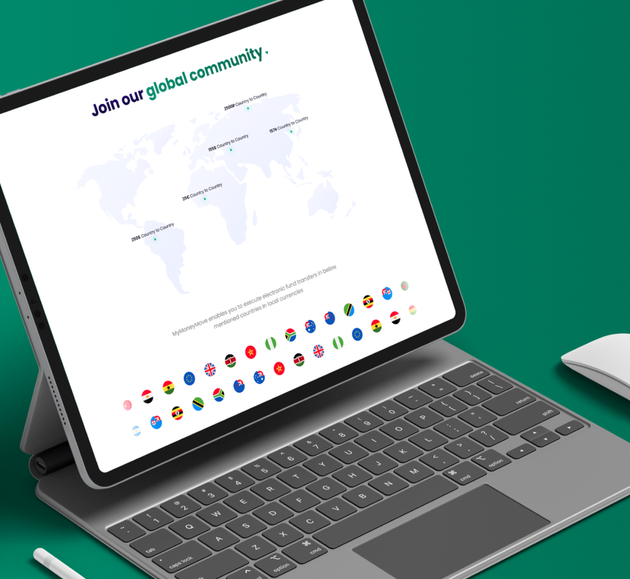
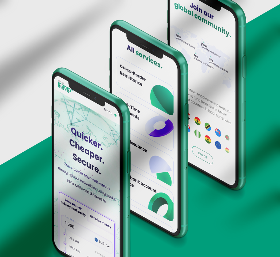
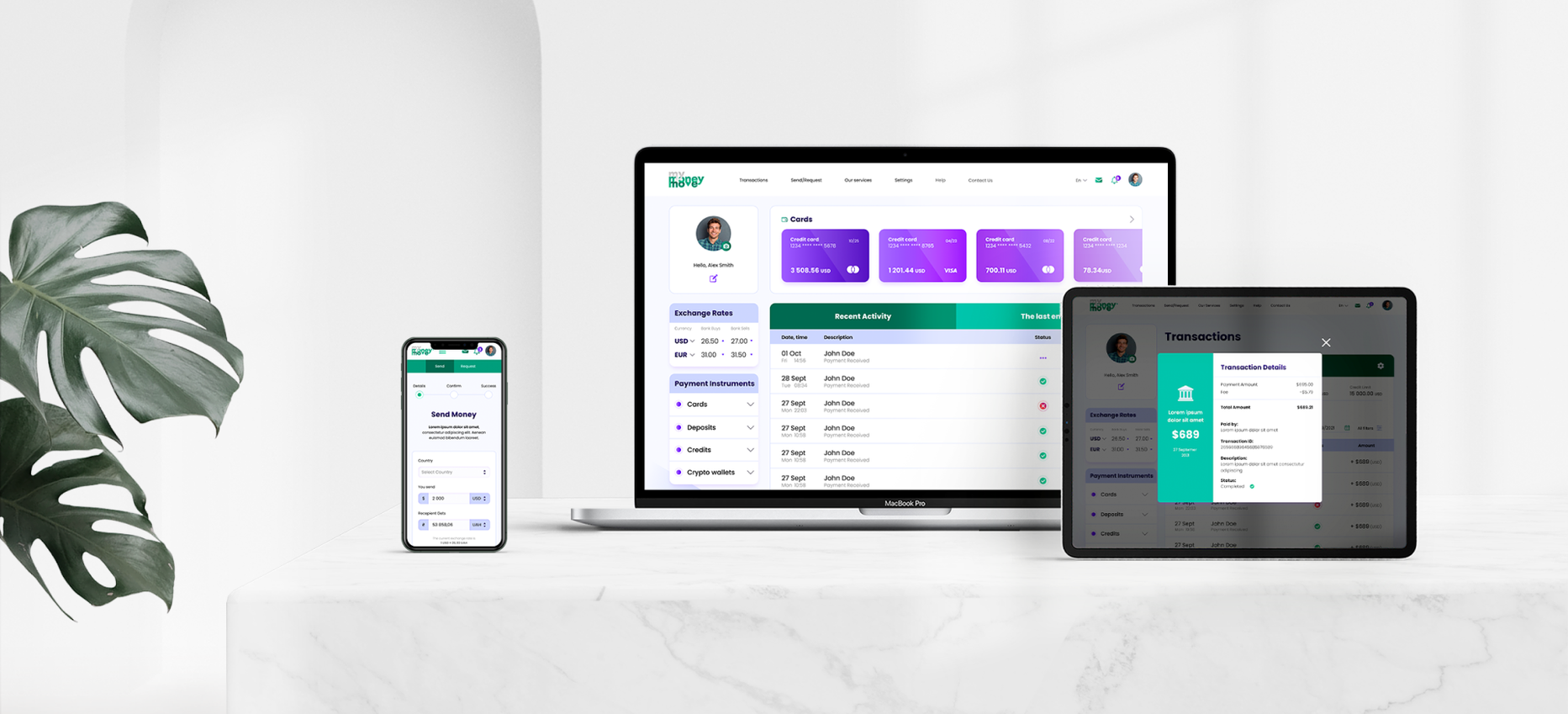
- The principal position of the client is to adapt the site for viewing in a horizontal position on mobile devices. Therefore, we paid special attention to testing the site in different positions and on different devices.
UX / UI design of personal account
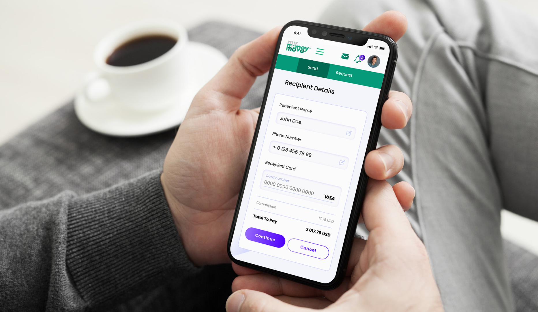
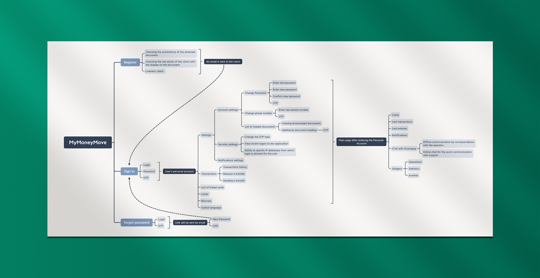
- The first stage in the development of the personal account was the creation of an information structure. The content was divided into two parts so that users could perceive it properly. It is arranged so that you can easily identify the functions for which the user entered the personal account.
- The second stage is the creation of an interactive UX / UI prototype, which:
- - significantly reduced development resources (20-40% less design improvements and changes);
- - the number of product versions decreased;
- - the number of design errors decreased;
- - there is an opportunity to quickly show what the final version will look like.
- A good feature is the large selection of scenarios that depend on how you deliver or receive a particular transaction.
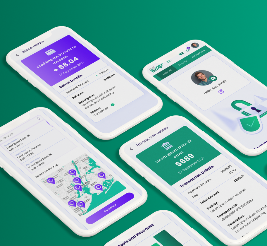
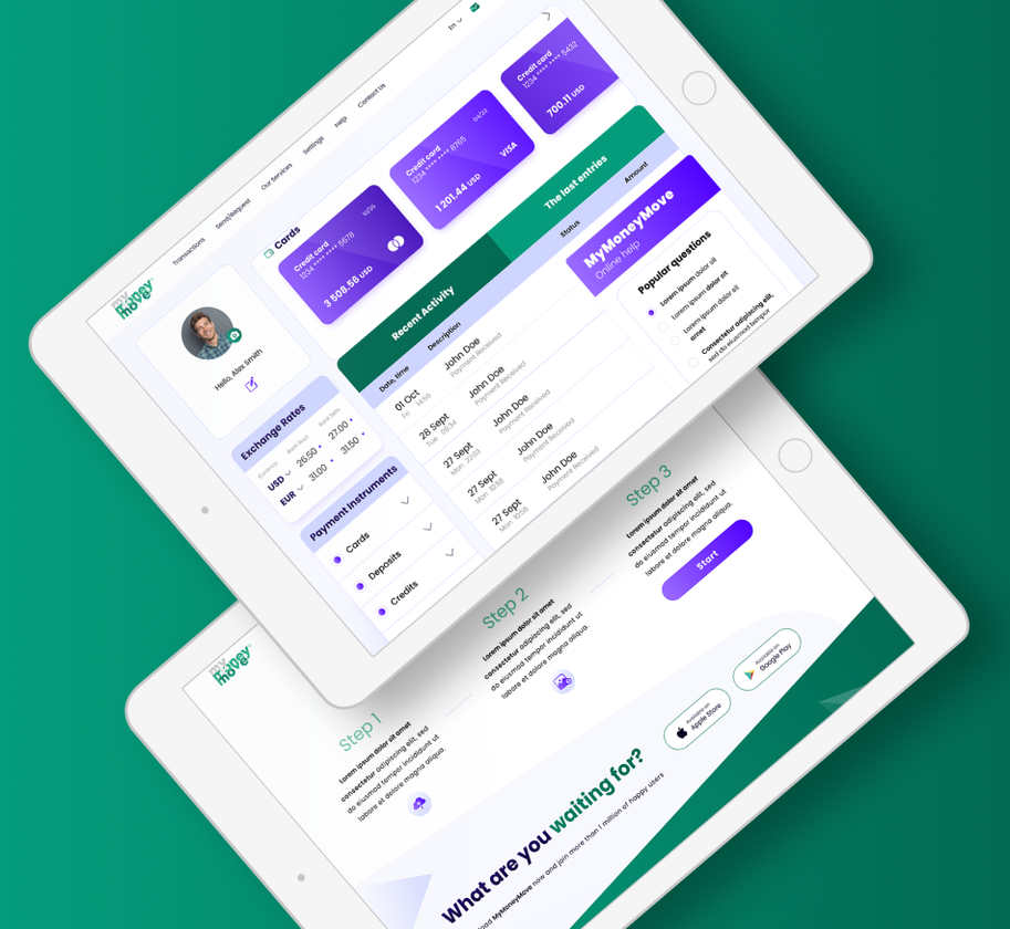
- The last stage is the development of UI-design, ie work with the graphical part of the interface.
- MyMoneyMove users can easily track their accounts, change settings, send / receive money and track their expenses.
PROJECT RESULTS
We have developed an intuitive site with a logical structure and accessible interface. Adapted the site for viewing on various devices and locations.
The complex approach at creation of UX/UI-design of a personal account, guarantees its convenient use.
Developed personal account, opens wide opportunities for MyMoneyMove users, which makes the company more attractive to potential customers.
-
nice job guys !
Add a comment
Fields are required *

 Russian
 Ukrainian
