Case: logo rebranding, brand book creation
Client:

-
What is done:
- logo redesign
- corporate identity
- brand book development

Objective:
To make a rebranding of the company that meets modern standards, conveys the brand philosophy. To develop a brand book.
Preliminary analysis:
Voevodyno is a resort for individual, corporate and family recreation in Transcarpathia.
Logo rebranding

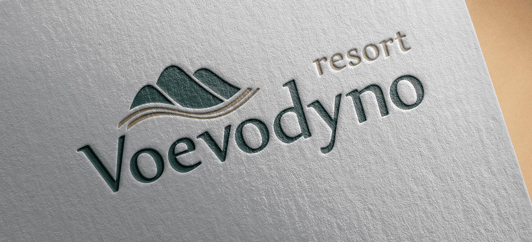
- Logo of the brand is combined. It consists of the brand name and the font part, that is, the brand name actually. We changed the color scheme of the logo, made it more eco-friendly: with a reference to nature, mountains and recreation.
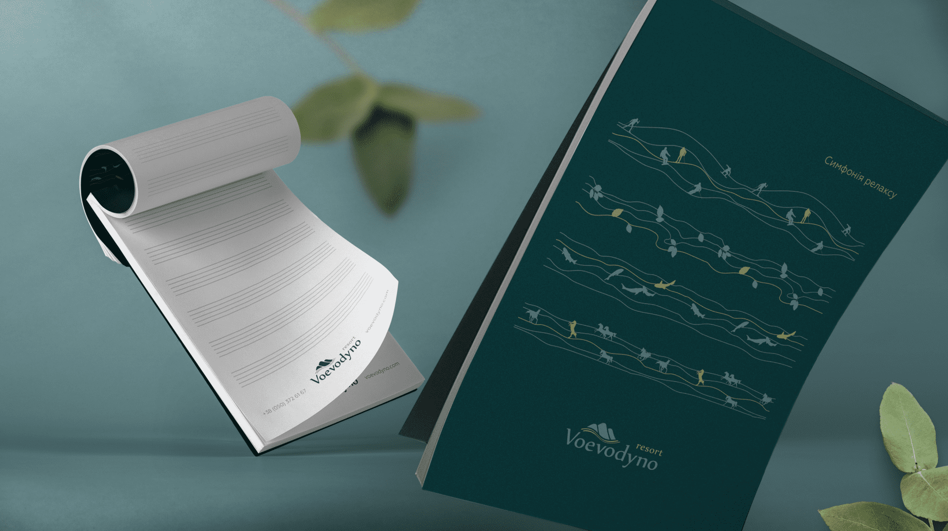
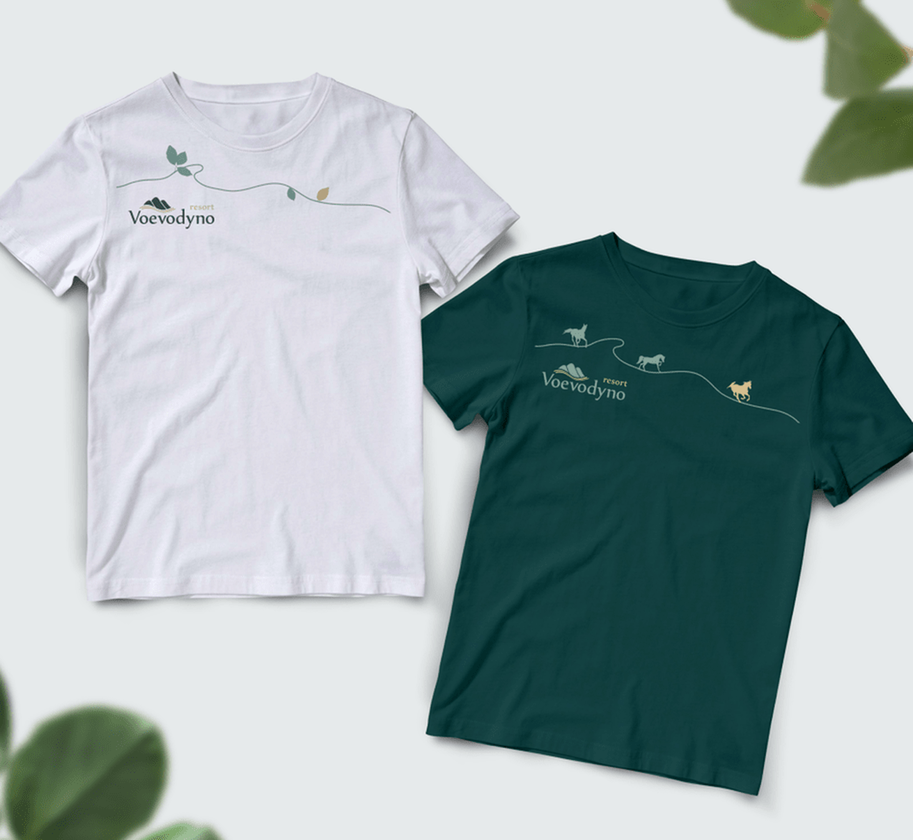
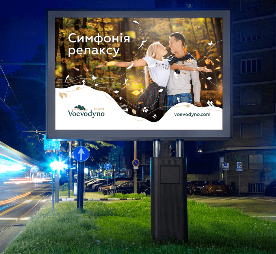
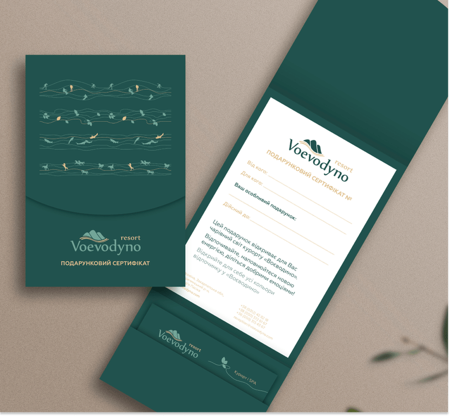
- A corporate pattern is an important component of an identity that can be used in advertising communications and distinguish a brand from its competitors.
- Our pattern symbolizes a vacation at the Voevodyno resort, namely:
- • ski vacation;
- • walks around resort, enjoying the Carpathians nature;
- • fishing in Transcarpathia;
- • horse Club.
- Five lines, on which the pattern elements are located - associated with the note staff, thus corresponding to the slogan "Symphony of relaxation".
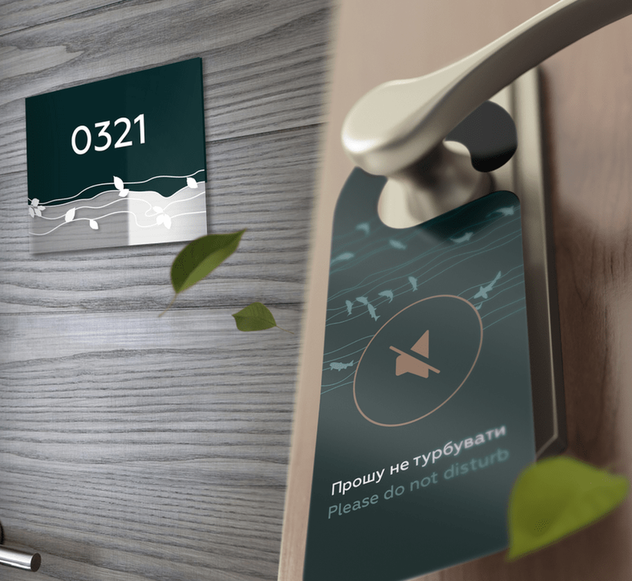
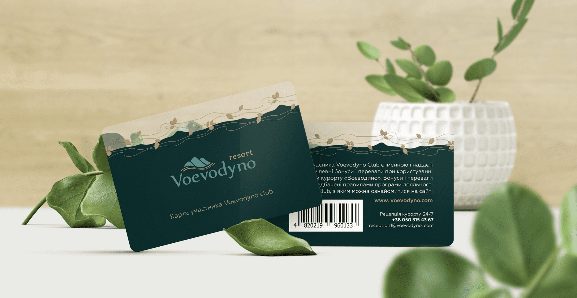
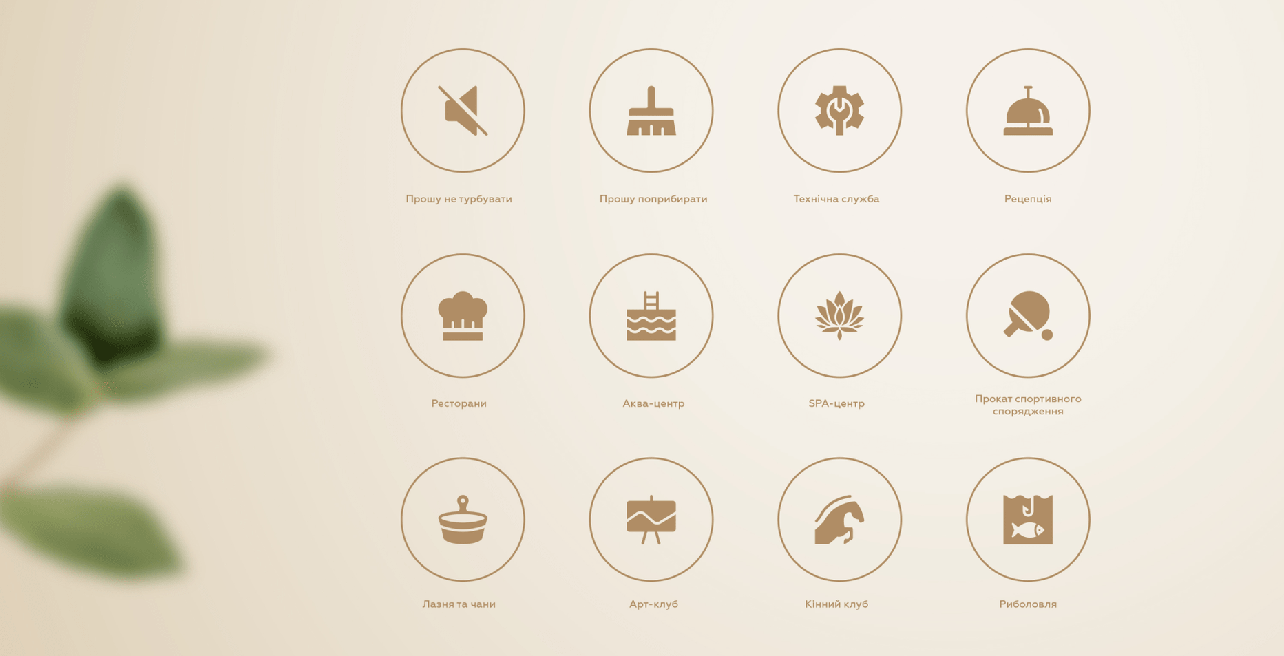
Corporate identity development.
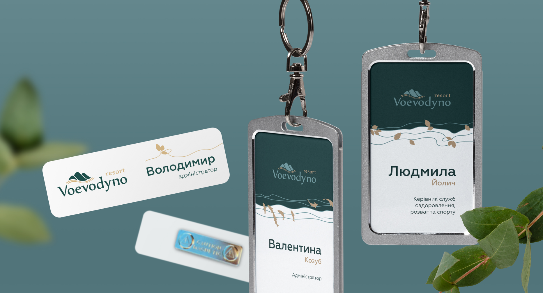
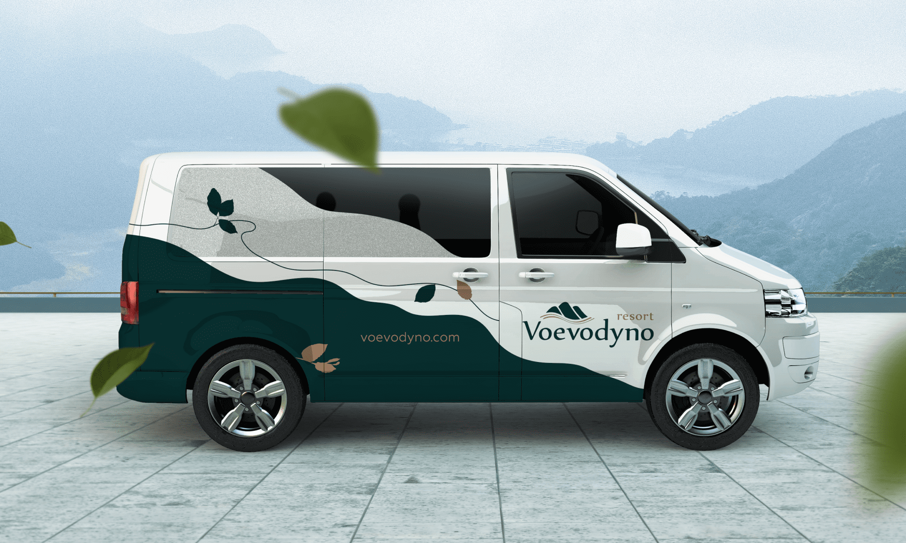
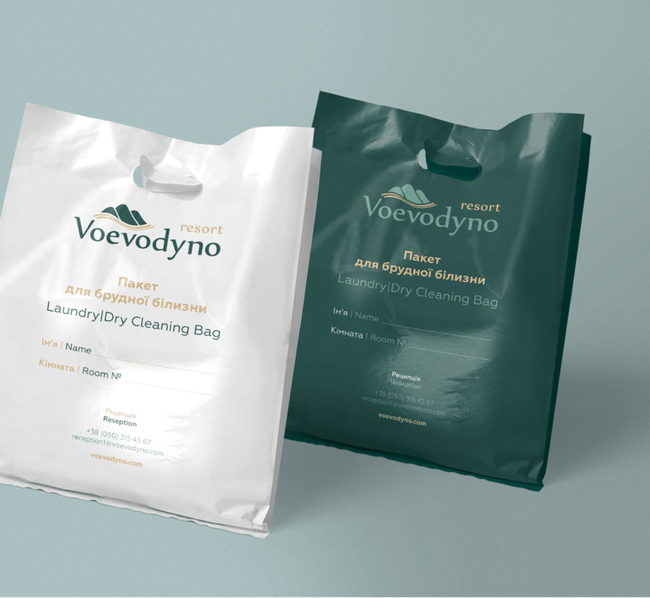
- The corporate identity allows you to stand out among competitors, strengthen the
- brand image in the memory of the target audience. The modern logo and
- corporate identity create a unified image of the brand that strengthens its position
- in the service market.
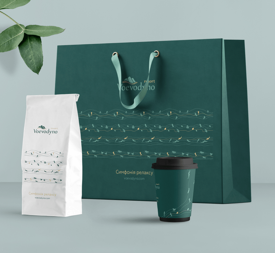
Brand book creation
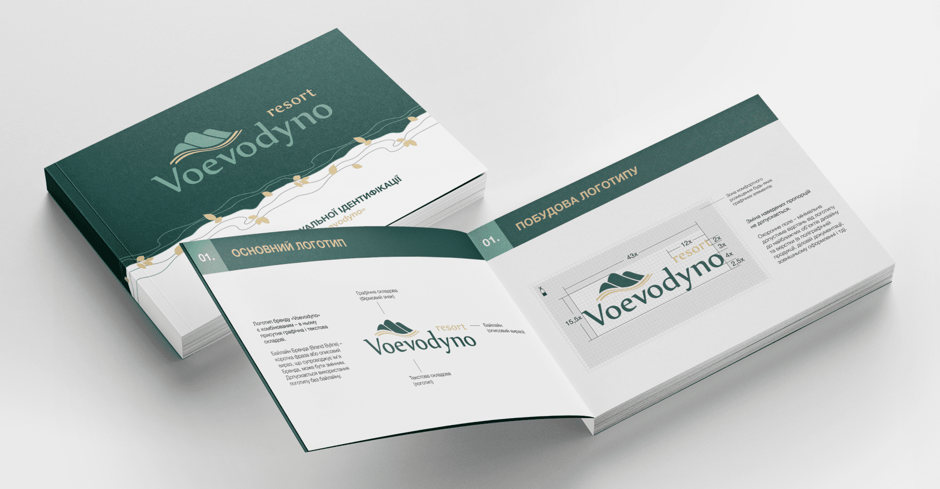
- Brand book is an effective tool for doing business, important not only for external
- cooperation, but also for creation the company's internal traditions. It helps to
- organize and describe all the semantic content of the brand, thereby optimizing
- the work of staff management, advertising activities and planning for the future
- development of the company. The main tasks of the brand book:
- • implementation of uniform corporate identity standards throughout the company;
- • improving corporate culture;
- • improving visual brand identity.

Project results
We made a rebranding of the logo and created many elements of the corporate identity. The corporate website also received its changes: the redesign helped the brand get a modern look and more intuitive UI.
A detailed guideline will allow the company to correctly use the corporate identity in its communication and brand identification, while the new pattern fully reflects the brand philosophy.

 Russian
 Ukrainian




Add a comment
Fields are required *